Art Materials - Watercolor Paints
Article by Vladimir London, Watercolor Academy tutor
Watercolor paints are the third necessary ingredient for good watercolor
I often the question, "what are the best watercolor paints?" As with paper and brushes, it depends on your artistic needs, painting style and preferences.
There are art teachers who insist on certain paints and give an exact shopping list with links to purchase art materials online. That is either amateurish advice or brand advocacy. I would warn to take such suggestions cautiously because your color palette should depend on your painting style rather than on someone else's marketing objectives.
First, let us clarify the terminology which is so often misused in YouTube videos and even in some art courses. Paints, colors, dyes and pigments are very different things. Color is a physical characteristic of reflected light. The color of paint comes from either pigment or dye. Pigments are microscopic particles that do not dissolve in water; they are suspended in the paint vehicle. Dyes are completely soluble and bind directly with the support (paper). Paint is the mix of pigments or dyes with the binding medium.
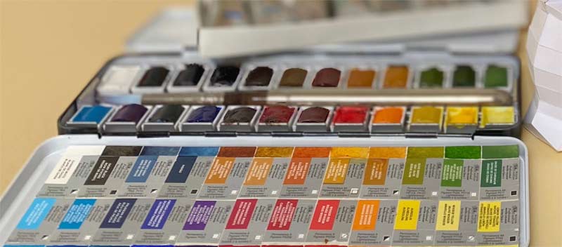
There are hundreds and hundreds of paints on the market; many have similar names but different colors, similar colors with different names, brand proprietary names, as well as various "poetic" names. The huge number of well-known and more obscure brands further complicate all this confusion. To clarify the situation, we need to talk about pigments, not colors.
In this article, you will see the pigment names paired with their codes (in brackets) to avoid any misinterpretations. I will only mention good quality permanent pigments, unless it is stated otherwise. When shopping for paints, look for those numbers printed in small letters. It is better to go for single pigment paint rather than a mixture of two or more pigments.
To make an educated decision when shopping for paints, you will need to know what watercolor paints are made of, what qualities they possess, and how to test those qualities.
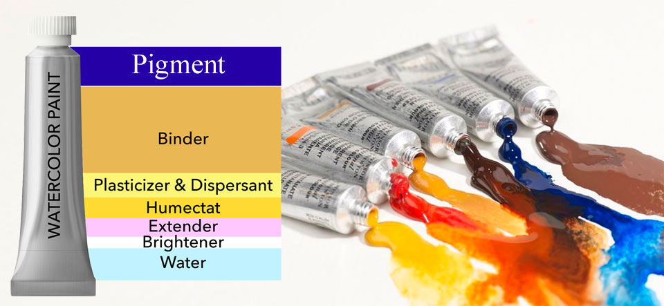
Watercolor paints are made of pigments mixed with the paint vehicle. The paint vehicle keeps the pigment particles suspended and binds them to the paper. It can account for more than 90% of the paint volume and consists of water, binder (traditionally gum arabic, but some manufacturers use synthetic glycol), plasticizer (glycerin), humectant (traditionally honey, now often cheap corn syrup), filler to bulk up the paint (usually dextrin), plus various additives like dispersants and fungicide. The paint vehicle influences how quickly the paint dissolves in water, its viscosity, the flexibility of the painting layer, and drying time.
Some brands, like Old Holland, have a higher proportion of pigment which gives better quality paints, but is reflected in prices. Some brands cut costs by adding more filler or extender to the paint vehicle, especially in student grade paints.
All pigments can be divided into natural or synthetic, and organic or inorganic. Natural organic pigments are derived from animal and plant substances: they are prone to fade and are no longer used for watercolor paints. The same goes for synthetic organic pigments, which are man-made carbon-based substances. Natural inorganic pigments come from metals and earths but can be very expensive. That is why synthetic inorganic pigments (chemically engineered from metals and earths) are used for manufacturing more than 80% of contemporary watercolor paints.
The color of the pigment determines the color of paint. However, the colors you see in pans or squeezed out of tubes will not be the same on paper. Depending on the pigment concentration, the color on paper can vary from the top tone (masstone) to the well-diluted with water undertone (tint). Undertones have lighter value, lower chroma (less saturated color), and often produce a hue shift (slightly different color).
The size of pigment particles plays a critical role in paint characteristics. Pigments with smaller particles go deeper into the fibers of paper, have a higher tinting strength, stronger staining, and are more transparent and more inclined to backrun than pigments with "large" size particles.
Here's a short list of pigments with different particle sizes.
Coarse pigments with particles larger than 5 microns:
- Cobalt blue (PB28)
- Cerulean blue (PB35)
- Viridian (PG18)
Pigments with medium size particles (5 … 1 microns):
- Ultramarine blue (PB29)
- Cadmium red (PR108)
- Yellow ochre (PY43)
- Cobalt teal blue (PG50)
Fine particles (1…0.5 micron):
- Cadmium yellow (PY35)
- Venetian red (PR101)
Very fine pigments (under 0.5 micron):
- Prussian blue (PB27)
- Phthalocyanine blue (PB15:3)
- Phthalocyanine green (PG7)
- Lamp black (PBk6)
One of the very important characteristics of paint is lightfastness, or the permanence of color. Lightfastness is the resilience of color to prolonged exposure to natural light. Lightfastness from strong to very weak is indicated in roman figures from I to V. Avoid any paints graded lower than I (excellent lightfastness).
The tinting strength of a pigment (or its colorant power) determines how much of the pigment is needed to produce the required color intensity. It also defines how much the pigment will dominate in a mixture with other pigments.
The staining power defines how resistant a certain pigment is to lifting. This quality makes watercolor painting "unforgiving" as some passages of paint can be difficult to correct by diluting with water and whipping or bloating. Staining happens when very small particles of pigment get into the fiber of paper, gripping the surface both mechanically and electrostatically. Of course, the paper surface and internal sizing plays a certain role in this process. Rough cold pressed papers will absorb paint more readily than sized hot-pressed papers. Some mediums can also influence staining. For example, humectant makes pigment particles penetrate the paper more deeply, while gum arabic keeps the paint on the surface.
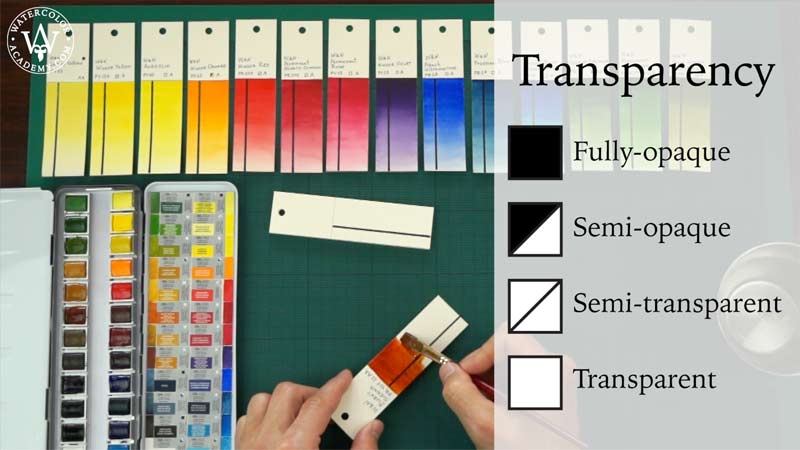
Another essential quality is transparency. Transparency (as opposite to hiding power) determines how well the blank background shows though a dried layer of watercolor paint. Transparency happens when light reflects on the support between the particles of the pigment and depends on the particles size and the tinting strength. It is indicated on the paint label as shaded, half-shaded, crossed, and empty square, indicating fully opaque, semi-opaque, semi-transparent and transparent paints respectively.
Here's the list of some pigments from very transparent to more opaque:
- Phthalocyanine blue (PB15:3)
- Phthalocyanine green (PG7)
- Ultramarine blue (PB29)
- Prussian blue (PB27)
- Viridian (PG18)
- Ultramarine Violet (PV15)
- Cobalt blue (PB28)
- Cerulean blue (PB35)
- Lamp black (PBk6)
- Burnt sienna (PR101)
- Raw umber (PBr7)
- Raw sienna (PBr7)
- Cadmium yellow (PY35)
- Burnt umber (PBr7)
- Bone black (PBk9)
- Cadmium red (PR108)
- Venetian red (PR101)
The pigment specific gravity is the weight of the pigment in water. It is unrelated to the particle size but depends on the density and mass of the particles. The heavier the pigment, the faster it will sink in solution. Here's a list of some pigments in order from very light to heavy weights:
- Phthalocyanine blue (PB15:3)
- Lamp black (PBk6)
- Prussian blue (PB27)
- Phthalocyanine green (PG7)
- Ultramarine blue (PB29)
- Bone black (PBk9)
- Raw sienna (PBr7)
- Raw umber (PBr7)
- Burnt sienna (PR101)
- Burnt umber (PBr7)
- Viridian (PG18)
- Cobalt blue (PB28)
- Cadmium yellow (PY35)
- Cerulean blue (PB35)
- Cadmium red (PR108)
Heavy pigments with bigger particle sizes tend to settle as sediment in mixes, so every time the brush is loaded with paint, the mixture needs to be stirred. Usually such pigments also have lower tinting strength.
And finally, the last attribute of watercolor paint I'll mention here is dispersability, which is how easily a pigment can be mixed in water. This quality depends on the manufacturing process and chemical properties. Dispersability influences how a drop of paint expands in all directions on paper. Some dispersants, like ox gall can increase this quality.
With the various attributes of watercolor paints listed above, it is time to describe some simple experiments you can do to test the qualities of pigments and paint vehicles.
To compare two or more brands of watercolor paint you don't need any special lab equipment: just the paints, a palette knife, a synthetic flat 1" brush, saucers, glasses, watercolor paper, a clear acetate sheet and water.
1. Start with mixing a small amount of paint in a glass of water. Check the dispersability (how easily paint dilutes); clumping (any undiluted particles sticking together), tint strength (how strong the color is), presence of brighteners (any lighter clouds), and the transparency of the mix. Repeat this exercise with the same color of different brands, mixing an identical amount of paint in another glass. Note any differences between two. For each test, write the results down to keep the track.
2. Now, leave the two glasses next to each other undisturbed for one week. Check every morning how the pigment has separated and the sediment has settled on the bottom of the glass. Note which mix settles faster, indicating either a heavier pigment or bigger particle size.
3. For the next test you will need hot pressed (smooth) watercolor paper. Squeeze a small amount of paint from the tube onto the paper and smear it with a palette knife in one energetic movement as if spreading butter on bread. Clean the palette knife and repeat with another paint. Check the granularity (pigment texture), tinting strength and any variations in color. Also, observe any irregularities in the paint vehicle.
4. For the next test you will need a cold-pressed (or 'not') watercolor paper. Draw a rectangle with a pencil and mark a solid line with permanent black marker. Make a strong mix of paint in a saucer and apply a wash of paint inside the rectangle. With cotton swab or paper tissue, absorb a line of paint while wet to check the bloating properties of the paint. While the paint is still wet, apply a brushstroke of clean water at the bottom end of the rectangle. This will cause a backrun: check its size. Repeat the exercise with another brand of paint. When the paint dries, check the layer's transparency – how well the black line shows through. Use paper tissue wrapped around your finger and rub the swatch. Check how strong the binder is by how much pigment transfers to the tissue. Rub a line with wet cotton swab or a stiff brush to dilute and lift the paint. Check the staining power of the pigment both in wet and dry lifting.
5. With clean water, draw a square with a flat brush. Apply paint at one side of the square to check the "wet on wet" dispersability attribute of the paint.
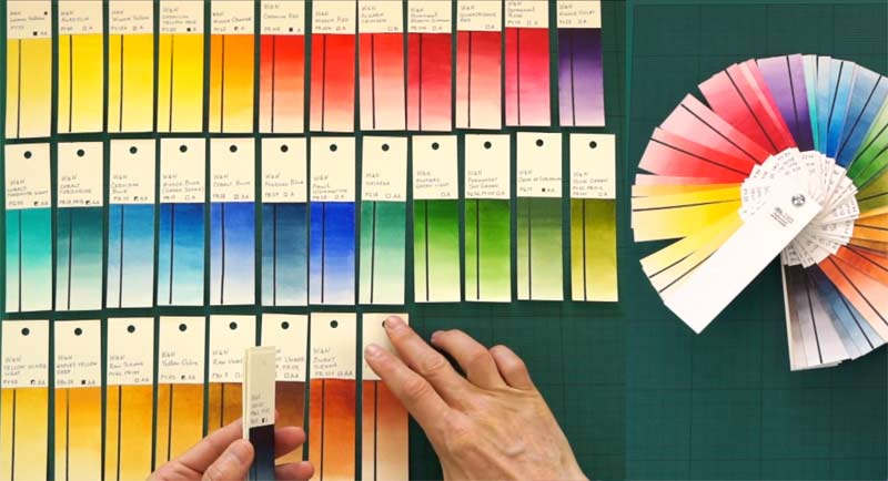
6. To check the masstone and undertone, draw a rectangle with pencil and make a gradated wash starting from strong color and gradually ending with very light tint. You will find a step-by-step description of how to make gradated washes in the "Watercolor Painting Techniques" video lessons of the Watercolor Academy course. Compare the colors of the top tones and any color shift in tints by placing two washes of the same paint from different brands next to each other.
7. To check lightfastness, make a range of swatches and cover half of every swatch so only the remaining half can be exposed to light. Place the sheet with the swatches in direct sunlight for several months to see whether any fading occurs after prolonged exposure. This is the longest test you would do, but it is worth the wait to eliminate paints and brands from your palette that will not stand the test of time.
8. To test how different brands of paint dissolve in water, place small amounts of paint squeezed from the tubes into water-filled saucers. Do not stir and leave the samples undisturbed for a couple of days. Compare how the paint dissolves and what variations of colors it releases.
9. To check the paint vehicle, you can dry and re-wet similar paints of different brands. Make a strong mix of paints in saucers and leave to dry untouched for several days. When the paint is completely dry, check whether it is glossy or matt (a glossy surface indicates a higher proportion of gum arabic), look for discoloration (any clouds show separation of the vehicle ingredients), check if the surface is smooth or cracked (cracks indicate a low proportion of humectant). Re-wet the paint, and stir with a brush to observe whether paint dissolves evenly and quickly or breaks into bits, which is a sign of a low proportion of binder, plasticizer and humectant. Draw a square with clean water on stretched watercolor paper and pour paint from the saucer into this square to achieve a thicker layer than can be painted with a brush. Repeat with other samples. Leave puddles to dry. Check how even the color is. In a thick layer, heavier particles will settle at the bottom, which leaves lighter content at the top. Variations in colors and tones would reveal the presence of fillers and brighteners. To test how strong the binder is, rub dry swatches with paper tissue. Paints that do not rub off, have smooth dried surfaces, show the least discoloration and splotching, as well as re-wet quickly and evenly have superior quality.
10. To check for white brighteners and extenders, do the "black background" test. Take a black acrylic or clear acetate sheet and mix a puddle of paint with a brush directly on the sheet. Let it dry. Check how the dried paint looks on black (clear acetate sheet has to be placed on top of black paper or dark background). Good quality paint will look even and dark. Any brighteners will appear as lighter clouds.
11. And finally, because the purpose of paints is to be used in artwork, paint with them to see and feel how certain paints and brands perform.
With the information about pigments and paint vehicles you've learned above, it is time to talk about colors. The range of colors an artist uses is called a "color palette".
It might be tempting for a beginner to go for a multitude of colors. The truth is, good watercolor artwork can be painted with a very limited palette, which can produce a wide spectrum of colors. In the Watercolor Academy (https://WatercolorAcademy.com), you can see how some artworks have been painted with only one pigment (monochrome), two pigments (duo-chrome) and three pigments. For example, burnt sienna (PBr7) and ultramarine blue (PB29) can be used to make a very colorful and creative artwork. This two-color palette can be extended with yellow ochre (PY43) to become even richer in color nuances. This three-color palette is sometimes referred to as the "Velázquez classical". There are professional watercolor artists who paint exclusively with three pigments.
Of course, you might want to have a wider color range than three pigments. Most paints are manufactured from about 100-120 pigments, which can be restricted to under 40 pigments with good lightfastness and color qualities. Below, I will list some of those pigments:
- Cadmium yellow (PY35)
- Cadmium yellow deep (PY35)
- Cadmium orange (PO20)
- Cadmium scarlet (PR108)
- Cadmium red (PR108)
- Cadmium red deep (PR108)
- Perylene violet (PV29)
- Quinacridone rose (PV19)
- Cobalt violet deep (PV14)
- Ultramarine violet [RS] (PV15)
- Ultramarine blue (PB29)
- Phthalocyanine blue (PB15:3)
- Iron [prussian] blue (PB27)
- Cobalt blue (PB28)
- Cerulean blue RS (PB35)
- Phthalocyanine turquoise (PB16)
- Manganese blue (PB33)
- Cobalt teal blue (PG50)
- Viridian (PG18)
- Chromium oxide green (PG17)
Good permanent Earths:
- Raw sienna (PBr7)
- Quinacridone gold (PO49)
- Gold ochre (PY42)
- Yellow ochre (PY43)
- Burnt sienna (PR101)
- Venetian red (PR101)
- Raw umber (PBr7)
- Burnt umber (PBr7)
- Indigo (PBk6+PB60) – convenient mix of two pigments
- Perylene black (PBk31)
- Lamp black (PBk6)
- Bone black (PBk9)
Most of colors I use come from that list. It doesn't mean, however, that you have to limit yourself to those pigments. From time to time, you may want to test other colors and you may find them more suited to your painting style.
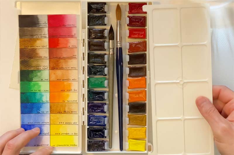
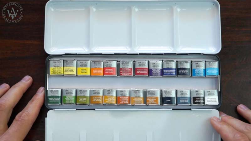
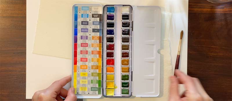
Watercolor paints come in half- and full-size pans and in tubes. Paint in pans is semi-moist and in tubes is more 'liquid'. A set of pans is easier to travel and paint outdoors with, while paint from tubes is easier to mix for larger-scale artworks. You might want to have both pans and tubes at your disposal.
If you are a complete beginner and need an advice where to start, here are three criteria to keep in mind when shopping for watercolor paints:
1. Choose only artists' quality watercolor paints from the most reputable brands like Daniel Smith, Da Vinci, Holbein, Maimeri, M. Graham & Co., Old Holland, Rembrandt, Utrecht, Winsor & Newton and some others.
2. Give preference to single-pigment paints instead of mixes of several pigments.
3. Buy only Grade I lightfastness paints.
If you are wondering what my palette is, it's about 12 paints, but do not take it as a direct suggestion, because your painting style and therefore choice of paints might be very different to mine:
- Cadmium Yellow Pale (PY35)
- Cadmium Red (PR108)
- Ultramarine Blue (PB29) – French Ultramarine
- Phthalocyanine Blue (PB15:3) – Winsor Blue (Green Shade)
- Iron [Prussian] Blue (PB27)
- Cobalt Blue (PB28)
- Cerulean Blue RS (PB35)
- Cobalt Teal Blue (PG50)
- Viridian (PG18)
Earths:
- Raw Sienna (PBr7)
- Yellow Ochre (PY43)
- Burnt Sienna (PR101)
One final word about pigments. By the nature of watercolor you do not need white and black pigments, even though they are available on the market. The white in watercolor comes from the color of the paper and the black always looks better when it is mixed from complementary pigments.
To learn how to paint in watercolor, enroll now
Watercolor Academy Online Course
A self-study, self-paced course where you can learn how to paint in watercolor by watching video lessons and doing assignments
- Unlimited access to 80 watercolor painting video lessons
- Lifetime membership without deadlines
- Unlimited support from the Academy tutors
- Constructive critique of your artworks
- Member access to the Academy's Art community
- Place in the Academy's Students Gallery
- Exclusive members-only newsletter and bonuses
- Watercolor Academy Diploma of Excellence in your name
One-time payment - Lifetime membership
$297 USD
ENROLL NOW
Personal Tutoring online + Online Course
One-to-one, unlimited and custom-tailored to your skills and needs Personal Tutoring by the Watercolor Academy teachers
- Everything in Online Course, plus:
- Dedicated team of art tutors
- Assessment of your current level of art skills
- Personalized curriculum tailored to your skills and goals
- Up to 100 art tasks with by-task assessment
- Unlimited one-to-one personal coaching with detailed per-task instructions and feedback
- Artwork critiques and results-oriented guidance
One-time payment - Lifetime membership
$997 USD
ENROLL NOW