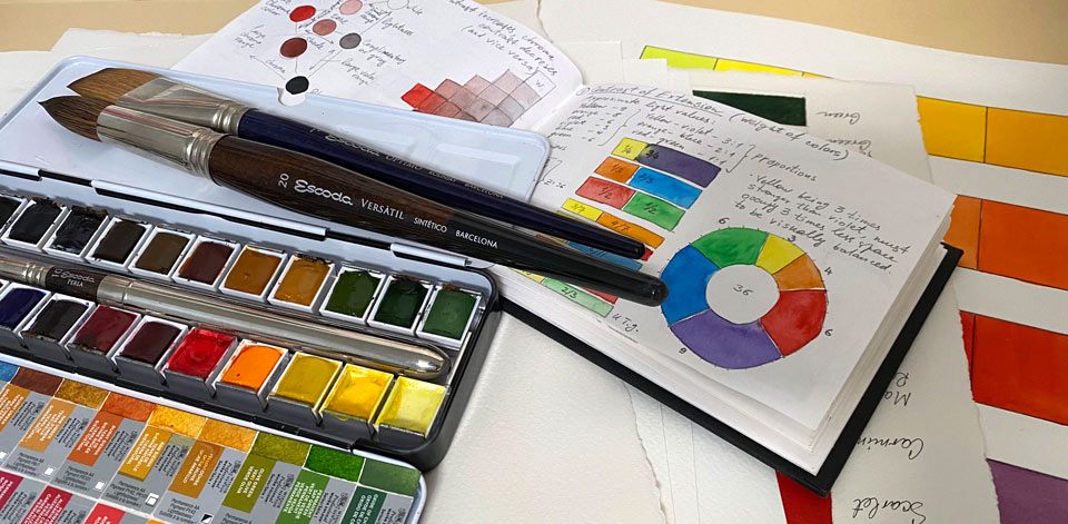
Color Theory - Contrasts of Colors
Article by Vladimir London, Watercolor Academy tutor
When it comes to contrasts, we need to examine colors' hue, values, temperature, and how they influence each other
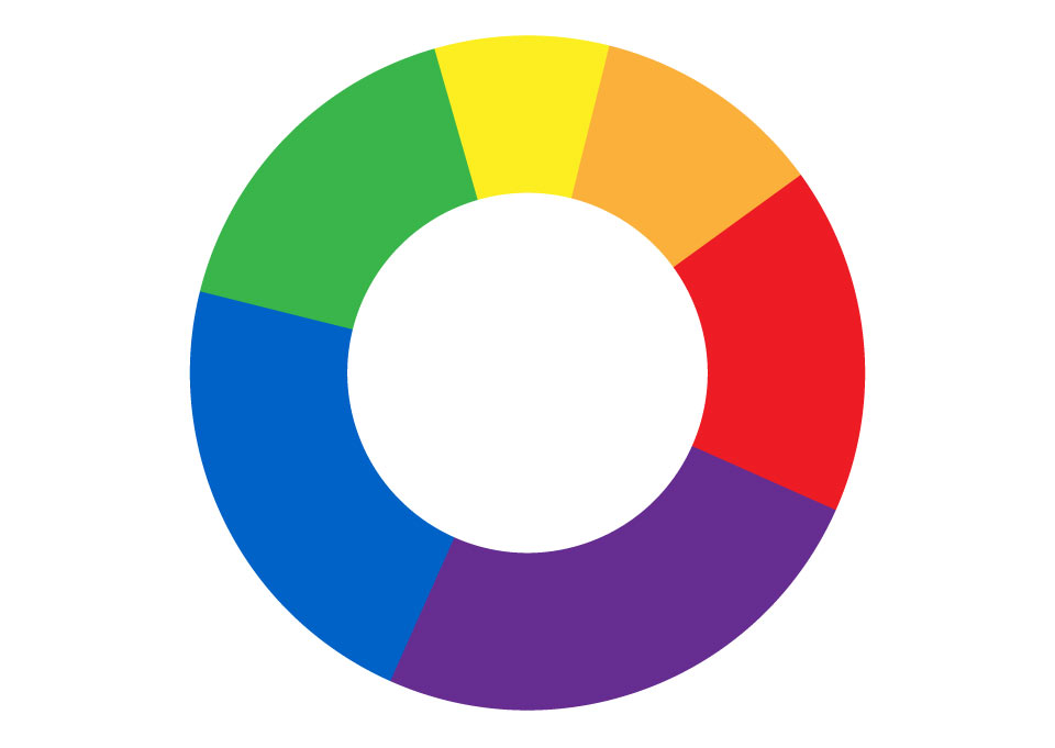
In contradiction with harmony, we also need to examine contrast which is a "distinct difference". Johannes Itten proposed seven kinds of color contrast:
- Contrast of hue
- Light-dark contrast
- Cold-warm contrast
- Complementary contrast
- Simultaneous contrast
- Contrast of saturation
- Contrast of extension
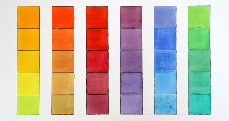
Contrast of hue
The contrast of hue is the difference between the "basic color". The primary triad (yellow, red and blue) has the strongest difference between hues. The contrast between secondary hues is weaker and the contrast between tertiary hues is even more so. The contrast of hue in watercolor has profound significance. You may find that children's art and folk art tend to have very strong hue contrasts. It takes time to develop good taste in classical art and to learn to see beauty in more complex nuances of colors. Professional painters and graphic artists may use strong hue differences to evoke emotions and tell a story with their art.
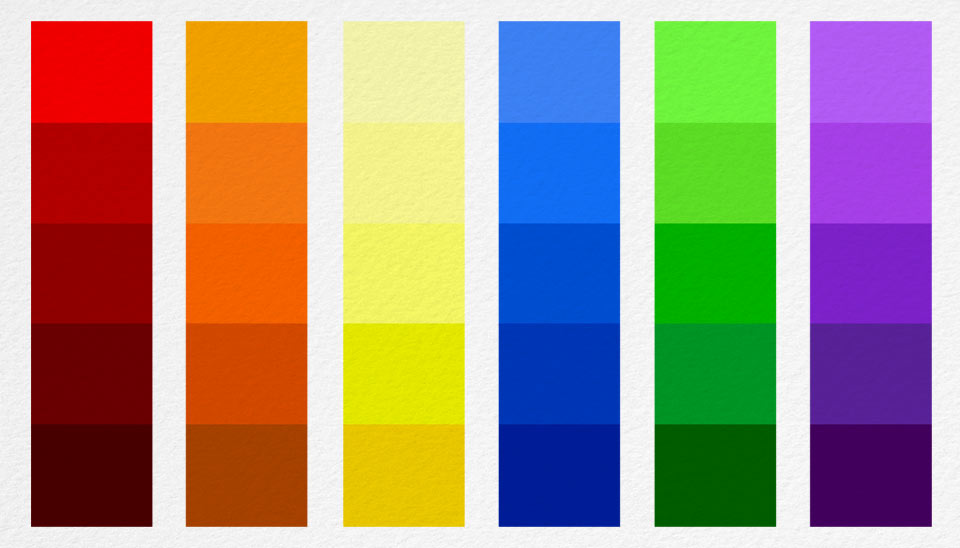
Light-dark contrast
The light-dark contrast refers to differences in the values of various colors. Arguably, this contrast is the most important in European and Asian art.
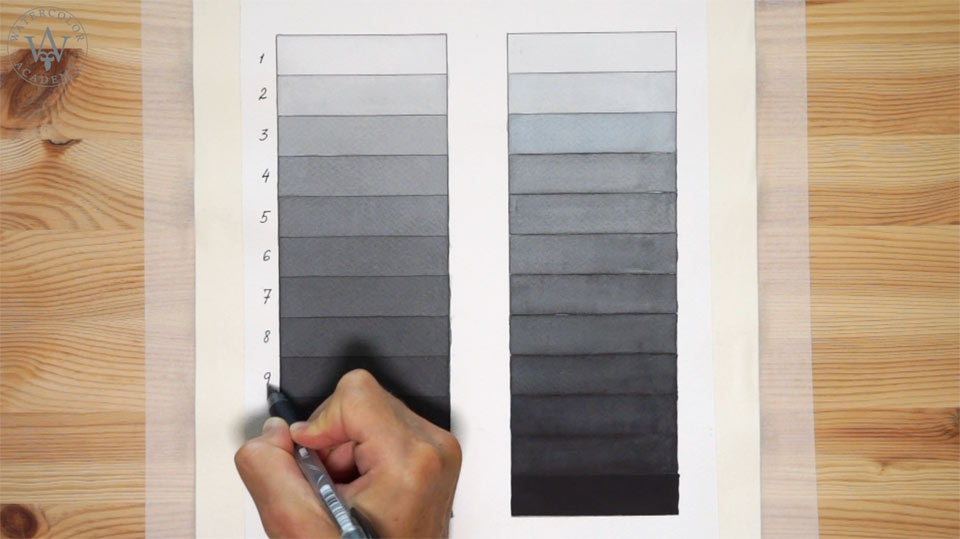
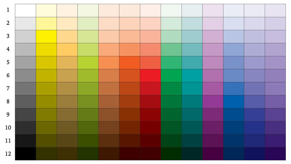
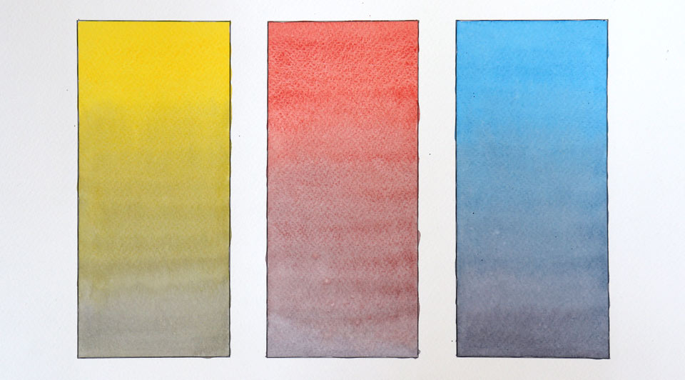
To get an idea of the measurement of tonal values, we can divide the range from white to black into 12 equal steps. On this scale, pure yellow would take the third step; yellow-orange the forth, the fifth step would correspond to yellow-green, orange, and red-orange; the sixth step is shared by red and green colors; blue-green is the seventh; red-violet, blue and blue-violet are in the eighth step; and the darkest color is violet which takes the ninth step. The biggest light-dark contrast is between the lightest yellow and the darkest violet color, while colors that share the same step, such as red and green for example, have the least tonal difference.
The gradation of 12 steps also tells us that there is no such thing as a pure dark yellow or a saturated light blue. After the third step, to make the yellow darker it has to be toned down by adding darker colors or a complementary violet. Therefore, its shades cannot be pure yellow. Likewise, tints cannot have high saturation. Diluting blue to get a lighter value will make it pale and dim. The same goes for red; it can only be vivid when dark. The Old Masters knew this. To achieve a bright and strong red, Rembrandt surrounded it with dark colors. Red will only appear radiant and light in contrast to very dark values, but it will look dark on a yellow background. A yellow composition must be light because shades of yellow lack purity.
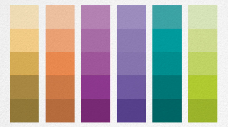
Cold-warm contrast
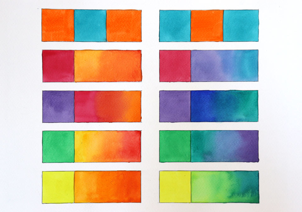
The cold-warm contrast is the difference between the "temperature" of colors. The strongest temperature contrast is between red-orange and blue-green. Colors located next to each other, for example red-violet and violet or yellow and yellow-green, will have the weakest cold-warm contrast. Such contrasts are very important in landscape painting. A cold blue sky gets warmer closer to the horizon: backgrounds in aerial perspective are always colder than mid-grounds and foregrounds. This way, the temperature of colors helps describe distances in watercolor. The cold-warm contrast can also be used to differentiate between light and shadow. Outdoors, light can be warm while the shadows reflect the cold blue sky. It is vice versa indoors, where cold light through a window illuminates objects and their shadows are warm.
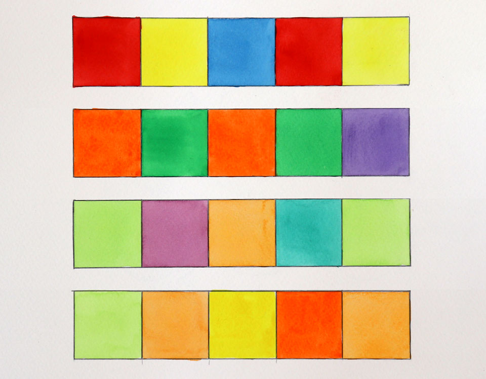
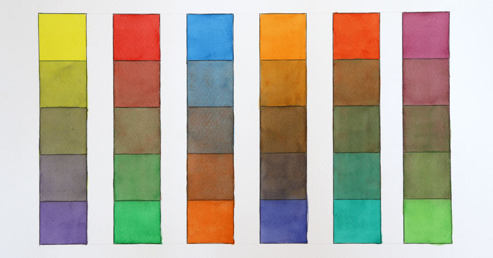
Complementary contrast
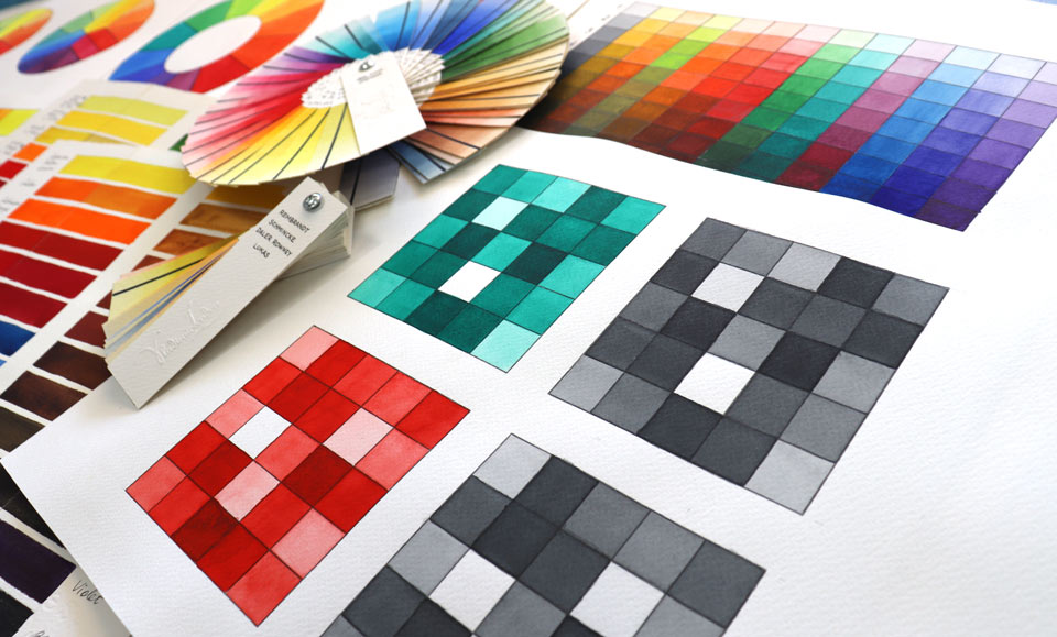
The complementary contrast is the difference between opposing colors on the color wheel. Complementary colors should be used to achieve beautiful chromatic grays. The fewer pigments that are in the gray mix, the better it will look. A coat of glazing with a complementary color will also mute pure color.
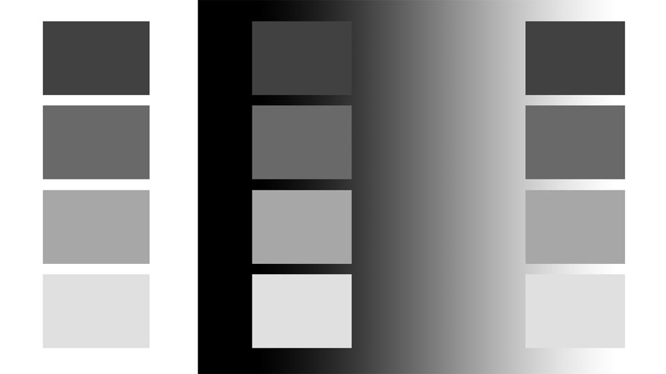
Simultaneous contrast
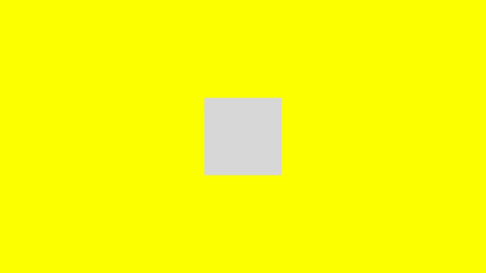
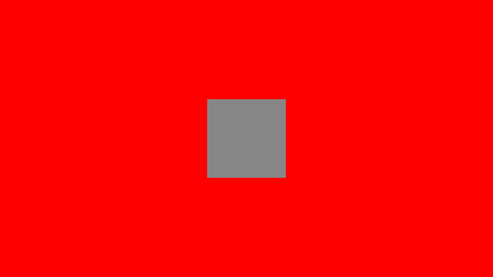
Because the human brain looks for balance, it creates simultaneous contrasts when a complementary color is not present. For example, a neutral gray on a yellow background would appear to the human eye to be a bit purple, while a gray on purple will look yellowish. The same applies not only to grays but to other colors as well, with the shift going toward complementary color.
Contrast of saturation
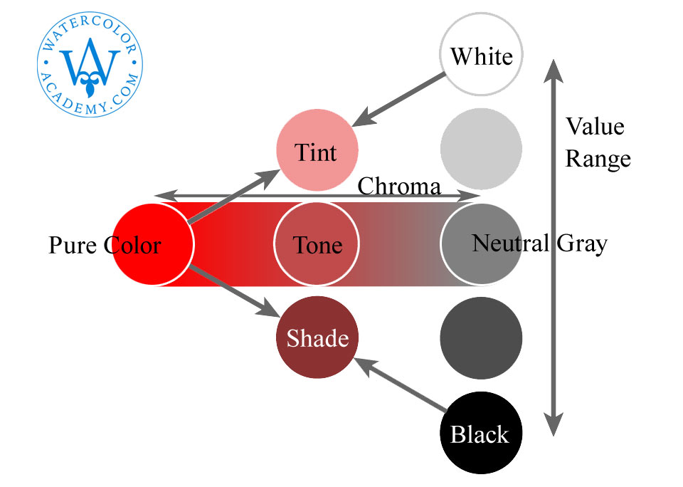
The contrast of saturation is the difference between a pure color and its darker shades and lighter tints. There is a correlation between the saturation (or chroma) and the lightness of a color. This directly influences its gamut, or range of color. When the light-dark contrast increases, the saturation contrast decreases, and vice versa. A very diluted color will have a small chroma range, while a large chroma range is only obtainable by adding a complementary color or a gray without diluting or darkening the color.
Contrast of extension
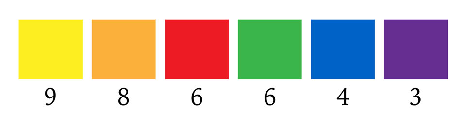
The contrast of extension deals with the relative proportion of areas which needs to be filled with different colors for those colors to look in balance. The values of visual strength or "weight" of colors from the strongest to the weakest were proposed by Goethe as follows:
9 – yellow
8 – orange
6 – red and green
4 – blue
3 – violet
For saturated yellow and violet to be in balance, the yellow has to occupy three times less space on an artwork so as not to overpower the violet, because saturated yellow is visually three times stronger than violet.
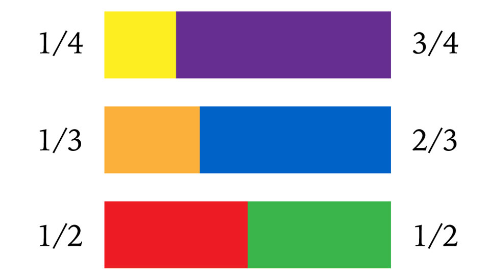
According to Goethe's scale, the harmonious ratios of area filled by complementary colors must be as follows:
yellow : violet = 1/4 : 3/4
orange : blue = 1/3 : 2/3
red : green = 1/2 : 1/2
The same principle can be used to find ratios for remaining color combinations. For example, pairs with yellow in them:
yellow : orange = 3/7 : 4/7
yellow : red = 1/3 : 2/3
yellow : blue = 3/11 : 8/11
yellow : green = 1/3 : 2/3
When it comes to the application of color theory in watercolor, two things interest us the most:
- how the combination of various colors creates different visual effects
- how to achieve those effects by mixing watercolor pigments
There are three basic ways to mix paints and achieve visual effects in watercolor:
- Mechanically mixing wet paints on a palette or directly on paper (wet-into-wet)
- Optical glazing by overlaying translucent layers (wet-on-dry)
- Juxtaposing various paints next to each other without overlapping (stippling, dry-brush, and retouching)
I will explain this topic more fully in the 'Watercolor Painting Techniques' artciles.
To learn how to paint in watercolor, enroll now
Watercolor Academy Online Course
A self-study, self-paced course where you can learn how to paint in watercolor by watching video lessons and doing assignments
- Unlimited access to 80 watercolor painting video lessons
- Lifetime membership without deadlines
- Unlimited support from the Academy tutors
- Constructive critique of your artworks
- Member access to the Academy's Art community
- Place in the Academy's Students Gallery
- Exclusive members-only newsletter and bonuses
- Watercolor Academy Diploma of Excellence in your name
One-time payment - Lifetime membership
$297 USD
ENROLL NOW
Personal Tutoring online + Online Course
One-to-one, unlimited and custom-tailored to your skills and needs Personal Tutoring by the Watercolor Academy teachers
- Everything in Online Course, plus:
- Dedicated team of art tutors
- Assessment of your current level of art skills
- Personalized curriculum tailored to your skills and goals
- Up to 100 art tasks with by-task assessment
- Unlimited one-to-one personal coaching with detailed per-task instructions and feedback
- Artwork critiques and results-oriented guidance
One-time payment - Lifetime membership
$997 USD
ENROLL NOW