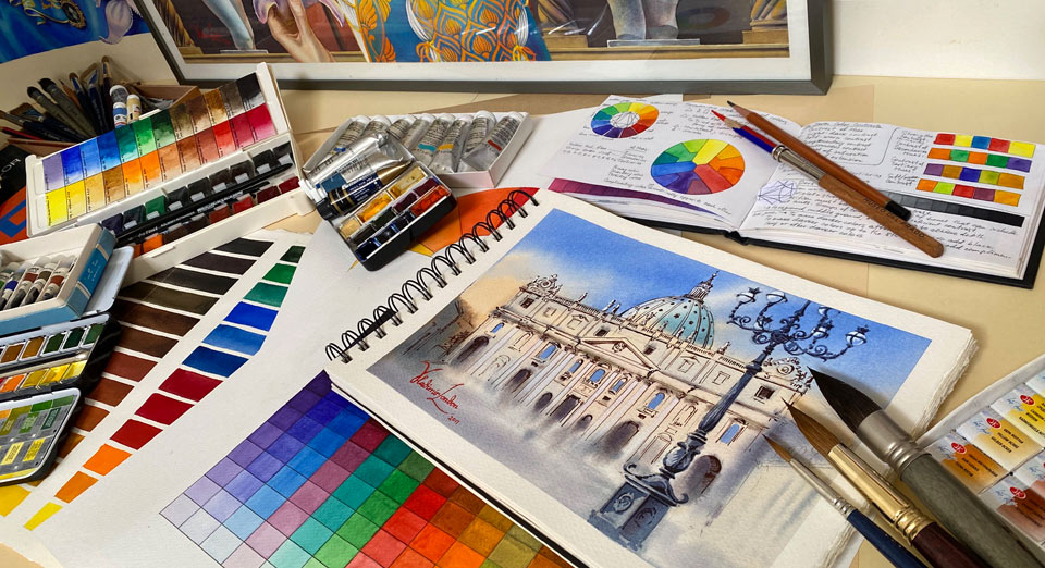
Color Theory in Watercolor Painting
Article by Vladimir London, Watercolor Academy tutor
Discover the difference between color, hue, pigment, dye, and paint, as well as learn primary, secondary, tertiary and complementary colors
There are many books written on color theory. More than 500 year ago, Leon Battista Alberty, an Italian Renaissance man, pointed out in his treatise "On Painting" ("Della Pittura") that, "through the mixing of colors infinite other colors are born." After that, many other notable men took an interest in solving the mystery of colors. In 1676, Sir Isaac Newton analyzed how white sunlight separates into a rainbow spectrum of colors when going through a prism. In 1810, Johann Wolfgang von Goethe published his well-illustrated "Theory of Colours". This was followed by Charles Hayter, who published "A New Practical Treatise on the Three Primitive Colours Assumed as a Perfect System of Rudimentary Information" in 1826 in which he described how by mixing just three colors all other colors can be obtained. The color principles were further developed by Albert Henry Munsell, who started working on his system in 1898 and published "A Color Notation" in 1905, followed by the "Munsell Books of Color" and the "Atlas of the Color Solid." I also would like to mention Johannes Itten, who wrote "The Art of Color" which was published in Germany in 1961, and his later, simpler treatise "The Elements of Color". This book was especially helpful in designing the color theory video lessons of the Watercolor Academy course.
By no means this article intends to present a comprehensive analysis of color theory, but rather to give a basic introduction and inspire you to learn more from sources that dive more deeply into the interesting world of color.
When talking about colors, some artists might use words such as color, hue, pigment, dye, and paint interchangeably. To clarify the terminology, let's define those words.
Color
Color is the visual sensation of how a human eye and brain conceives different wavelengths of visible light.
Saturation
Hue is the basic or "source" color like red, orange, yellow, green, blue, and violet, without taking into account its lightness or saturation (hue purity). So, light red is pink, but it still has a red hue, and yellow ochre is less saturated than aureolin but they both have a yellow hue. "Hue" may also consist of two colors from this list, like 'yellow-green', for example, with yellow being more prominent than green in this case.
Hue
Another word for saturation is hue, or the color intensity. It describes how dull or intense the color is; whereby "low chroma" means desaturated and "high chroma" means a very saturated, intense color.
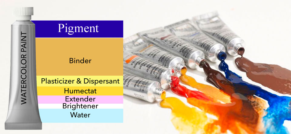
Pigment
Pigment is the physical matter which does not dissolve in water and reflects certain wavelengths of visible light. It refers to the tiny particles of matter that is used in paint manufacturing.
Dye
Dye is a colorant that is fully dissolvable in water and usually staining, and therefore is used in paints.
Paint
Paint is the mixture of pigments (or dyes) with binders and fillers which artists use to create colorful artwork. There are single pigment paints and convenience mixes. The first contains just one kind of pigment or colorant, while the others may have two or more. You may also see the word "Hue" on the paint label. This means that such a paint in not made of the genuine pigments as it used to be, but is an imitation of the original color. Sometimes paint manufacturers use "lyrical" names like Peacock Blue, or Bright Opera that have very little to do with the actual colors or pigments and complicate the terminology even further.
Primary colors
There are three primary colors:
Conventional color theory says that none of these colors can be obtained by mixing other colors. However, in my experience mixing violet and emerald-green from a St. Petersburgh (Russia) paint manufacturer produces a dull but nevertheless blue color similar to indigo. Also, I was able to obtain a red color (similar to scarlet red) by mixing carmine and cadmium orange.
Secondary colors
Secondary colors are mixed from any two primaries. A combination of yellow and red gives orange, yellow and blue – green, and blue and red – violet; or at least so the theory goes. You may refer to an interesting book by Michael Wilcox: "Blue and Yellow Don't Make Green". This is because the paints available today do not have pure blue or yellow color which would produce pure green through mixing. Blue paints come with either green or violet shade, yellow paints with orange or green shades, and red paints with violet or orange shades.
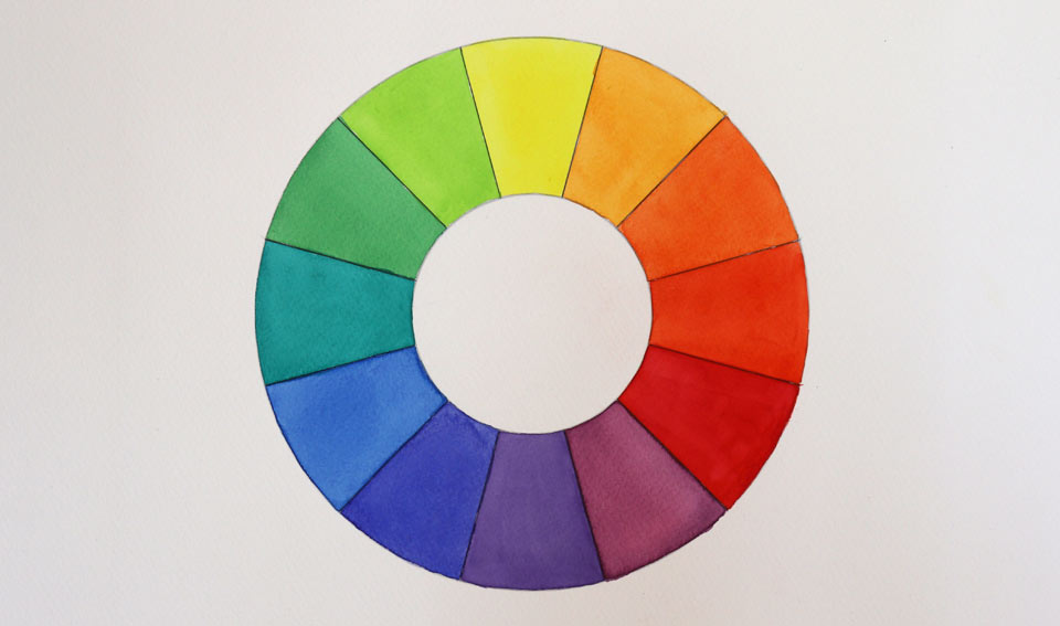
Color wheel
Together, primaries and secondary colors create a six-color palette. This color palette can be arranged into a circle: the color wheel. The first circular diagram of colors was developed by Sir Isaac Newton in 1666. This was followed by Mosses Harris, who published his practical color mixing wheel in 1776, and then by Wolfgang von Goethe with his color wheel in 1810.
A simple six-color wheel has the following sequence:
- yellow
- orange
- red
- violet
- blue
- green
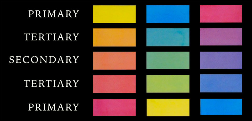
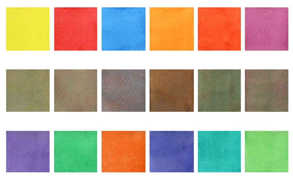
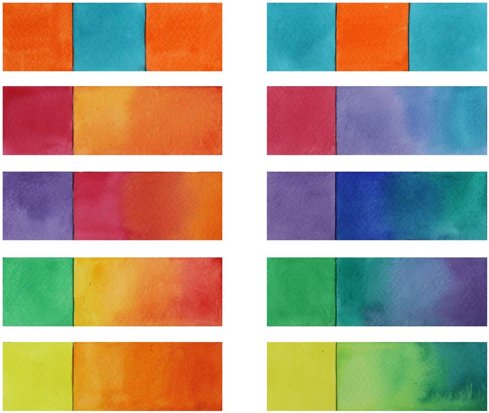
Any two colors located diametrically opposite each other on that wheel are complementary colors. There are three pairs of complementary colors here: yellow and purple, blue and orange, and red and green. According to the color theory, complementary colors produce a neutral gray when mixed together. In practice, you may find that these gray colors are not so "neutral" but have some color shades because of the impurity of the complementary color paint. In practical application, this is a good thing because you more likely to need different grays in watercolor painting rather than one identical gray obtained in different ways.
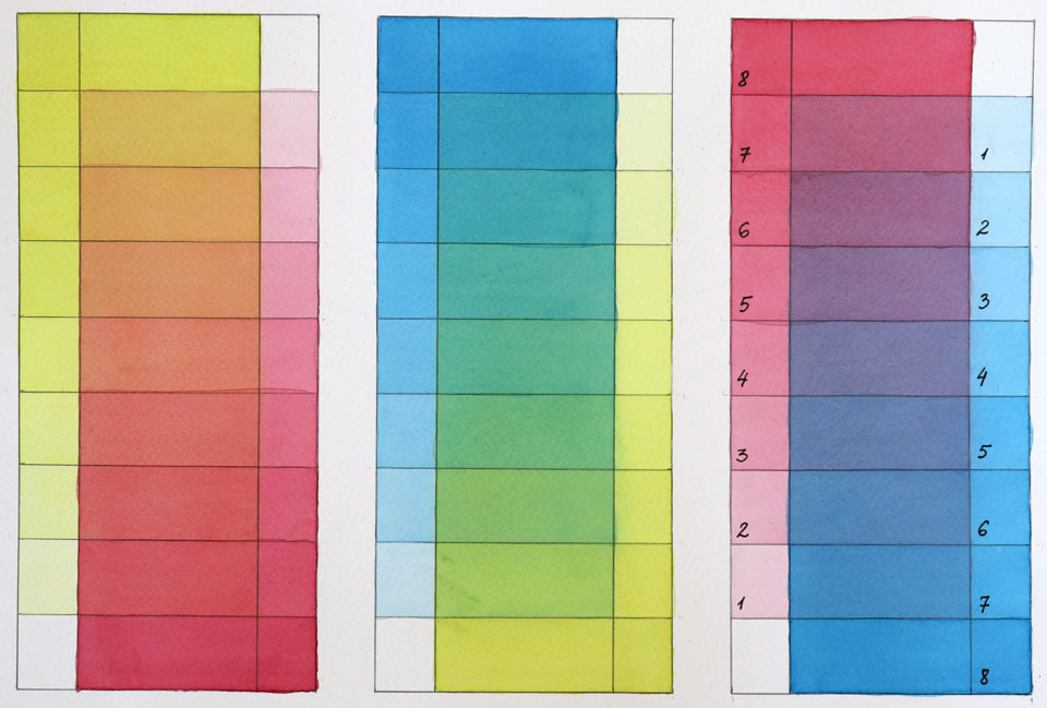
Tertiary colors
By mixing any two neighboring colors from the six-color palette, you can obtain a tertiary color. A mix of yellow and orange produces yellow-orange; red and orange gives red-orange; red and violet makes red-violet; blue and violet produced blue-violet; blue and green makes blue-green; and finally, yellow and green gives yellow-green.
Together, the primary, secondary and tertiary colors form a 12-color palette that can be arranged into the color wheel.
Complementary colors
Any two opposing colors on that palette are complementary colors. There are six complementary pairs as follows:
- yellow and violet
- yellow-orange and blue-violet
- orange and blue
- red-orange and blue-green
- red and green
- red-violet and yellow green
By now, you are already aware that in theory those paired colors would give a neutral gray, but in practice it is a "near-gray" with different color shades.
Of course, there is no limit to mixing colors. Any two neighboring colors on the color wheel mixed together will produce a new color swatch. In theory, you can obtain new swatches indefinitely, but in practice I do not see much benefit in making hundreds and hundreds of swatches. Instead, you need to understand the principle of obtaining different colors and develop a feeling for complementary colors to predict how adding various pigments will change your artwork appearance, enhancing (intensifying) its chroma or desaturating (muting) it.
Color "temperature"
The color wheel can be divided into two sections: cold and warm colors. Yellow, yellow-orange, orange, red-orange, red and red-violet are regarded as having a "warm temperature", while yellow-green, green, blue-green, blue, blue-violet and violet are cold. Keep in mind that even within one hue, for example red, there will be some swatches that are colder or warmer than the other red colors.
Because warm and cold colors lie opposite one another on the color wheel, mixing pigments with different "temperatures" will mute the resulting color, while using two colors from the same temperature group might enhance it.
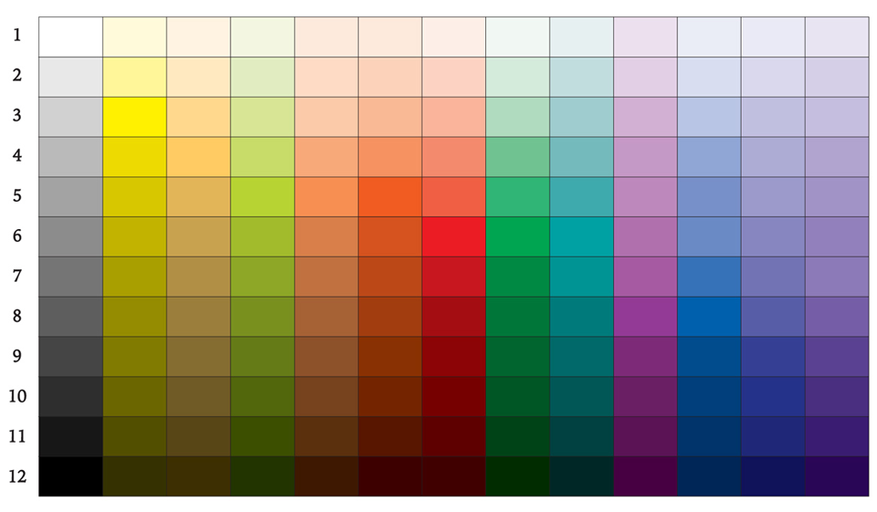
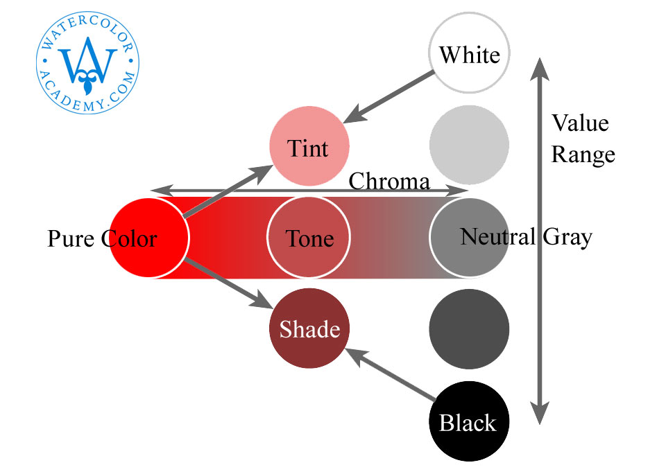
Values
So far, we have talked about saturated colors. What if we need lighter or darker colors? Light and dark tones are called values. In watercolor, values are more important than colors. You may "miss" the right color, but as long as the tonal values are right, the artwork can look believable. Because of their importance, I dedicated a separate article to tonal values.
Tints
When painting in oil, acrylic, tempera or body color, an artist adds white pigment to lighten the value. Mixing with white is called tinting. In watercolor, white pigment is not used for tinting. Instead, paint is diluted with water to become more transparent and for the white paper to reflect more light.
Shades
When a darker value is needed than the original hue can provide, black paint can be introduced into the mixture. The result is called a shade. In watercolor, it is better to avoid black pigments to keep the artwork vibrant and fresh. Instead of black, darker colors can be added. The exception is violet and blue-violet colors, which are the darkest. No other color added to violet would make its value darker, so black can be used if necessary, although if you reach this point, it might be that the artwork's tonal balance is off.
Color harmony
Talking about balance in watercolor, we also need to discuss color harmony. The sense of harmony is very subjective; a color combination that looks pleasing to one person might not resonate with another. Nevertheless, I will give you some suggestions and you may experiment with color to find your personal preferences.
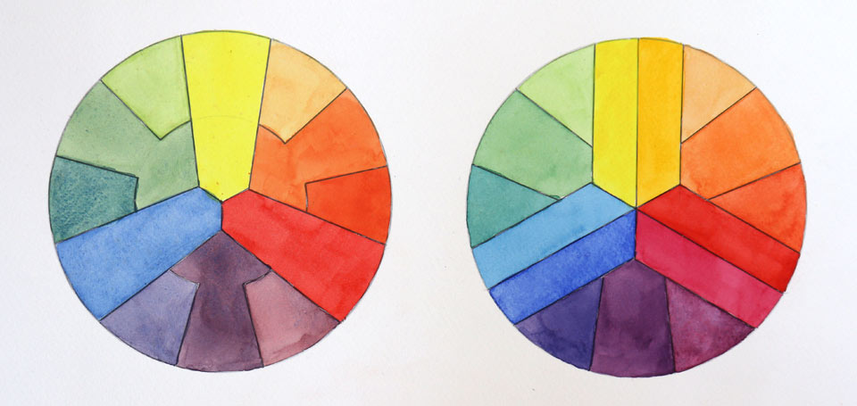
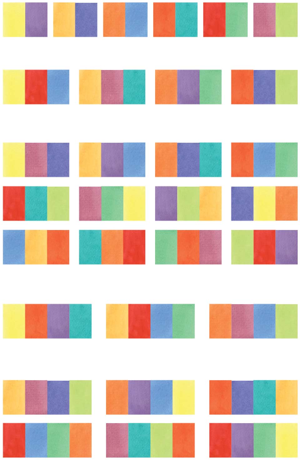
Harmony is the balance, or symmetry of force. When two or more mutually harmonious colors are mixed, they yield a neutral gray. In this respect, they are complementary colors. We have already established that two diametrically positioned colors on the color wheel are complementary, but what about a three or four color combination?
On the 12-color wheel you can connect any three colors with chords that make an equilateral or isosceles triangle. These three colors, when mixed, will give a neutral gray. For making a set of four harmonious colors, you may connect four colors with chords that form a square or rectangle. Once again, these four colors will give a gray mix. On the 12-color wheel, we will find:
- six harmonious pairs of colors (three primary-secondary pairs, and three tertiary-tertiary pairs)
- 16 harmonious triads (four triadic sets each containing three colors that are equally spaced from one another and 12 sets of split-complementary colors that have one base color and two opposite colors separated by a one swatch-gap between)
- and nine sets of four colors that yield a neutral gray (three sets of four colors equally spaced on the color wheel and six sets of four colors that have one and three swatch-gaps along the short and long sides of the rectangle accordingly)
Do not worry if you did not grasp this geometry explanation the first time. I have a good tip for you. You can make the 12-color wheel and cut a separate paper disc on which you draw two triangles (equilateral and isosceles), one square and one rectangle. This disc can be placed in the center of your color wheel and rotated at any angle. The corners of each shape will point to harmonious colors.
Apart from colors that together yield neutral gray, there is also an analogous scheme that has 12 sets of three colors which are located next to each other on the color wheel. A very limited palette of only 12 colors gives 43 combinations of color harmony. This number can be multiplied by as many chromas and shades as you feel necessary. It gives a tremendous variety of harmonious mixtures you can use in watercolor painting.
To learn how to paint in watercolor, enroll now
Watercolor Academy Online Course
A self-study, self-paced course where you can learn how to paint in watercolor by watching video lessons and doing assignments
- Unlimited access to 80 watercolor painting video lessons
- Lifetime membership without deadlines
- Unlimited support from the Academy tutors
- Constructive critique of your artworks
- Member access to the Academy's Art community
- Place in the Academy's Students Gallery
- Exclusive members-only newsletter and bonuses
- Watercolor Academy Diploma of Excellence in your name
One-time payment - Lifetime membership
$297 USD
ENROLL NOW
Personal Tutoring online + Online Course
One-to-one, unlimited and custom-tailored to your skills and needs Personal Tutoring by the Watercolor Academy teachers
- Everything in Online Course, plus:
- Dedicated team of art tutors
- Assessment of your current level of art skills
- Personalized curriculum tailored to your skills and goals
- Up to 100 art tasks with by-task assessment
- Unlimited one-to-one personal coaching with detailed per-task instructions and feedback
- Artwork critiques and results-oriented guidance
One-time payment - Lifetime membership
$997 USD
ENROLL NOW