Tonal Values in Watercolor
Article by Vladimir London, Watercolor Academy tutor
Tonal values refer to the lightness and darkness of the colors in an artwork. To depict an illusion of the real world in watercolor, an artist has to get not only the various colors right, but also the tonal values. Arguably, values are more important here than colors
For example, an artist might apply the wrong color when painting an apple, green, yellow, red or anything in between, but as long as one has the correct tonal values, an apple painting can look believable.
I have to say, the illusion of reality in artworks is always the approximation of the exact tonal values in nature. In fact, it is physically impossible to portray the full spectrum of tonal values in watercolor paints on paper. For example, sunlight is 600,000 times brighter than moonlight while the whitest paper is only 25 times lighter than the darkest paint tint. That is why the creative task is not to replicate the exact difference between light and dark tones but to make tonal gradations that will be perceived as natural and believable by a viewer.
The theory of tonal values relates to a graphical approach to art and an in-depth explanation is provided in the Drawing Academy video lessons. In this artcile, I will just give an overview of this theory.
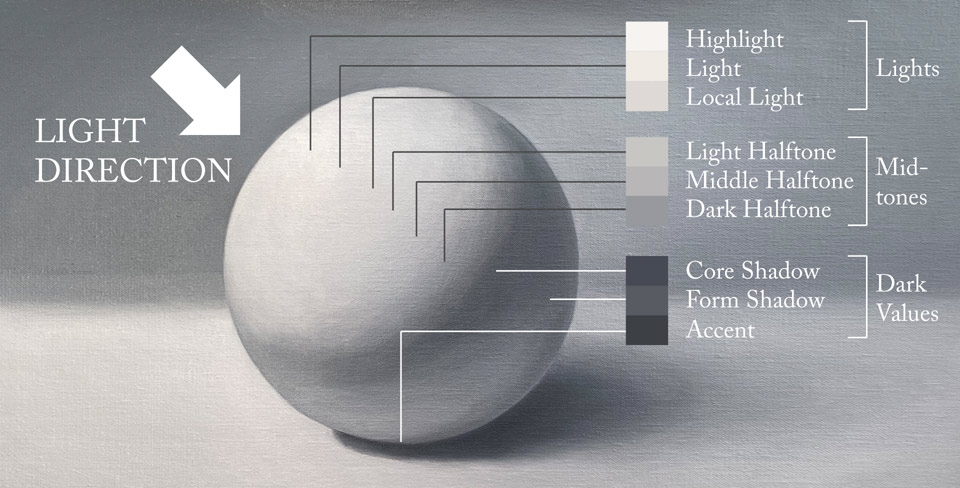
The effect of tonal values and the contrast between light and shades is called chiaroscuro. This word comes from Italian "chiaro" (clear or bright) and "oscuro" (dark or obscure).
In the real world, there are indefinite ranges of chiaroscuro so to keep things simple we can split all tones into three main groups:
- Light
- Mid-tone
- Shadow
Every group can be further sub-divided into three values. Various art schools give different classifications. I will use the following division:
Lights:
- Highlight (the brightest spot on an object)
- Light (surrounds highlight)
- Local light
Mid-tones:
- Light mid-tone
- Middle mid-tone
- Dark mid-tone
Shadows:
- Form shadow (includes reflected light)
- Core shadow (the darkest shadow on the object)
- Dark accent (the darkest part of the cast shadow)
Bright sunshine and diffused light will give different chiaroscuro. Strong direct light creates a stronger contrast between light and shadow, while in soft reflected light the contrast may weaken or disappear completely.
For a beginner, it might be quite challenging to work simultaneously on colors as well as on chiaroscuro when painting multicolored artworks. To get a good grip on tonal values, I suggest Watercolor Academy students do several exercises in grisaille (painting pictures with one paint). Another interesting technique is to paint only in two colors. Using a limited mono- or dual-color palette will help to concentrate on gradations and contrasts of tonal values rather than on colors. Grisaille and two-color pictures can be completed artworks in their own right. Alternatively, they can serve as the under-painting for multi-colored transparent glazing to be applied to. A full explanation and presentation of these painting techniques is available in the Watercolor Academy video lessons.
When painting in full color, there are two main ways of working on colors and chiaroscuro:
1. The first approach works well for bright, daylight landscapes and well-lit still-lives. The painting process goes from the overall color scheme of direct light to local colors and the reflected light of objects.
2. When the light is not bright and diffused, it is better to paint from the local colors of objects to their united color scheme of shadows.
Do not worry if you didn't fully grasp the description above. I'll explain it in the example below.
Tonal values in watercolor should be painted step by step from light to dark values. Artwork should be started from the biggest sources of light, and then continued onto defining color characteristics. The painting process can progress from chiaroscuro to color or from color to chiaroscuro.
Let say, we are painting a redbrick building lit with mid-day sunshine. The whole sheet of paper can be washed with a gradated and very light yellow-orange wash to set up the overall color scheme which is the bright sunlight. Then, starting from light tones of the roof and the wall that is facing the light, we paint the building in pale yellow or ochre. The walls that are sideways to the light would have local red-brick colors – these are mid-tones. We finish the building with the walls that are facing away from the light and under the roof shadows. The reflected light of the blue sky that bounces from other objects and the ground influences these core shadows, giving a dark-bluish tint. The cast shadow will also have cold tints because this area is blocked from direct light by the building and the blue sky colors it.
The process of painting the same building lit with diffused light from a cloudy sky will be different. We can start with establishing the local color of the red bricks and work from light to darker areas. The reflected light would be less blue than in the previous case. Its color would depend more on the local colors of the surrounding objects and the ground. So, if there were a green bush or a tree next to the wall, working with the grass on the ground, it would reflect greenish tints on the walls. The contrast between light and shadows would be much less pronounced than in a brightly lit landscape. The cast shadow would also be much less pronounced if it is present at all.
It is good practice to paint light and dark areas using different methods. For example, shadows and reflected light areas can be painted in wet-on-wet or wet-on-dry washes, and light areas by using the dry-brush technique. Areas done with washes should be bigger than places painted in dry-brush. Watercolor artworks painted with different treatment of light and shadows look more interesting and attractive.
When discussing tonal values, Watercolor Academy students often ask me how dark they go can in watercolor. There is one good rule here: the limit is when the white paper stops showing through dark layers. When working on tonal values, it takes more time to depict darker places.
You also need to keep in mind that some watercolor paints are light and superimposing multiple layers of those paints will not achieve dark tones.
Another question I'm often asked is what color shadows have. It depends. The color of both core shadow and cast shadow will depend on the reflected light rather than on the direct light. Outdoors, objects usually have cold shadows of blue, purple, or gray-violet tints, which reflects the blue, pink or gray sky. Indoors, reflected artificial light often creates warm shadows in red, brown, gray-orange. Of course, the color of shadows also depends on the local colors of the surrounding objects that reflect the light.
When painting shadows, remember that cast shadow is always darker than the shaded area of the object that casts it. The darkest place is next to the object. This is the "dark accent", which we have mentioned in the classification above. This dark accent belongs to the umbra: the fully shaded area of shadow cast by an opaque object. The partially shaded outer region of the cast shadow is called the penumbra.
Here is the most important rule of this article: watercolor should always be painted from light to dark tonal values, not vice-versa as is acceptable in tempera, acrylic or oil.
To learn how to paint in watercolor, enroll now
Watercolor Academy Online Course
A self-study, self-paced course where you can learn how to paint in watercolor by watching video lessons and doing assignments
- Unlimited access to 80 watercolor painting video lessons
- Lifetime membership without deadlines
- Unlimited support from the Academy tutors
- Constructive critique of your artworks
- Member access to the Academy's Art community
- Place in the Academy's Students Gallery
- Exclusive members-only newsletter and bonuses
- Watercolor Academy Diploma of Excellence in your name
One-time payment - Lifetime membership
$297 USD
ENROLL NOW
Personal Tutoring online + Online Course
One-to-one, unlimited and custom-tailored to your skills and needs Personal Tutoring by the Watercolor Academy teachers
- Everything in Online Course, plus:
- Dedicated team of art tutors
- Assessment of your current level of art skills
- Personalized curriculum tailored to your skills and goals
- Up to 100 art tasks with by-task assessment
- Unlimited one-to-one personal coaching with detailed per-task instructions and feedback
- Artwork critiques and results-oriented guidance
One-time payment - Lifetime membership
$997 USD
ENROLL NOW