Watercolor Academy Online Course
A self-study, self-paced course where you can learn how to paint in watercolor by watching video lessons and doing assignments
$297 USD
ENROLL NOWA self-study, self-paced course where you can learn how to paint in watercolor by watching video lessons and doing assignments
$297 USD
ENROLL NOWOne-to-one, unlimited and custom-tailored to your skills and needs Personal Tutoring by the Watercolor Academy teachers
$997 USD
ENROLL NOWVideo lesson by Vladimir London
In this video lesson, you will discover how to make a monochrome artwork in one color.
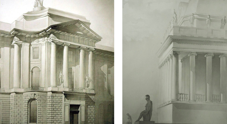
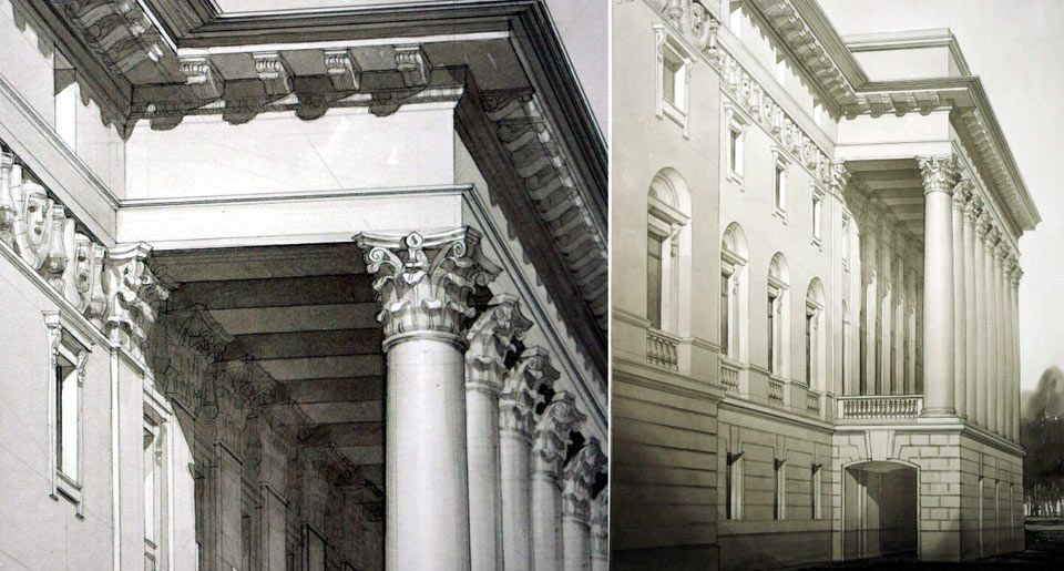
As an object for this lesson, I will depict an Ionic capital. This architectural style is known as the Ionic order, a classical architectural style that was created more than 2,500 years ago and is still in use today. This classical column capital has beautiful proportions and will be a great subject for a monochrome artwork. Here is the finished artwork picture I will achieve by the end of this video lesson.
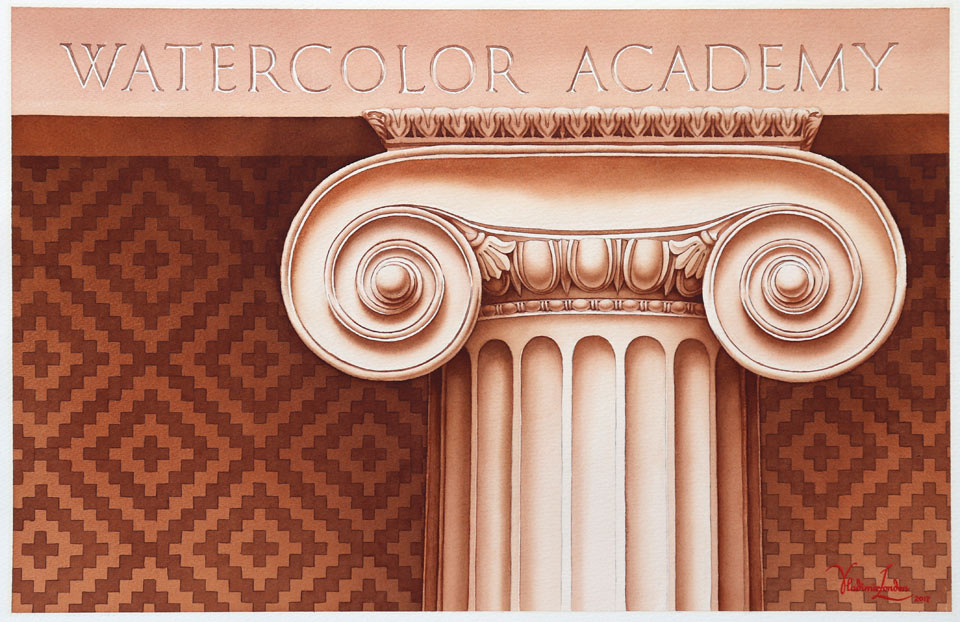
In one of the previous lessons of the watercolor course, I presented how to make an Ionic capital drawing and to transfer it from the tracing paper. Now I trace this tracing paper on top of the watercolor sheet, fix it with masking tape to one side of the board, and repeat every single outline with a pen in order to transfer the design.
If you feel that your drawing skills have to be improved, you can learn how to draw whatever you see or imagine in the Drawing Academy online course.
With the artwork composition fully transferred, I can remove the tracing paper. To make the task of washing-in-color easier, I will mask the 'Watercolor Academy' characters with a masking fluid. I put the plastic bottle inside the ceramic jar in order to make it more stable. I will use a ruling pen because it produces straight, thin lines and is much easier to clean than a brush. The only places that I will mask are the highlights of the 'Watercolor Academy' writing. For the next step, I require a saucer and the soft mop brush.
This will be a monochrome artwork, meaning that only one paint will be used for the entire painting. So, the choice of the color is quite important because you will use it right from the beginning to the very end. It is totally up to you as to which color you use for the artwork. You may test different paints on a separate piece of paper, before making a final decision. I will now paint the first wash in order to make the paper off-white. The brown pigment is diluted quite thinly. The first layer will be quite light. I have pre-mixed enough quantity of paint to cover the entire paper sheet. I am making the first layer wet-on-dry, applying the tint following all the rules of the plain wash. For this type of wash, the board must be tilted at around 15 degrees, for the paint to flow down on the surface of paper and collect into the bead at the bottom edge of the painted area. For every next brushstroke, I am loading an equal amount of paint onto the mop brush, and I make brushstrokes with a constant speed. I also keep the same time intervals between each brushstroke. Such consistency results in a constant bead amount, and its steady flow from stroke to stroke. This gives a very smooth layer of paint without any visible brushstrokes, nor borders between stripes.
I overlap about one third of the width of every previous brushstroke, which ensures that there are no unpainted gaps left between the stripes. As I am coming to the end of this sheet, I do not load any more paint onto the brush; instead, I squeeze out liquid paint from the brush into the saucer, to collect the remaining bead. With all the bead absorbed by a damp brush, I will now leave this wash to fully dry.
When watercolor paint dries, it will become lighter, so I have to account for it in every wash. The creative task that I have in mind is to make this artwork in multiple layers of paint. So, there will be several washes on top of each other. Every such wash I will make following the wet-on-dry technique. That is why the paper surface has to be totally dry before applying the following wash. If you do not follow this rule, the paint may run uncontrollably and it would be much more difficult to achieve a smooth wash with uniform tonal value. You may notice that I did not apply a masking fluid anywhere on the column capital. I am preserving the light tone of the capital by painting around it. You may see that I left two volutes unpainted; however, the columns' shaft is partly covered with the wash.
At the end of the wash, I will absorb the paint bead with a damp brush. To make this round mop brush damp, I accurately squeeze its belly with my fingers. When squeezing the hair, it is very important not to pull it, in order to prolong the brush life. After thoroughly drying the previous wash, I will make another one. You may wonder – why not paint the wall in full strength from the first attempt. Yes, it is perfectly possible to make any painting in alla prima. However, should you make a painting in multi-glazing layers, the end result will look different.
I would also like to show you how to gradually build tonal values layer-by-layer. Because this is monochrome artwork, we do not worry about colors here. The main question is to depict chiaroscuro. The "chiaroscuro" an Italian word meaning 'light and dark'. Although the word 'color' is actually included in the medium name 'watercolor', it is in fact secondary to chiaroscuro. This particular watercolor artwork is a great example for demonstrating this theory. It only has one color, and to be a recognizable illustration of a classic Ionic order capital, it does not matter what the color is. I could easily use a brown, red or blue color, and this Ionic capital will remain an Ionic capital as long as I depict chiaroscuro correctly. I will now make another wash on top of the previous layer that was thoroughly dried. With every next layer, the background tonal values become darker and darker. Painting in multiple glazing layers is a great way to keep full control over how values are developing.
I think I have reached the desired tonal value for the top part of the artwork, and I will start the next wash below this strip. I am now using a slightly smaller mop brush from Escoda, and despite its smaller size, this brush holds plenty of paint and therefore makes juicy brushstrokes. I have changed the brush because I will make a plain wash using a slightly different technique. Instead of applying wide horizontal brushstrokes, I am making shorter diagonal strokes at a roughly 45-degree angle. This technique is called the 'saw' wash, because the bead resembles the teeth of a saw. The saw wash technique is great for making both plain and gradated washes. I will now apply a gradated wash. I start the first brushstroke with a fairly dark tone. Then, I continue with the wash, applying diagonal brush strokes; and after making about one third of the wash, I add more clean water into the saucer to slightly lighten the tint. With this lighter tint, I paint another stripe of diagonal brushstrokes. Then, I add more clean water into the paint mix, give it a stir with the brush, and paint another stripe in a further slightly lighter tone.
I repeat the sequence of adding more water and applying new bands of diagonal brush strokes until I reach the end of the wash. I will do the same gradated wash on the right-hand side. I keep building tonal values layer-by-layer to achieve the tone I have in mind. If you wonder how many layers you need to create, it depends on how dark and transparent every layer is. There is one good rule that you have to keep in mind – a watercolor artwork has to be transparent. If you make so many layers that the white paper surface does not show through anymore, that would be too many.
Watercolor looks good as long as it is transparent. If the paint layer becomes opaque, the colors will become dull. This means that there is a limit as to how many glazing layers you may make, and it is better not to come too close to that limit. I have completed the plain and gradated washes for the background, and now I will take care of the capital. I would like to paint the capitals' volutes wet-into-wet, so I first apply clean water with a natural-hair flat brush from Escoda, accurately wetting only the areas that I would like to paint. Such application of water ensures well-defined borders between light and dark areas. I continue to use the same pigment because it is a monochrome artwork. The paint is applied with a round natural-hair brush which is springy and holds its shape very well. This is a great tool for painting with precision. You may see that the border between light and dark areas is sharp; however, the soft gradation of tone happens naturally on the wet paper surface. To further smooth-out this gradation, I am using a flat natural-hair paintbrush. After applying this first layer, I let the paper fully dry, because I would like to make this artwork in glazing layers.
When the paper is dry, I wet it once again to prepare for the next glazing layer, which I would like to make wet-into-wet. If you wonder why I am drying the paper and then wet it again, there is a good reason for this: if I apply paint on top of a painted area that is still wet, it will not be the glazing technique, and this method would then be the 'wet-into-wet alla prima' technique. However, my creative task is different. Since I am creating this artwork using multiple layers. That is why, every previous layer has to be dry before applying the next one. I will be repeating the same sequence of steps, first wetting the paper with clean water, then applying the paint wet-into-wet, smoothing out soft borders with a damp brush, and then drying this layer; when the paint is totally dry, I wet the paper surface once again with clean water. This sequence will be repeated as many times as I make glazing layers using the wet-into-wet technique.
For the background brickwork decoration, I will use a flat natural-hair brush from Escoda. Its width happens to be exactly the same size as a brick, which makes the very repetitive and rather boring work of painting bricks on the wall faster and easier. I paint the brick decoration wet-on-dry, filling in the pattern with precision. I will fast-forward this rather mechanical step so that you do not get bored watching me painting this brick-by-brick; it is a very time-consuming job, but the end result looks quite pleasing. With the background in place, I come back to the volutes to depict their three-dimensional geometry. Once again, I follow the wet-into-wet technique, so I apply the clean water first. For the job, I use a slightly smaller round brush, which will give me the precision that I desire.
The watercolor technique that I am demonstrating to you in this video lesson is a part of the curriculum at Russian universities and academies for architecture students. Despite all the modern technology and advances in three-dimensional software for computer-generated images, future architects in Russia have to develop good skills of rendering highly-realistic architectural artworks by hand, using watercolor paints or making such artworks in inks.
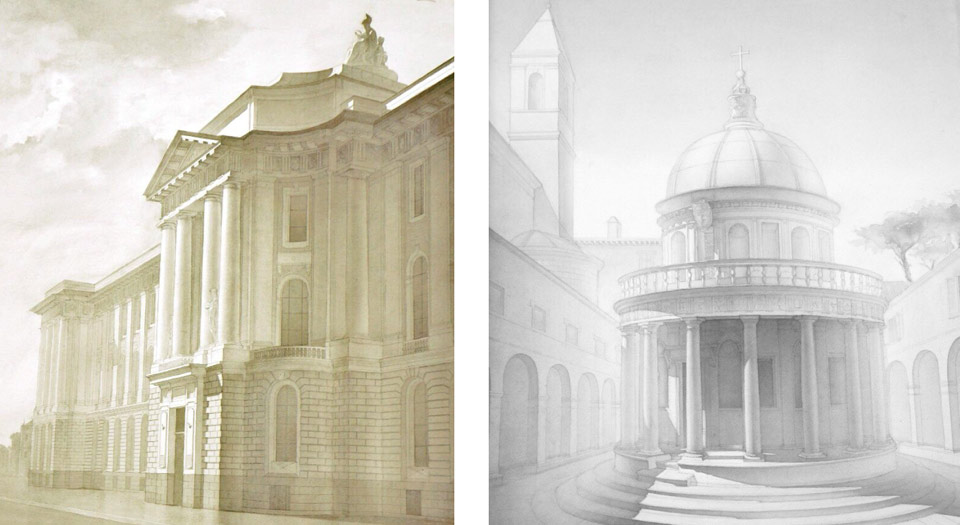
This is in addition to learning 3-D computer software. Rendering architectural plans by hand used to be the must-have skill for an architect in every country. However, not every university teaches these skills today. What I am demonstrating here is a good example of how to make a really slick and precise rendering of architectural details. It is not about how to express your feelings in bright colors, but how to portray a man-made object believably, so that it looks three-dimensional and realistic. This is a great skill to have, not only for an architect, but also for a watercolor artist. That is why this lesson is included in the Watercolor Academy course.
If your idea about painting in watercolor is that it is about how to use bright and vivid colors to express your feelings and create impressionistic artworks, do not worry – we will cover this part of watercolor painting as well. However, before we come to the video lessons which demonstrate how to use different colors to their full potential, we have to cover one important aspect of watercolor painting: how to depict objects in monochrome. You may be wondering: 'I am not an architect, and I have no plans to become one, so why do I need to paint in monochrome?' In response to that, this is not about architecture, and you are welcome to pick any other topic for a monochrome artwork. It could be a still-life, a landscape, a portrait, or anything you choose. It is about how to obtain different tonal values when using one or another pigment.
To make this task easier, only one pigment is used for the entire artwork, meaning that you do not have to think about different colors. When you understand how to obtain a wide range of tonal values using just one pigment, and then further improve your knowledge by developing strong practical skills through making monochrome artworks, it will be much easier for you to paint colorful chiaroscuro artworks using any pigments you like. Therefore, your paintings will have not only different colors, but also a wonderful gamut of tonal values. I hope that you now see the value in making pictures in one color: developing a knowledge of monochrome is important for growing your watercolor painting skills.
As a Watercolor Academy tutor, I often receive artworks for critique from art students. In many cases, I see one common mistake: that students do not pay any attention to chiaroscuro. An artwork may have beautiful, vibrant colors, but it looks unprofessional if tonal values are not present. In order to check if your artwork has sufficient chiaroscuro, you can do the following: if you squint your eyes so much that all of the colors almost disappear and you see in grayscale, would your artwork still look good? Or conversely, does it become a mess of gray splodges? Alternatively, you can use some photo-editing software to completely desaturate a photo of your paintings, and then assess how good it looks. I have seen many watercolor pictures by students in which a composition becomes totally unrecognizable after desaturation.
With this knowledge in mind, I hope that you pay more attention to developing good tonal values in your artworks when painting in multiple colors. As this lesson shows, the best way to practice painting in tones is by making monochrome pictures before advancing to multicolor compositions. I hope that painting an artwork with one pigment gives you enough motivation to test your chiaroscuro skills.
I am now depicting the flutes of the column shafts wet-into-wet. For this purpose, I moisten the flutes' area with clean water first, and then apply the pigment wet-into-wet. I will now make the egg-and-dart design between the volutes. This type of design is more than 2,000 years old. The history of art does not give us one precise answer as to what such designs symbolise, but in any case, it looks nice and well-balanced, and it has stood the test of time. The egg-and-dart design is still used as an architecture decoration today. To paint this element of the classical capital, I am using a smaller natural hair brush from Escoda.
Because an egg has an almost spherical shape, it will always have a gradation of different tones. The tonal values of a sphere can be divided into three big groups: 'light', 'mid tones' and 'dark values'. Each group can be subdivided further: for example, the 'light' group would have 'highlight', 'light' and 'local light' subcategories. The mid tones can be divided into 'light half-tone', 'middle half-tone' and 'dark half-tone'; and in turn, 'dark values' contain 'core shadow', 'form shadow' and 'accent'.
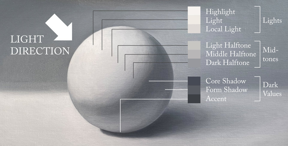
Such division is not set in stone; different art schools may use a different number of tonal values and their own names. Nevertheless, if you understand the reason behind this terminology and what those tonal values represent, you would be able to depict tonal values of any three-dimensional object in a realistic manner. Every single part of this artwork has one or another tonal value, and it is not about how light or dark a value should be, but very much about the balance between them. Therefore, all tonal values of an artwork have to be evaluated and compared to each other. For example, the value of the brick wall is gradated; at the top it is darker than at the bottom, and next to the column, it is darker than on the left-hand side.
To make this artwork look believable, I have to not only pick the right value for the wall, but also the correct difference between tonal values. The theory of tonal values and how to render them proficiently is fully explained in the Drawing Academy online video course. The decoration design at the top of the capital is quite intricate. I will use a small well-pointed brush to depict its details. Because I am making a highly detailed artwork, there is no shortcut as to how to make it fast; I have to simply invest time in making it bit by bit. The beauty of working in glazing layers is that I can come back to the parts of an artwork that have been painted previously and are already dry in order to further develop their tonal values. As other parts of an artwork become darker, I have to work on the areas that are left behind, in order to maintain the balance of tonal values.
This is what makes the multilayer technique so suitable for the gradual development of the chiaroscuro – I do not have the pressure of guessing and making the correct tonal value of any part of this artwork from the first attempt. Instead, I can build tones step by step, layer by layer; and because I am painting with only one pigment, this makes the job much easier. In the Watercolor Academy, you will see multiple video lessons on both alla prima and multilayer painting techniques. There is no one technique which is better than others – they are all just simply different to each other. One artist may prefer painting in alla prima, whilst another achieves great results by painting in multiple layers.
The choice of the technique depends on the personal preferences and the creative task an artist has in mind. For fast sketches, and impressionistic artworks, alla prima would be the technique of choice. However, for artworks such as this one, the multilayer technique is more suitable. I keep working on the tonal values of the column flutes in order to make the shaft more cylindrical. You can see that I apply the pigment with a round brush and then diffuse the paint border with a soft flat brush. In such technique, every layer has to be dry before applying the next one. To keep the tonal balance in place, I think that the top band needs to be a bit darker. So, I will do one more wash with a light tint in order to tone down this area. To make it appear a bit more interesting, I will make a gradated wash, making a soft gradient from darker to lighter tones as I paint from top to bottom. After each stripe of paint, I add more clean water to the saucer, stir the mix and apply another band in a slightly lighter tone. This gives more contrast between the tone of the band, and the white characters which have been protected with masking fluid. This is the only place in the entire artwork that has been protected with masking. After this paint layer is fully dry, I can remove the masking film to reveal the writing. A piece of masking tape can be handy for this task. As the final step of this artwork, I paint the shadow areas of each letter. This job requires precision, so I undertake this task with a round brush...
A self-study, self-paced course where you can learn how to paint in watercolor by watching video lessons and doing assignments
One-time payment - Lifetime membership
$297 USD
One-to-one, unlimited and custom-tailored to your skills and needs Personal Tutoring by the Watercolor Academy teachers
One-time payment - Lifetime membership
$997 USD


