Watercolor Academy Online Course
A self-study, self-paced course where you can learn how to paint in watercolor by watching video lessons and doing assignments
$297 USD
ENROLL NOWA self-study, self-paced course where you can learn how to paint in watercolor by watching video lessons and doing assignments
$297 USD
ENROLL NOWOne-to-one, unlimited and custom-tailored to your skills and needs Personal Tutoring by the Watercolor Academy teachers
$997 USD
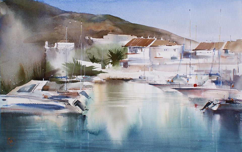
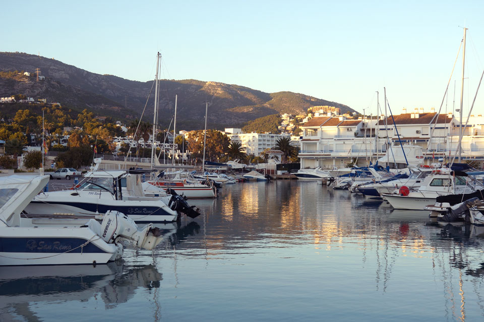
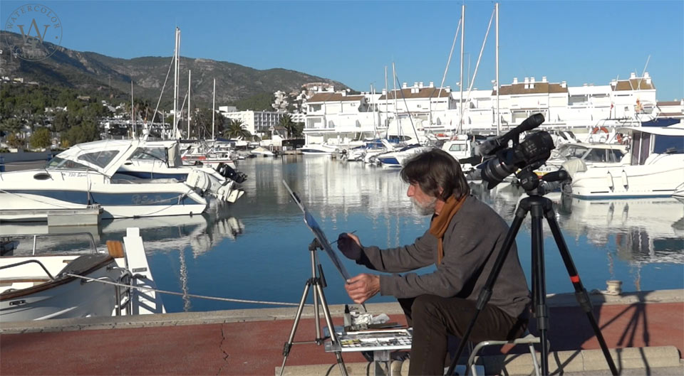
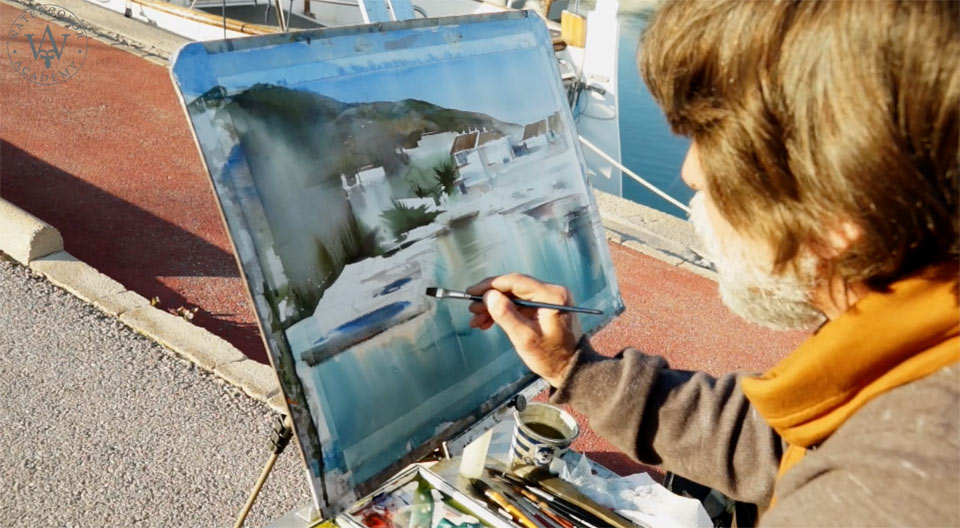
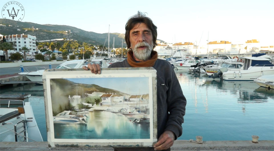
ENROLL NOWBy Ilya Ibryaev It is late afternoon – we have a sunny and cloudless day, with a lot of sunshine, and a beautiful marina with white boats, calm water, interesting reflections, white buildings in the background, and green hills. I will depict all of this in an impressionistic artwork today. Let's begin. Here is the watercolour I will achieve by the end of today's painting session.
I begin this artwork with a very rough sketch in graphite pencil, done directly on watercolour paper. Pure Ultramarine paint is applied in wide brushstrokes, using a round mop brush. I produce this wash on dry paper, which is fixed with masking tape to a vertically positioned board. I add into the mix, a little bit of yellow ochre light, to warm up the lower half of the sky.
A slightly darker mix of the same two pigments is used for the hills, since yellow ochre and Ultramarine produce a greenish color once mixed. The hills are not too far away, and therefore their color is quite saturated. Making the hills a bit darker produces a light-dark contrast between the sky and hills. The board is positioned almost vertically, which makes it even more important to have just enough water loaded on the brush, so that a juicy wash can be made without paint running down. What makes impressionistic washes beautiful is the juxtaposition of various colors next to each other. You can see blue, green, yellow, orange colors, which all work together to give an impression of the far away hills.
I am adding paints wet-into-wet, keeping an eye on both tonal values and colors. After using a big round brush, I am now using a smaller one, which holds less water, allowing me to paint on the vertical board. Also, with a flat wide brush, I can unite different areas of the hill while still having contrail over small details. The mix of Ultramarine with Cadmium orange can produce a wide gradation from cold to warm colors; this depends on how much of each pigment is added into this mix. I am using blue color for the hills for two reasons: first, it is better to make a green color by mixing blue and yellow pigments. Secondly, these hills are in the background; therefore, their color is affected by air, which gives blue shade to the faraway objects.
I can rotate the board at various angles for the paint to flow in different directions, and intermix softly under gravity, without me touching it with the brush. Water and gravity give some degree of unpredictability here. This is what makes the painting process interesting, and very different from other media, such as oil, acrylic, or body-color. I am trying to keep this artwork very impressionistic without well-defined details, and concentrate on tonal values and colors, rather than on the photo-realistic outlines of objects. The greenery is painted with free and loose brushstrokes. I am more interested in how dark and saturated these areas of an artwork are, than precise shapes of the palm trees. Once again, it is better to obtain green by mixing blue and yellow colors, than to use paint directly from the tube. The combination of blue and yellow looks better than pure green, and also gives a wider range of color temperature.
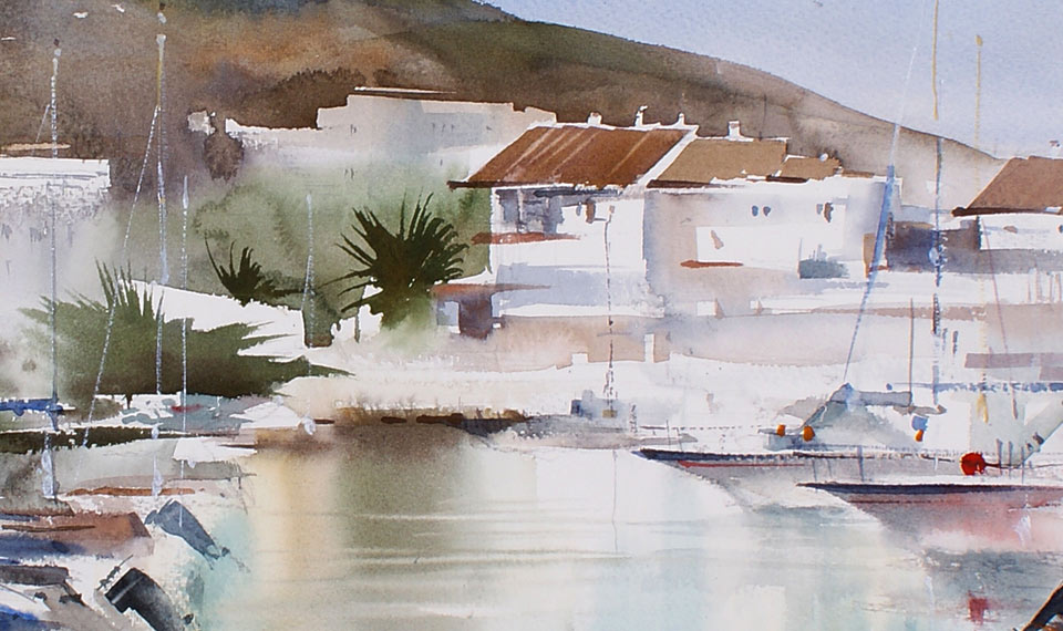
I am painting the terracotta roofs of buildings with a mixture of Ultramarine, yellow ochre and Cadmium orange. The cold shadows of white buildings are blueish; I am using Ultramarine and a bit of orange for this color. For the warmer, reflected light, a bit of Cadmium orange is added. A small, flat, synthetic brush holds very little water, making it ideal for rectangular brushstrokes that can be applied with high precision. This is exactly what I need for painting these buildings. The palm tree in the middle of this artwork is in shadow; this dark spot will be one of the key points of this composition.
It is time to paint the middle ground. I prepare a warm color from Cadmium orange, yellow ochre light and Cadmium yellow. This mix is used for painting the light reflected in the water; I apply it with a flat white brush, using vertical brush strokes. I then mix turquoise blue and Ultramarine together, and add a little bit of Veridian to the mix, creating a blue color with a greenish shade. This is also applied with a flat brush, with vertical upward brush strokes. The tone of this new blue-greenish shade is quite light; I produce a darker color, by adding more Ultramarine pigment and a bit of Veridian green. The brush is loaded with more pigment, but less water. I continue painting with vertical brushstrokes, and then spray paper with an atomizer.
With the first wash in place, I can now deepen up the color, mixing Ultramarine, dark green and Cadmium orange. This dark blue-green mix is painted wet-into-wet. The brush is loaded with very little water, but enough pigment; this helps to avoid the paint running down uncontrollably. Into the mix of dark blue-green paint, I also add a little bit of Cobalt turquoise light.
Painting in watercolour goes from light to dark tones, so it's time to deepen up the value of the seawater. I achieve this by adding more Ultramarine, Cadmium orange and dark green into the previous mix. The reason I apply paint with vertical brushstrokes is to preserve the white reflection of the boats. With enough paint on the paper, I can now rotate the board upside down, and at various angles, for gravity to do its job, and mix this wash in softer gradations of colors and tones.
The palm tree in the middle is also reflected in the water. The color of this reflection consists of Ultramarine, Cadmium orange and dark green. Because this reflection is painted wet-on-dry, I soften up its borders, applying brushstrokes with clean water. To warm up this reflection, I also add a little bit of Cadmium orange into the previous mix. To make it even lighter and warmer, Cadmium yellow can be used here as well. Turning the board upside down changes the paint flow direction. Reflections in water of white yacht masts are done by wiping off paint with a small flat synthetic brush. It is easy to do while the paint is still wet. It is a beautiful sunny day, and I am really enjoying painting outdoors.
It is time to take care of the yachts. For this task, I am using a flat synthetic brush, and I apply paint with confident brushstrokes. The brushstrokes are spreading out in some places, which is good because I don't want to have hard borders here. The creative task I have in mind is to make an impressionistic watercolour artwork, which by its name, creates an impression of this place, and not a photo-realistic screenshot of the scenery. That is why colors and tonal values are more important to me than sharply-defined details. It doesn't mean, however, that I totally ignore all of the small details. They are an important and integral part of this artwork – a combination of big washes and small details makes any artwork interesting to look at...
A self-study, self-paced course where you can learn how to paint in watercolor by watching video lessons and doing assignments
One-time payment - Lifetime membership
$297 USD
One-to-one, unlimited and custom-tailored to your skills and needs Personal Tutoring by the Watercolor Academy teachers
One-time payment - Lifetime membership
$997 USD


