Watercolor Academy Online Course
A self-study, self-paced course where you can learn how to paint in watercolor by watching video lessons and doing assignments
$297 USD
ENROLL NOWA self-study, self-paced course where you can learn how to paint in watercolor by watching video lessons and doing assignments
$297 USD
ENROLL NOWOne-to-one, unlimited and custom-tailored to your skills and needs Personal Tutoring by the Watercolor Academy teachers
$997 USD
ENROLL NOWVideo lesson by Vladimir London
In this video lesson, you will discover how to paint in watercolor using a very limited palette of only three colors.
Here is the finished artwork I will achieve by the end of this video. It is done in only three colors: yellow, red, and blue.
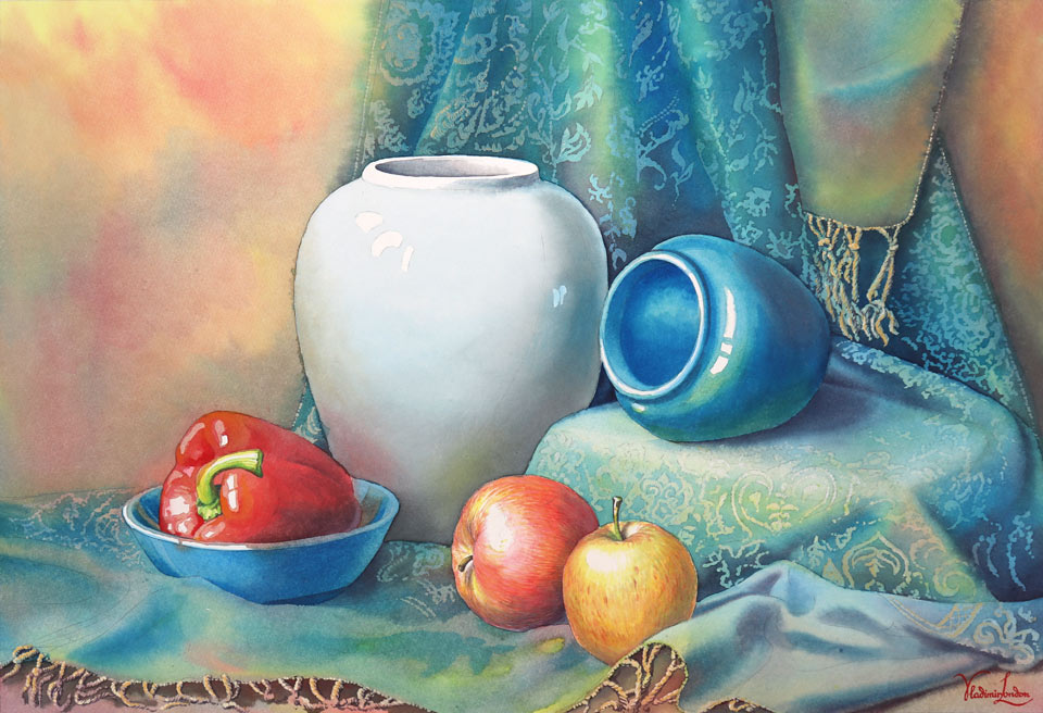
To begin with, I have to decide on the still-life composition. It will be a very simple still life with some fruits and vegetables, a bowl, and a drapery. After deciding on the still-life composition, you can make a linear drawing, or cartoon, in the actual size of the watercolor artwork, then transfer the design from the cartoon to the tracing paper, and finally from the tracing paper to the watercolor sheet. The process of how to transfer drawings is fully explained in the dedicated Watercolor Academy video lesson. The whole watercolor artwork will be done in only three colors. First I have to decide which colors to use. I will go for the primary colors—yellow, red, and blue—so the decision is only which pigments to choose. For yellow, I was considering Winsor & Newton Aureolin. However, it did not perform well in my lightfastness test. So I will use the Winsor Yellow paint instead. The other two paints are Winsor Red and Winsor Blue Green Shade. All these paints are permanent.
Just to make sure I am making the right choice, I would like to see how these three pigments mix and look together with each other. Winsor Yellow is a semitransparent, one-pigment paint made with PY154 yellow pigment. It has a warm yellow color and is highly staining. The Winsor Red paint is also staining. It is semitransparent and permanent and also contains only one pigment: PR254. The Winsor Blue Green Shade paint is made of the highly staining Phthalo Blue colorant PB15. It is transparent and permanent. Together, these three primary pigments will give a wide range of secondary and tertiary colors. Also, mixed together, they will produce a neutral gray as well as chromatic grays. Before beginning the artwork, I premixed these three colors to make a variegated wash with a soft natural-hair brush from Escoda.
This mop brush takes a lot of paint and releases it nicely on the painting surface. I load the full brush with yellow paint and start from the top left corner, applying paint in loose brushstrokes on the dry surface of paper. I add a little bit of red paint into the yellow area, slightly intermixing these two colors on the paper surface. Red and yellow pigments are added next to each other randomly without any order. Their borders are intermixed, and paint flows from one place to another. I also add a blue pigment in the place where the drapery is. This pigment is a mixed with yellow directly on paper, giving a greenish color.
I am painting precisely around the neck of the big vase, preserving its light color. I am planning to do the variegated wash on the left-hand side and do another wash on the right-hand side later. However, I don't want a strong border between these two washes. That is why I wet the paper with clean water where the border between two washes will be, and then diffuse the border with a soft, flat brush. Now, I can continue the variegated wash on the left-hand side. I have to do it promptly before the bead dries out. I am adding red and yellow pigments next to each other and also introducing blue paint into the mix. I would like to achieve the low contrast between light and dark areas and have different hues in this wash. I am painting wet-on-dry, mixing three pigments directly on the paper surface. As you can see, yellow, red, and blue paints are still bright in the saucer because I am not using it for mixing pigments, only for loading the brush with paint. Although I am randomly applying colorful spots on paper, I pay close attention to how much of each pigment I am loading on the brush. I would like the left-hand side to be warm in color. That is why I am using more yellow and red pigments than blue. Also, I would like the left-hand side to be lighter at the top and darker at the bottom, and that is why I am using different proportions of paints, adding more blue pigment to the red and yellow mix at the bottom. Such combination gives a brownish gray, which is darker in tone and less saturated.
The bright red pepper lies in the bowl on the left-hand side. I take the pure red pigment and paint this pepper wet-on-dry. However, the background is still wet. That is why the pepper's border is not hard but diffused. This is great because it's exactly what I would like to have in this still life: that combination of sharp and soft borders. For example, there is a soft border between the drapery and the backdrop and a soft outline for the pepper, while the outline of the big vase is well defined. So far, I don't want to use any masking fluid, and you can see that I am preserving white paper by painting around the highlights on the red pepper skin and also precisely going along the bowl's edge. I'll introduce dark blue pigment next to the red to depict the shadow area of the pepper.
I can't spend too much time painting the pepper because I have to keep going with the gradated wash, or at least add more paint to its bead to keep it wet. While the bead is juicy, I can spend a couple of minutes painting the blue bowl. The choice of the pigment is quite obvious. I only have one blue paint. This is the beauty of painting in a limited range of colors. I'm more free to concentrate on tonal values, light and dark contrast, temperature contrast, hues, and saturation of three pigments instead of spending my time deciding which paint I should use and which colors I can achieve by mixing different pigments. Although the color palette is limited to only three colors, there is so much I can get out of these three pigments. As the conventional color theory goes, by mixing three primary colors—yellow, red, and blue—I can get three secondary colors: orange, violet, and green. By mixing the neighboring primary and secondary colors, I can also get yellow orange, red orange, red violet, blue violet, blue green, and yellow green colors.
Three primary, three secondary, and six tertiary colors already give us a nice range of 12 colors. However, because I am mixing not only neighboring primary and secondary colors but also the colors from the opposite sides of the color wheel, I can achieve a great variety of chromatic grays like gray orange, gray brown, gray blue, and so on—not to mention the neutral gray. Of course, these are just colors, and every color can have indefinite range of tints, which are light tones of paint when it is diluted with water. By now, the wash on the left-hand side is dry, and I will wet the border between it and the next wash with a soft, flat brush. When watercolor paint dries, it becomes lighter, especially when it is applied in juicy washes. This happens because pigments sink into the paper fibers and the white paper surface shows through the paint layer. When painting in watercolor, you have to account for such color shift. I will now continue the variegated wash on the right-hand side. I mixed more paint in the saucer, which will hopefully last for the entire wash. To make the seamless border between the washes, I started painting wet on wet, and will now continue doing the variegated wash, wet on dry. I am making a wash for the blue-green drapery on the background. That is why this time I am loading more blue and yellow pigments on the brush and keeping the red pigment to the minimum.
Although it is possible to paint this still life alla prima, which is in one attempt, I have a different creative task in mind. I would like to show you how to paint such a still life in multiple layers. The layer I'm doing now is called an underpainting. It is painted very freely, without any precision and attention to the borders within the wash. However, I am keeping well-defined borders for the unpainted objects, which I will do later; for example, the big vase in the middle. The only places I am very precise within the wash are the highlights, which I carefully paint around, leaving the white paper untouched. Of course, I could easily apply a masking fluid to preserve such highlights, but I would rather do it freehand without masking so the borders will look much more natural and pleasing. I will now continue the greenish-blue drapery, depicting it with a variegated wash, mainly applying yellow and blue pigments. The drapery ends at the right hand side where we can see the wooden backdrop. That is why I added red pigment here and also a touch of blue to suggest the shadow cast by the drapery. I have to pay attention to the bead of the wash and not let it dry. If it dries out, I will not be able to continue the seamless wash without visible borders between layers. Watercolor is a fast-drying medium, so I have to work quickly but without rushing. As one artist put it, when painting in watercolor, one has to be in the state of cheerful calmness. I think that is exactly what I feel right now: confidence and calmness.
Here is another very good tip for you: whatever object you are painting—for example, a blue vase—always find other colors than blue. You can see that the small vase, which is lying on its side in the middle, is not just blue. It is also has yellow on its shoulder and red on the body. By looking at the blue vase, a beginner artist might not see any other colors but blue. However, this is not the case in real life. It is not isolated, and its color will always be influenced by other objects around that have different colors and therefore reflect light differently. That is why an artist has to learn to see different colors that are not obvious to an untrained eye. You are welcome to exaggerate such colors rather than ignore them. For example, the wooden backdrop in this still life is painted in different colors despite its intrinsic color is quite simple and plain. The same can be said of the drapery; it would be too boring in just one color.
The limited palette of just three pigments removes a lot of guesswork about which colors to use. You only have three pigments. The creative task for this lesson is to get the maximum such a limited palette of colors can provide. A professional artist will be able to do a very colorful artwork by using just three pigments, and it will look like a painting that has been done with 20 or 30 different paints. However, if an artist doesn't know how to use pigments proficiently, 30 or more watercolor paints would not necessarily make an artwork beautiful. It is not about how many paints an artist has in the paint box. It is about the skill of using colors to their full potential. That is why making an artwork using just yellow, red, and blue primary colors is a great exercise. It will develop good painting skills based on the deep knowledge of color theory and good understanding of how to mix different pigments to achieve a wide variety of hues, saturations, shades, tints, and tones. I am about to complete the first variegated wash, which will serve as the underpainting. I hope by now you have a good idea of how to make variegated washes, why they have to come in different colors, and why they are done with little attention to the borders within them. After finishing this wash, I will let it dry thoroughly.
When the first layer is fully dry, I can now apply the masking fluid to protect the embroidered design on the drapery. For this purpose, I will use a cheap synthetic round brush, wetting it with liquid soap, drying it a bit, and then dipping into the masking fluid. Drawing the embroidery design is a rather mechanical task, and I will fast-forward to the step where unmasking is done. With the first layer of the underpainting in place, it's time to develop the tonal values of the drapery. To give it a soft border on the left-hand side, I am wetting the paper surface with clean water. The drapery has a greenish-blue color, so the main two pigments I will be using are blue and yellow. The drapery's decoration pattern is elaborate. It would be very time-consuming to paint around it, so this is one of those cases where masking is appropriate. When applying the blue pigment, I must take into account how much lighter it will become when the paint is dry. It is not exact science, so a little bit of guessing is required.
As you remember, the first variegated wash was done wet on dry. However, this time is different. To achieve softer gradations of colors and tones, I would like to do it wet into wet. That is why I first moisten the paper surface with a flat brush to prepare it for the next coat of paint and then apply the pigment wet into wet. There is a reason why this layer has to be done on a wet surface. The lightest tone of the drapery is already in place. It cannot be lighter than the tone of the previous layer. So, in the light areas, I have to leave the underpainting untouched and only work on the mid-tones and shadows. At the same time, I would like to achieve soft gradations between light and dark areas to illustrate the curly geometry of the drapery's folds. To make such soft gradations between the dark shadows and light areas where no more pigment should be added, I need to have a wet paper surface. That is why the second variegated wash is painted wet on wet.
I am using a smaller, natural-hair brush from Escoda because this time I do not need a lot of paint for every brushstroke. Even though the drapery has a greenish-blue color, I add all three pigments into it, including red. This comes back to the fact that even single-color objects will have shades in various colors. Differently colored light will be bouncing off other objects around them, influencing the overall color appearance. Also, should you closely observe objects in life, you will notice that the colors of light areas are different from the colors of shadows, and such difference is not only about hues but also about the temperature contrast. The warm and cold contrast depends on the quality of light and the environment an object is placed in. For example, when painting landscapes or an outdoor theme, you should take the kind of light into account. Is bright sunshine filling all objects with warm light? Or maybe it's a cloudy day with silver-gray cold light. Indoors, the situation will also depend on the source of light. If a cold blue light, which is filtered by the blue sky, comes through the window, it will be very different in temperature to the warm color of the artificial light. How will this influence the temperature contrast between light areas and shadows of an object? If an object is lit by a warm sunshine, for example, then the colors of its light areas will be warmer. At the same time, in shadows there will be no direct sunshine reaching an object's surface. Such areas will be colored by the light bouncing from other objects, so the color of such light will depend on the colors of those object. For example, if the shadow area reflects the blue sky, its color will be cold. However, a red or orange object will reflect warm light, affecting the colors of other nearby objects. Of course, such nuances could be quite subtle, but as an artist, you have to learn to see them. Even though you might not notice such temperature difference at the beginning, you can paint what you know rather than what you see. With time, you will begin seeing such warm and cold contrasts within one object colored in one hue. There are always warmer and colder areas of the same object. You just have to learn to notice them. This is especially important when painting white or black objects. They are achromatic, but that doesn't mean they will not have any colors apart from shades of neutral gray. In fact, such white and black objects will be multicolored in different hues depending on the environment and the light. Such hues will be muted and desaturated but nevertheless colorful. So, when it comes to painting black objects, I would strongly advise you not to use black pigment, although it might be available in your paint box. There are no black objects in this still life, but take my word for it. Such an object will look much better when painted in different chromatic grays, which can be obtained by mixing complementary colors. However, there is a big, light vase in the middle of this still life, and I will paint its white color in three pigments: yellow, red, and blue. I will talk more on this topic when we come to this vase. The drapery is coming along nicely. Sculpting its three-dimensional folds is a quite straightforward process. I do it wet into wet, first moistening the paper surface and then adding more pigments into the wet area. The soft borders of the brushstrokes create the illusion of tonal value gradations.
I am using all three pigments—yellow, red, and blue—to depict this blue-green drapery. The choice of Winsor Yellow, Winsor Red, and Winsor Blue Green Shade works well for the purpose of this still life. These pigments are very close to the primary yellow, red, and blue, which gives great flexibility in achieving different secondary and tertiary colors. Chromatic grays look nice, and it is also easy to obtain a neutral gray. All three pigments are quite transparent, which makes them very suitable for a multilayered painting technique. So, I am quite pleased with the choice of three pigments. However, there is one main drawback. All three paints are highly staining, which means the colorants of these pigments grip the paper fibers very strongly. This would be great if you want to dye some fabric. However, such staining pigments can be extra-challenging for beginners. It is very difficult, if not impossible, to wipe out or wash out staining paints. That is why they are very unforgiving. If you make a mistake and try to correct it by removing wet paint from the paper surface, you will find Winsor Yellow, Winsor Red, and Winsor Blue Green Shade are not removable. Their colorants are not sitting on top of the paper surface. They go deep into the paper fibers. That is why even wet paint is very difficult to wipe out. When these paints dry, it becomes impossible to remove them without damaging the paper surface. If you're not confident in your watercolor painting skills, you might decide to go for other pigments that are easier to manage if anything goes wrong.
Because watercolor paints are so widely available, some beginner artists may think using this medium is as easy as simply mixing it with water and applying it to paper; and because painting watercolor is practiced in grade school, it is a junior craft. Painters in oil and acrylic might even look on it as something inferior and less advanced. Such perception is far from reality. Watercolor is not the easiest medium to master, and true skill plays a vital role here. The second layer is complete, and I am now removing the masking film from the paper. Masking with a liquid results in harsh, strong borders which seldom look good in watercolor. To soften up the contrast of the embroidered design on this drapery, I will give another wash over the entire drapery surface with a light tint. I will do this wash wet on dry with a soft mop brush from Escoda. Almost the entire wash will be done in one light blue tint. This is a mechanical rather than artistic task because the main purpose of this wash is to tone down the light lines of the decoration and to unite the area of the drapery into one object. This tint is rather light and does not have much effect on the light areas of the drapery. Also, because the Winsor Blue Green Shade paint is transparent, the design that was done previously will show through.
Transparency is one of the main characteristics of watercolor. That makes it very different from oil or acrylic. In a way, painting in oils or acrylics are simpler techniques. Paint dries more slowly, giving you time to think. Lighter tints can be applied at any time on any area of an artwork. Mistakes can be fixed by repainting with opaque layers or scraping them out. It is possible to rework the same artwork indefinitely. None of these luxuries is available in watercolor. It is a tough and unforgiving medium. Because every layer of paint is visible, the artist's skill plays the most important part in painting. In watercolor, it is impossible to fix errors by painting over some not-quite-right areas. Every mistake will show through. Sometimes it is easier to start an artwork all over again than to try fixing something that went wrong. So, if you have chosen watercolor because it is simple and easy to use, you will be surprised how much you will need to learn in order to achieve creative success in this medium. At the same time, the learning curve of painting in watercolor can be much faster than painting in oils, for example. This is because watercolor is a fast-drying medium. You don't have to wait for days for paint to dry. It might take you several weeks or even months to make just one painting in oil. In the same time, it is possible to make hundreds of watercolor artworks. With the drapery complete, I turn the board upside down and mix a dark shade by adding blue paint into red. This time, I do it in the saucer, not on the paper, because I would like to prepare a certain color for the background. To give this layer a soft border, I will first wet the paper surface with clean water using a flat, natural-hair brush from Escoda. Then I can add the mix of paint, wet into wet, making the tone of the background darker. I have mixed a warm gray color that will not only tone down the background but also slightly reduce the saturation of this area to suggest the aerial perspective in this still life. I will now take care of the blue vase that is lying on its side. Because the intrinsic color of this vase is blue, I will mainly use the blue pigment to work out the tonal values of this vase. There are several watercolor painting techniques that can be used for this purpose. There is no right or wrong technique, and the choice will depend on the personal preferences and the creative tasks you have in mind.
The fastest way to paint an object would be alla prima. This way, a piece is done in one attempt while the watercolor paint is wet. But painting in multiple layers can also give interesting results. This way, an artist has more control on how tonal values are developing, and therefore it is easier to avoid mistakes, which is especially important when painting with staining pigments. For the purpose of this visual lesson, I decided to demonstrate how to paint in multiple layers. This approach takes a bit longer than alla prima because every paint layer has to dry before applying the next one. However, because watercolor paint dries fast, it's not a big issue here. Also, to speed up the drying time, you can use a hairdryer. Every new glazing layer is added on top of the previous one when the paper is fully dry. Tonal values are built up layer by layer, which gives you greater control over the painting process.
The wooden backdrop reflects warm light. I wet the body of the vase first and then apply red pigment, wet into wet, on top of the blue color. Such reflected light creates a more realistic shadow on the vase. The reflected light bouncing from the drapery gives a yellow spot on the vase's body, which contrasts with the blue color of the vase's shoulder. The same theory of reflected lights has to be illustrated when painting the blue bowl. There are red spots on this bowl that are mirroring the color of the red pepper. You may or may not see such reflections in real life. Nevertheless, it would be better for your watercolor artwork if you paint what you know rather than copy what you see. If you know the glossy surface of a bowl reflects colors of the objects nearby, the watercolor artwork will only become better if you do it regardless of how much such reflection is visible in real life. As an artist, you have creative license to make your own reality and convince a viewer that your vision and story are correct.
There is an interesting theory that people do not see things they have no knowledge about. I will give you just one example to illustrate it. Aerial perspective is a scientific fact that we perceive objects that are farther away from us as being lighter in tones, less saturated in colors, and colder in temperature. Such faraway objects are smaller in size, have less-defined details, and are weaker in contrast compared to the objects that are in the foreground. Aerial perspective comes from the fact that we see the world around us through the filter of air, which is blue in color because the atmosphere has tiny drops of water. To make a realistic watercolor artwork, you have to depict aerial perspective. However, you won't see this perspective in real life because a still life is very shallow in depth. That is why, as an artist, you can create what you know but not what you see, applying the rules of aerial perspective in your still life painting. A person who doesn't know about aerial perspective will not realize it is present in your artwork. However, such a spectator will perceive your painting as more realistic.
Now I will paint the white, big vase. I do it wet into wet by applying a neutral gray that is obtained by mixing three primary colors: yellow, red, and blue. Such neutral gray underpainting has only one purpose: to indicate where the mid-tones and shadows are. It holds no chromatic information.
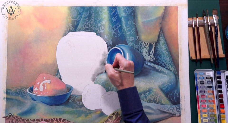
The alternative way of painting this vase would be applying three pigments separately without mixing them in the saucer, but instead intermixing three colors on the paper surface. Because I already demonstrated several times in this video lesson how to do the variegated wash, I decided to show you how to paint in monochrome just to make this lesson more diverse and educational. The gradated wash I'm doing now, wet into wet, differs from the variegated wash because only one paint mix is involved. It is a very simple way to describe tonal values because there is no need to worry about colors, only about tones. After this layer, I will add a glaze on top, but the underpainting has to be thoroughly dry to do so. On top of the neutral gray underpainting, I am now adding a wash with light chromatic gray, which has a yellow undertone. This will make light areas of this vase a bit warmer in color. The purpose of this layer is to suggest warm light and make the vase body off-white. I am painting this layer wet on dry using a soft mop brush from Escoda. While the paint is wet, I will add a blue reflection on the shoulder of this vase, painting it wet into wet. The blue area is the part of the form shadow, which is the place where the reflected light hits the object. This form shadow is slightly lighter than the core shadow. The core shadow is the area with the least light falling on the object.
Now I will add red pigment, wet into wet, to depict the reflected light bouncing from the red pepper. The yellow-orange light is bouncing from the apple. I also add it wet on wet. And finally, the bright blue reflected light comes from the blue vase. There are two apples in the foreground. I will make one apple red and the other more yellow. Because these apples are closer to the viewer than other objects of this still life, I will do them in a different way than the rest of the artwork, using the retouching watercolor painting technique.
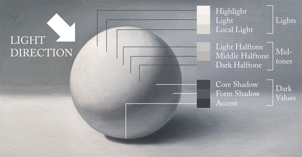
In several Watercolor Academy Video Lessons, you've already seen how to paint an apple in various painting techniques. So, by now, you should already have a good understanding of what watercolor techniques can be used to depict an object. To remind you, the retouching technique is the way of painting with thousands of tiny brushstrokes, applying them wet on dry in multiple layers. Conventionally, watercolor painting begins with light tonal values—in our case, the yellow pigment—and then gradually progresses from light to dark tonal values. Because an apple has a spherical shape, it will always have light and dark tones. Such tonal values can be divided into three main groups: light, mid-tones, and dark values. Each group can be further subdivided. For example, light might have highlight, light, and local light. In turn, the mid-tones will have light halftone, middle halftone, and dark halftone. And finally, dark values can be divided into core shadow, form shadow, and the darkest, accent.
Although I am painting in color, applying yellow and red pigments, the color is actually less important than tonal values. For example, an apple could be in any color you like: yellow, red, green, orange, or anything between. Some particular color will not make it an apple. It will become a recognizable object only if its tonal values are correct. That is why paying attention to chiaroscuro is very important in watercolor painting. Painting with the retouching technique is a very slow process but is a very good way to achieve an interesting texture. This is exactly what I would like to do for the apple skin. Different painting technique will make this apple look different from other objects. It will stand out from the rest, and because it is in the foreground, it will also create an illusion of aerial perspective. The highly detailed skin texture will visually bring this apple closer to us, and when it comes to the small details, there is one technique that is more suited than others: the retouching watercolor painting technique. It doesn't mean, however, every time you depict an apple you should use retouching. The choice of a painting technique should depend not on the object but on your creative task. In this case, two brightly colored apples are the focal point of this composition. That is why I am using this painting technique: to attract attention of a viewer to this area.
There are several advantages of the retouching technique. First of all, this is a technique of choice for well-detailed illustrations and watercolor artworks that are done on a small scale. By painting with a small round brush, it is easy to create small details. Because retouching is done with hundreds and hundreds of tiny brushstrokes, tonal values and saturations of colors are built gradually, stroke by stroke. With such an approach, it is very easy to be in full control of how hues and values are developing. Multiple separate brushstrokes give texture, so the retouching painting technique is a great way to depict various textures. There are some watercolor artists who make highly detailed illustrations using the retouching technique. Their artworks have certain instantly recognizable styles that make them truly unique. Although retouching has many advantages, it comes with one main drawback. Above all, it is a very time-consuming way to paint in watercolor. The small apple I am painting right now will require several thousand brushstrokes. This is probably as many as I did for the entire drapery.
You may find that not every yellow and blue paint, when mixed together, produce nice-looking greens. This is because not every paint has pure color. For example, yellow paint might have red undertone. Combination of yellow and red gives orange, and orange is located opposite to blue on the color wheel. Mixing two complementary colors will result in gray. So instead of getting some nice bright green, you might achieve a dull and grayish green. The same goes for the impure blue color, which might have some red or green shade. For example, the blue pigment I am using in this artwork, Winsor Blue Green Shade, will affect the mixed green appearance. This is not necessarily a bad thing, because mixed greens look more natural and organic.
A self-study, self-paced course where you can learn how to paint in watercolor by watching video lessons and doing assignments
One-time payment - Lifetime membership
$297 USD
One-to-one, unlimited and custom-tailored to your skills and needs Personal Tutoring by the Watercolor Academy teachers
One-time payment - Lifetime membership
$997 USD


