Watercolor Academy Online Course
A self-study, self-paced course where you can learn how to paint in watercolor by watching video lessons and doing assignments
$297 USD
ENROLL NOWA self-study, self-paced course where you can learn how to paint in watercolor by watching video lessons and doing assignments
$297 USD
ENROLL NOWOne-to-one, unlimited and custom-tailored to your skills and needs Personal Tutoring by the Watercolor Academy teachers
$997 USD
ENROLL NOWVideo lesson by Vladimir London
In this video lesson, you will discover how to make a colorful watercolour artwork using only two pigments.
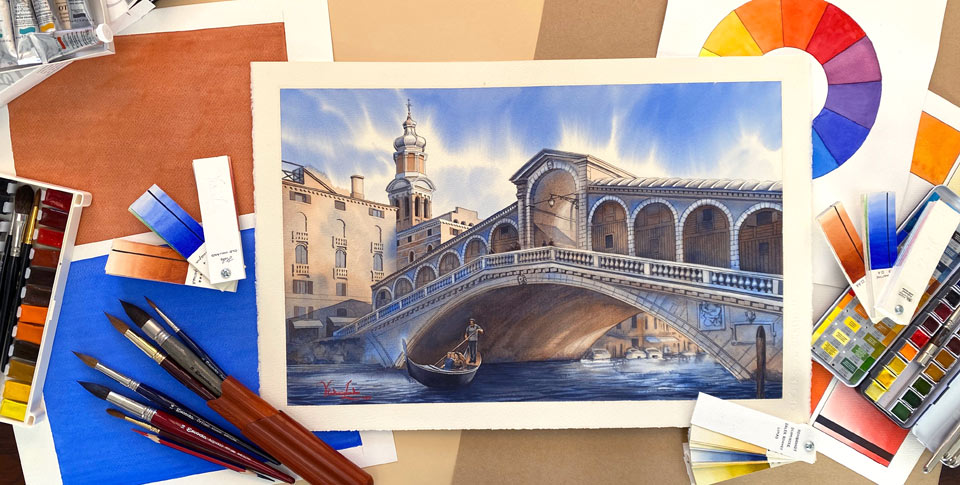
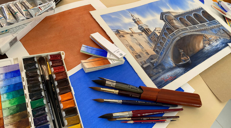
Here is the finished artwork that I will make by the end of this lesson. It was made in only two pigments.
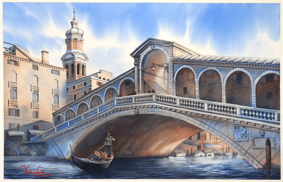
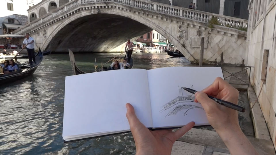
The topic for this watercolour painting is the beautiful Rialto Bridge in Venice, Italy. It is a sunny day with blue sky and few white clouds. We can see the bridge against the light, so its shadow side is facing us. Water in the canal is reflecting the light, which makes the chiaroscuro very interesting. I am making a quick sketch on location, in which I depict the arch of the bridge, capture some architectural details, and decide on the composition for the future artwork. I make this quick drawing in my travel sketchbook using a permanent CD marker. Travel sketches don't have to be perfect as they are not for display; they in fact have another purpose, to capture the feeling of the place and collect ideas for future artwork compositions.
I will use this sketch as a reference when I return to the studio. I will begin the watercolour artwork, by making an actual scale cartoon on drawing paper, with graphite pencil. In fine art, the word 'cartoon' does not mean a funny movie for children, but a preliminary drawing that is used to decide on the composition and all elements of the design. The same preliminary drawing is later used for transferring the design onto the support, which is, in this case, watercolour paper. This drawing in perspective is quite complex, so I don't want to draw it directly onto the watercolour paper sheet, because there is a good chance that I will need to erase elements and redraw them several times to make the composition I would like to have. Also, drawing may involve making some helping lines; for example, lines in perspective that go into vanishing points, which will have to be erased later. Furthermore, it is not advisable to erase graphite lines on the clean watercolour paper sheet, because an eraser may slightly damage the paper surface and these areas will take paint differently. Therefore, the safest way to work on the composition is by making it on a separate piece of drawing paper, one which is equal in size to the future artwork. As you can see, I draw all lines freehand, and so far, not much erasing is required. Nevertheless, using disposable paper gives me the confidence that, should anything go wrong, it will be easy to fix.
A good painting is well drawn, and good drawing only comes with the necessary skills. If you feel that your drawing skills should be improved, you may consider taking the Drawing Academy online video course. In this course, I explain in much detail, how to draw in perspective, including one, two, three and four-point perspective, and perceptive-perspective.
I have also written a book on this topic, named How to Draw in Perspective, which is available on Amazon.
Because the topic of this video lesson is not about how to draw in perspective, but how to paint an artwork in two colors, I will fast-forward the linear drawing in graphite pencil to the step where the drawing is already complete. However, should you want to learn more, in the Drawing Academy course, you will find multiple video lessons on this topic - How to Draw in Perspective.
To transfer the drawing, I am using tracing paper. First, the design has to be transferred from the cartoon onto the tracing paper. For that purpose, I have placed the tracing paper on top of the cartoon, and fixed it to the board with masking tape. I am now repeating the entire drawing in graphite pencil. When the drawing is done and I am happy with this final composition, I turn the tracing paper over so the drawing is facing down, and place it on a white background to view all pencil strokes clearly. Now, I will repeat every single line using a thin graphite pencil half a millimeter thick, in order to make a mirror image of the design on the reverse side of tracing paper. This step is required to avoid flipping an image when it is transferred onto the watercolour paper sheet. I now prepare the support. The wooden stretchers with a plywood board will give a good support to this artwork. The half sheet of watercolour paper fits nicely on that board. I check which side is the front one; usually, this is clear when you check the watermark. It is down to your personal choice what side to paint on, as some artists prefer painting on the backside of the wet paper sheet. To make a nice wide border around the artwork, I measure and mark its margins with a ruler. Masking tape is then used to fix the sheet to the board.
I try to pay enough attention to preliminary steps such as stretching the paper sheet, because it is better to do this properly now, rather than try to fix this during the middle of the painting process. When the masking tape stripes unstick, the edge of the paper gets wet, and new masking tape does not stick to a wet surface. When the watercolour paper sheet is secured in place with masking tape, I will use masking fluid from Windsor & Newton, which is of a good quality but the wrong bottle shape. That is why I put it inside the ceramic jar, which makes it a bit harder to accidentally knock it over. For the job, I will use a ruling pen and a ruler to mask thin lines along the masking tape edges. Such masking will prevent wet paint from getting under the masking tape, and will also produce a very sharp and straight border around the artwork. The reason why I am using a ruling pen is because it is very easy to use this for making long, thin lines, which is exactly what I need for the painting frame. Also, such a pen is very easy to clean with a paper napkin. When the masking fluid is applied, I will let it dry thoroughly.
The painting support is now ready for the transfer of the drawing. I have fixed the tracing paper with masking tape to one side of the board, to keep it secured in place. I will now repeat every line of the drawing with a black pen. Because the drawing is made in graphite pencil, the pen marks are different and it is easy to see which lines have been transferred and which parts are remaining. This is a mechanical job. From time to time, I flip open the tracing paper to check the quality of the lines and the progress. When the drawing is complete, I remove the tracing paper and get ready to paint in color. With the drawing in place, the next step is to decide on two colors. I would like to choose one cold and one warm color. For the cold, I have chosen blue Ultramarine, and to the side, for the warm color, I will test several combinations to see how the pair looks. It is also advisable that you test pigments on the same watercolour paper that will be used for the artwork. I will leave it to you to make your own decision on which colors you would like to use.
After premixing the cold and warm pigments, it is time to wet the paper sheet. For this step, I use a flat, wide synthetic brush to apply clean water, covering only the top half of the sheet. I leave the bottom half dry because my intention for now is to paint only the sky. I am intending to paint this wet-into-wet, so having a thoroughly moistened paper surface is essential. I will let the paper absorb the water for a minute or so, whilst mixing the blue tint for the sky. I will paint the sky with pure blue Ultramarine paint, without any traces of brown pigment. As I recall, on that particular day, the sky was blue with some white clouds. In order to depict this, I use the round mop brush from Escoda to painting with loose, diagonal brush strokes which suggest a dynamic movement of clouds.
I preserve the light tone of clouds by painting around them. You may notice that I do not load too much paint on the brush, so that even though the board is tilted at around 15 degrees, the paint does not flow uncontrollably. However, because I am painting wet-into-wet, the borders of brush strokes are diffusing, producing nice and soft white cloud edges. In order to achieve a fresh look of the sky, I am painting this in 'alla prima', which means 'in one attempt'. After applying the paint onto the paper, I can lift the border and rotate it slightly at different angles, so that the paint can flow on the paper surface and intermix more smoothly. To preserve this fresh look, I will not touch the sky with a brush anymore.
The sky is finished, so I will now paint the architecture. All of the building and bridge surfaces can be divided into two large groups: those that are facing the sun and appear warm in color, and those which have walls in shadow, without direct sunlight hitting them. Walls in the latter group appear cold and dark because they reflect blue sky and the light, which is reflected from the channel water. The building wall that I am painting right now is turned towards the sun, meaning that its color is warm. But nevertheless, I am adding a little bit of blue, cold pigment and mixing it with the brown one, directly on paper, to slightly mute the red-brown hue, and create an appearance of the wall texture.
Here is one great tip for all of your watercolour artworks: even if you paint a very warm object, always find cold places on its surfaces. The same is true for the other way around: when painting cold objects, learn how to see the warm areas within them.
The technique that I am using is called 'wet-on-dry'. At the same time, when I paint the warm wall with a brown pigment wet on dry, I then add blue pigment wet-into-wet, overlapping brush strokes with paint that is already on the paper.
I will now paint the wall that is turned away from the sun; because it is in shadow, it appears very cold. So, I start painting the wall using pure Ultramarine pigment; you can also see that I make the tone darker than I did for the previous wall. With the blue underlayer in place, I can now add brown pigment into the wet area. This approach also follows the same sequence; the underlayer is painted wet-on-dry and then the pigment is added wet-into-wet. I will now paint the shadow side of the bridge, but this time, the first layer will be painted wet-into-wet. That is why I first apply clean water with a flat natural-hair paintbrush from Escoda across the bridge area, accurately staying within the outlines and covering the entire bridge area without any gaps. Because this side of the bridge is in shadow, I start to paint it with Ultramarine paint. The pigment flows nicely on the wet surface; however, the outer outline is sharp because it borders with the dry area of paper.
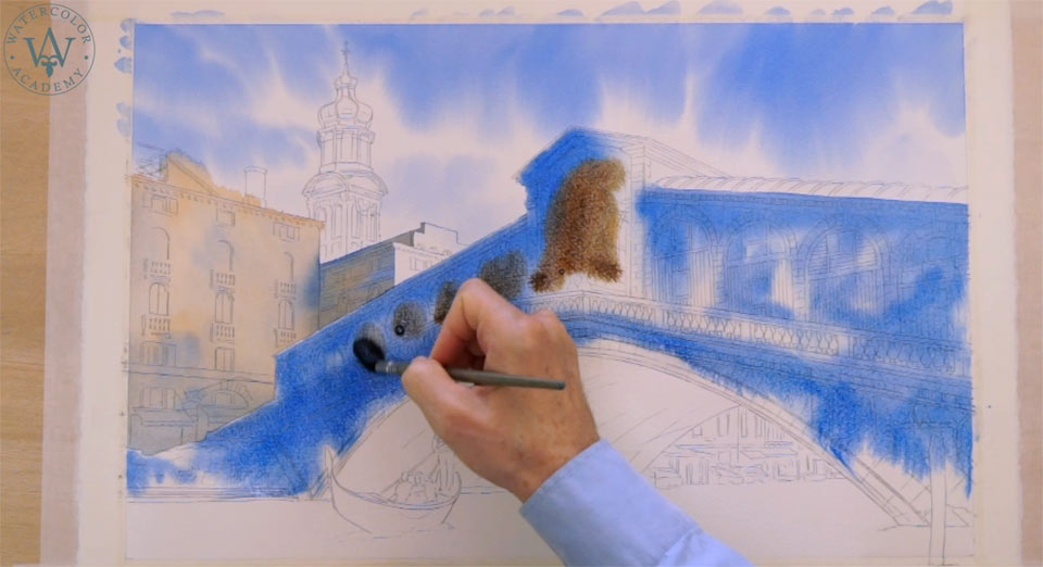
I paint a darker tone for the bridge, in order to follow the rule of an aerial perspective. This rule states that the objects which are closer appear darker in tone and more saturated in color, and also have sharper contrasts than the objects that are further away from a viewer. With the blue underlayer in place, I can now add a brown pigment wet-into-wet. Once again, I apply darker tones to suggest the aerial perspective. When the paint dries, those tones will become lighter.
Whilst the paint is still wet, I highlight some areas by wiping out the pigment from the paper surface. I do this with a clean and damp brush, absorbing the excess pigment from it with a paper towel. I did not mask the lighter areas with masking fluid for a reason – I want to have soft borders between light and dark areas in this artwork, but masking produces hard edges. The arched surface underneath the bridge is lit by the reflected light that is reflecting from water in the canal, but at the same time, it is turned away from the light sky, and therefore it will be one of the darkest areas in this artwork. That is why I paint this arch in much darker tones, mixing brown and blue pigments directly on paper. As you may see, these two colors are almost complementary, which means that, when mixed together in equal quantities, they give an almost-neutral gray color. This was the main reason for choosing these pigments.
I wanted to demonstrate that it is perfectly possible to paint a colorful artwork using only two pigments. These two complimentary colors come from opposite sides of the color wheel. Because one pigment is cold and another is warm, this allows me to paint both warm and cold areas of this artwork in just two colors, and as many mixes, shades and tints that those two pigments can provide. Although there are only two pigments, it is possible to mix an unlimited number of tints of each color, as well as an unlimited number of mixes of two colors. This gives a very wide range of color nuances from warm to cold, and a great variety of tonal values from dark to light.
A beginner may think that, in order to make a good artwork, he or she must have many different paints. That is why, when making a purchasing decision, a watercolour enthusiast would buy a big box with different paint colors because it seems obvious that one needs many colors to make colorful artworks. With time, such an artist will find out that some paints are used far more frequently and in larger quantities, whilst others are left almost untouched. I do not advocate buying too many colors, nor would I insist on using only two pigments.
The purpose of this video lesson is to demonstrate to you that it is possible to paint in color using a very limited number of paints. When painting in watercolour a beginner will face many challenges, including how to control wet paint on the paper surface, wondering whether the surface should be wet or dry, how much paint should be loaded on the brush, how to achieve light and dark tonal values, how to make hard and soft edges, and so on. On top of this long list of challenges, if you also have to make a choice of which colors to choose, this would make the watercolour painting process even more difficult. This is why I am showing you, in this video, how to paint a colorful artwork without the challenge of the color choice. This is one of the best exercises if you would like to achieve great results and advance your watercolour painting skills to a higher level.
A self-study, self-paced course where you can learn how to paint in watercolor by watching video lessons and doing assignments
One-time payment - Lifetime membership
$297 USD
One-to-one, unlimited and custom-tailored to your skills and needs Personal Tutoring by the Watercolor Academy teachers
One-time payment - Lifetime membership
$997 USD


