Watercolor Academy Online Course
A self-study, self-paced course where you can learn how to paint in watercolor by watching video lessons and doing assignments
$297 USD
ENROLL NOWA self-study, self-paced course where you can learn how to paint in watercolor by watching video lessons and doing assignments
$297 USD
ENROLL NOWOne-to-one, unlimited and custom-tailored to your skills and needs Personal Tutoring by the Watercolor Academy teachers
$997 USD
ENROLL NOWVideo lesson by Vladimir London
In this video, you will discover the theory of color design, and how to make your very own 12-part color circle.
Before making a color circle, I would like to demonstrate to you that the conventional color theory has to be taken with a disclaimer: that not all rules of this theory can be replicated with the watercolor paints that we have available today. Paint manufacturers worldwide are doing their best to produce high quality paints with saturated colors and excellent permanency, but such paints do not always have a pure chroma in order to work, as suggested by the color theory rules. For example, here is a gradient of red color, for which I was using the scarlet red paint, which contains two pigments: PR2 and PR4. Another swatch is made of Prussian blue, which contains blue pigment PB27. Conventional color theory states that red and blue are primary colors, and therefore should not be obtained by mixing any other colors. Let's test how this theory works in real life.
Here is the Carmine watercolor paint, which is made of the PR170 pigment. I take the Cadmium orange PO20 pigment and add it to the Carmine paint. The Carmine paint has a Rose violet shade, and when it is mixed with Cadmium orange, a very intense red color is obtained. It is slightly colder than the scarlet swatch on the left, but nevertheless it looks very red, which goes against the conventional theory that pure red cannot be obtained by mixing any other colors.
Now, let's do another experiment; I will once again use the Carmine paint, this time mixing it with Cadmium yellow (PY35 pigment). I first make a swatch of the Carmine color, and then add the Cadmium yellow paint into this swatch, mixing these two paints directly on paper. This gives a slightly warmer red color than in the previous mix. To me, it appears very close to the scarlet red color, which was applied first on the left-hand side.
This simple experiment doesn't prove that color theory is wrong, and that the primary red color cannot be achieved by mixing any other paints, but it shows that paints do not always have a necessary purity to follow the color theory rules.
Let's now undertake another experiment. Here is a violet paint made of the PV3 pigment, and here is an Emerald green paint containing the PG7 pigment. Let's see if both of these, when mixed together, can produce a blue color. The Prussian blue, on the left-hand side, is not the purest blue color; nevertheless, it is blue enough to stay close to the primary blue. Let's see how well it can be imitated by the mix of violet and green paints. The color of this mix appears quite dull and unsaturated; at the same time, it is no longer violet neither green. It has a blue hue; although unsaturated, it looks greyish, but has an unmistakeably blue shade. It also comes with a slightly red undertone, so I will make another swatch, this time adding more Emerald green paint, to achieve the color which is more similar to the Prussian blue on the left-hand side. In this experiment, I want to demonstrate that the blue shade can be obtained by mixing two colors. Although it is not a pure blue, it is close enough to the Prussian blue paint color.
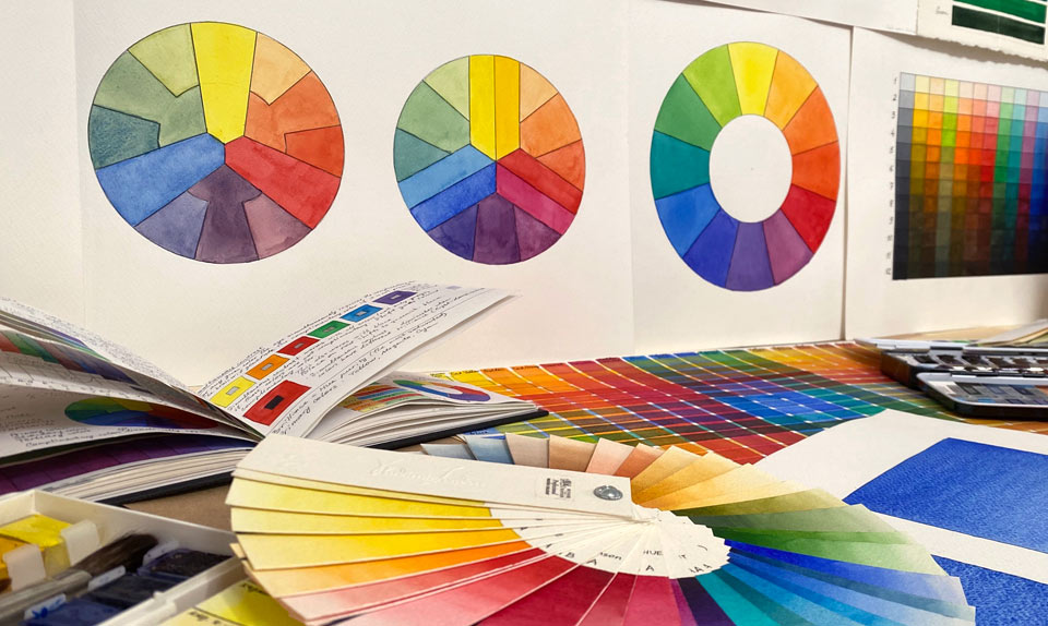
It's now time to make the color wheel. There are many different wheel designs.
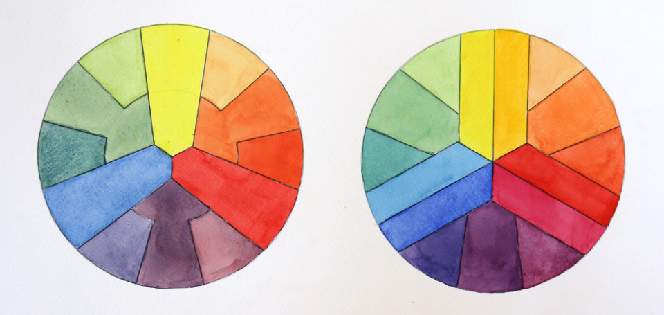
They all have the similar feature of colors arranged in a circle. Here is one particular design, where interlocking shapes indicate how colors should be mixed with each other. I begin with the yellow color at the top, using the Cadmium Lemon yellow paint (pigment PY35). For the red color, I am using scarlet paint, which is made of PR2 and PR4 pigments. When mixed together, the two primary colors yellow and red produce the secondary orange color; to show this, the orange shape on the color wheel touches both yellow and red swatches, which makes it clear which paints have been mixed to produce this orange color.
I now add more yellow paint into the orange mix, to get the yellow-orange color. Such a color is called 'tertiary', because it is obtained by mixing the neighboring primary and secondary colors. This color is added between the yellow and orange swatches of the color wheel. The color wheel design, once again, shows which paints have been mixed to make this yellow-orange color.
It is time to add more red paint into the mix of two primary colors, which gives us a tertiary red-orange color. This color is added onto the color wheel between primary red and secondary orange colors.
I then add the third primary color, which is blue. For this purpose, I am using Cobalt blue paint (pigment PB28). You do not have to use exactly the same pigments as I am demonstrating here – after all, you may or may not have the same paints, or you may have paints with similar names but different pigments. It doesn't matter – for the purpose of this exercise, you may use whichever yellow, red and blue paints you have. Choose the colors which are the most saturated and have the purest hue – for yellow, red and blue.
I have mixed, on the palette, the Cadmium Lemon yellow with the Cobalt blue to obtain a green color. As you can see in this video, it is not the most exciting green, but nonetheless, this is the color that my two primary colors produce. I place this secondary green color between the yellow and blue swatches on the color wheel.
Adding more blue paint to the green mix gives us the tertiary blue-green color. It is placed on the color wheel between the primary blue and secondary green.
By adding yellow paint into the mix, I produce a yellow-green color. This tertiary color goes on the color wheel between the primary yellow and the secondary green.
It's now time to mix red and blue paints to obtain the secondary violet color. On the color wheel, it is placed between the primary red and blue. The mix of this violet color with the primary blue produces a blue- violet tertiary color. On the color wheel, it is located between the primary blue and the secondary violet swatches.
Finally, mixing violet with red gives us a tertiary red-violet color – on the color wheel, this is placed between the primary red and the secondary violet.
I am not sure about you, but when I look at this color wheel, I think that, while the orange color is acceptable, hues of the remaining green and violet secondary colors are fairly questionable. There is a reason why the desaturation of secondary colors happens.
I will make another color wheel to explain why mixing primary colors does not always result in vivid and saturated secondary colors. Yellow, red and blue paints, as produced by manufacturers, seldom have pure chromas of primary colors. This means that some yellow paints will not necessarily have pure yellow chroma; instead, the color of such paint may be slightly shifted toward green or orange colors. To improve this situation for the color wheel, I am painting not just one but two yellow colors. On the left-hand side is Cadmium lemon yellow, which has a slightly green shade. And on the right-hand side is the Cadmium yellow paint, which has a slightly warmer color, with a very slight shift toward orange.
For the red primary color, I will also use two different paints. For the warm red, I take the scarlet paint – for the colder red, I utilize the Carmine paint, which is slightly closer to violet than the previous red swatch.
I am also making two swatches for the primary blue color. The first blue swatch is painted with a Phthalo blue paint, and the second one with Ultramarine. Each of the three primary colors now has two swatches. Two neighboring swatches of differing primary colors, such as yellow and red, are more suited to make an orange color than the remaining two swatches.
This orange shade, of course, produces a better-looking yellow-orange color when mixed with yellow.
The same goes for the red-orange color.
The secondary violet color also looks more vibrant and saturated than the violet in the previous color wheel; this is because different primary pigments for red and blue are mixed this time.
We see he same improvement for the tertiary colors blue-violet and red-violet. Their saturation is higher because the colder red pigment does not mute down the warmer blue one.
The green color also looks a bit better than the previous time. This is because the Phthallo blue pigment has a slight green shade and is suited better when mixed with Cadmium Lemon yellow. Of course, such higher saturated green gives a better tertiary color – blue-green – when mixed with the Phthallo blue paint.
Finally, the last tertiary color – yellow-green – also appears slightly better than in the previous color wheel.
The second color wheel looks better as more suited pairs of primary colors are mixed together to obtain secondary colors.
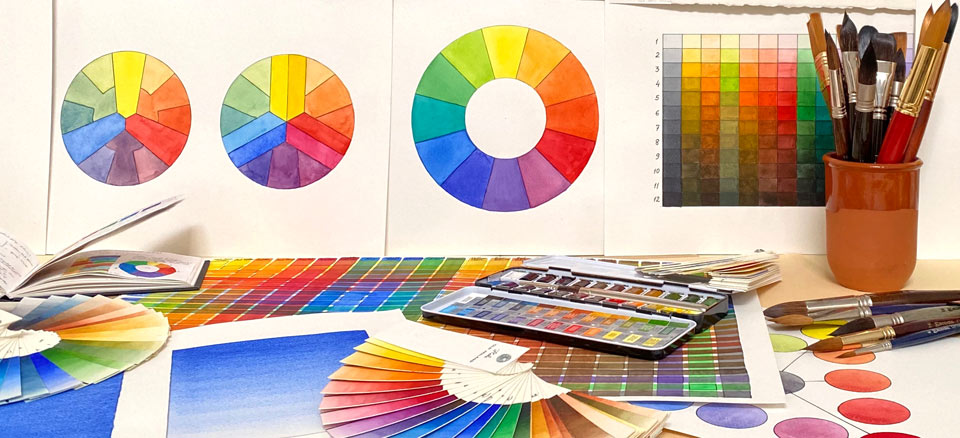
I will now make a third color wheel, which will be used as a reference for future video lessons on color theory. This time, it has a very simple design - 12 equal-size segments, which can be obtained by dividing a circle with its radius into six segments and then subdividing each segment in half.
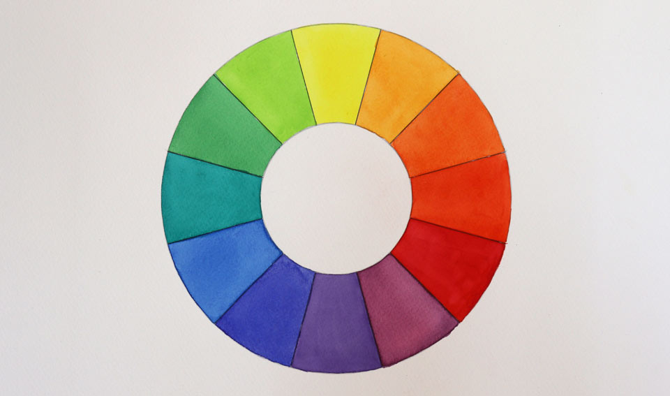
I would advise you to make the same color wheel design, so that you can use it for the color theory exercises. This wheel will contain 12 colors: three primaries, three secondaries and six tertiaries. I will not tell you which pigment should be used for the primary colors, because you may or may not have exactly the same watercolor paints in your box. I am sure that you already have a selection of yellow, red and blue paints, and therefore you can pick three colors that you think are most suited for the primary swatches. Also, you don't have to mix those three colors to produce secondaries. Instead, you can test the ready-made orange, violet and green paints you have, and if they look better than the colors achieved from mixing primaries, then you are welcome to use ready-made paints for this color wheel. This wheel is not about mixing pigments, it is about bright and saturated primary, secondary and tertiary colors. That is why – when using this tool – you can either mix your own secondary and tertiary colors, or use manufactured paints.
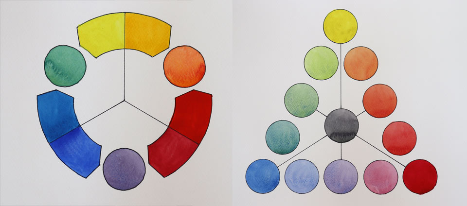
Here is the finished color diagram. Let's recap what this 12-part color circle is about. There are three primary colors: yellow, red and blue. When two primary colors are mixed together, they produce secondary colors. There are three of them: orange, violet and green. When the neighboring pair of primary and secondary colors are mixed together, a tertiary color is produced. Each tertiary color is conveniently named by the colors which are mixed together to make it. The tertiary color names are: yellow-orange, red-orange, red-violet, blue-violet, blue-green and yellow-green.
There are also complimentary colors. Two complimentary colors, when mixed together, will produce a neutral gray. There are six pairs of complimentary colors – such colors are located diametrically opposite each other on the color wheel. There is much more we need to cover about color theory...
A self-study, self-paced course where you can learn how to paint in watercolor by watching video lessons and doing assignments
One-time payment - Lifetime membership
$297 USD
One-to-one, unlimited and custom-tailored to your skills and needs Personal Tutoring by the Watercolor Academy teachers
One-time payment - Lifetime membership
$997 USD


