Watercolor Academy Online Course
A self-study, self-paced course where you can learn how to paint in watercolor by watching video lessons and doing assignments
$297 USD
ENROLL NOWA self-study, self-paced course where you can learn how to paint in watercolor by watching video lessons and doing assignments
$297 USD
ENROLL NOWOne-to-one, unlimited and custom-tailored to your skills and needs Personal Tutoring by the Watercolor Academy teachers
$997 USD
ENROLL NOWVideo lesson by Vladimir London
In this video lesson, you will discover the Contrast of Hue and its implementation in watercolor painting.
Just to remind you that 'hue' is defined as the basic or source color, like red, orange, yellow, blue, green and violet, without taking into account its lightness or saturation, in other words, without considering a color's purity.
Contrast of hue is defined as the difference between basic colors – the primary triad yellow/red/blue has the strongest difference between hues, while the contrast of secondary hues is weaker, and even weaker so for the contrast of tertiary hues.
The contrast of hue in watercolor has profound significance. You may find that children's artworks and folk art tend to have very strong hue contrasts. It takes time to develop good taste in classical art, and to learn to see beauty in more complex nuances of colors. Professional painters and graphic artists may use strong hue difference to evoke emotions, and tell a story through their art.
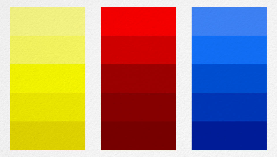
To demonstrate to you contrast of hue in action, I will do a simple exercise, by filling in squares with different colors. The first row of boxes will have the strongest hue contrast. As I have already mentioned, such contrast comes when the primary colors are used. As you already know, there are three primary colors – red, yellow and blue. So, I only use these colors for the first example.
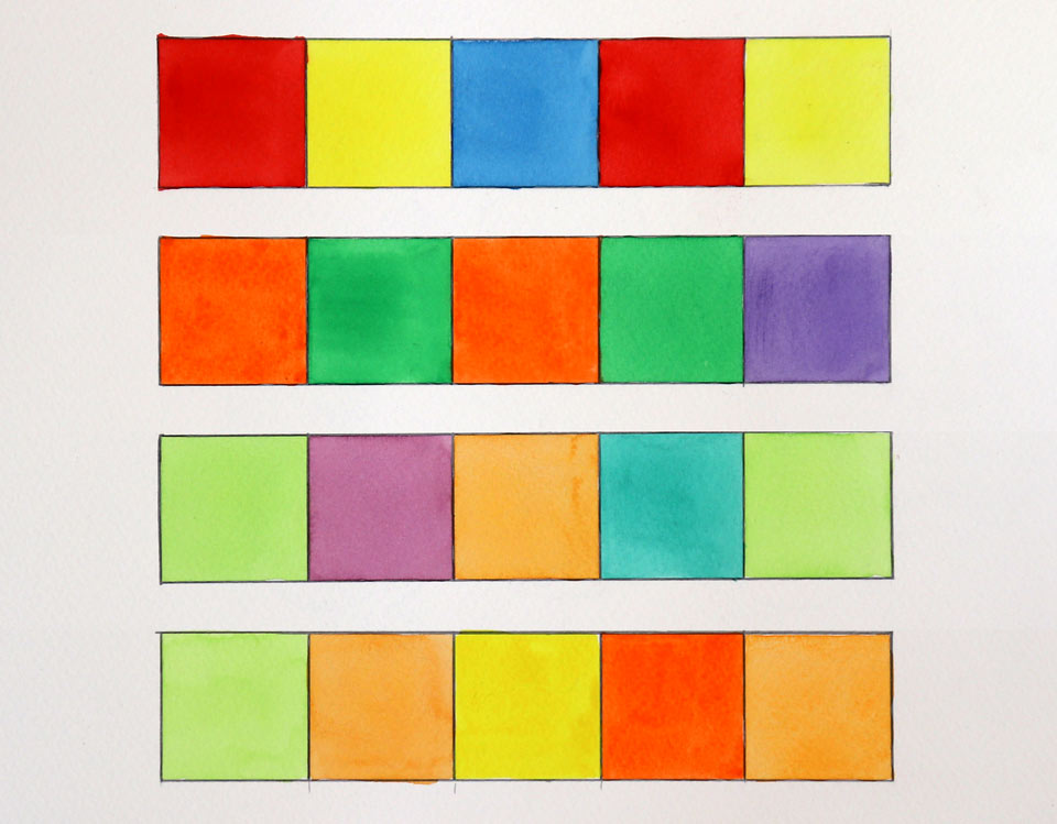
Each color here is applied in full strength, because it is not about tints or shades, but pure colors with full saturation. The colors here are as different from one another as they can be. That is why you will find such a contrast in children's artworks and folk art, which are very often bright and colorful.
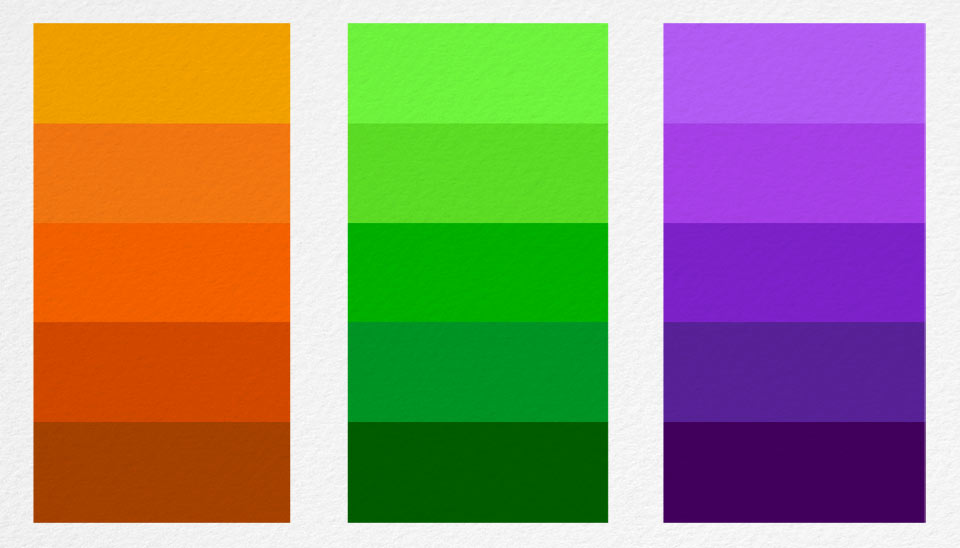
In a second example, I will reduce the contrast of hue slightly, by using secondary colors instead of primaries. As you already know from the previous color theory lessons, there are three secondary colors – orange, green and violet – that are obtained by mixing any two primary colors. For example, orange color is a mix of red and yellow, green is produced by mixing blue and yellow, and violet can be obtained by mixing blue and red. Because the hues of these three secondary colors - orange, green and purple - are not as strong as the hues of the primary colors, the contrast between them will be weaker.
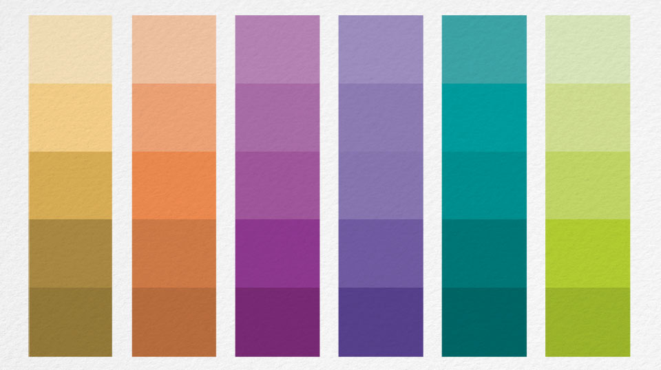
To reduce the contrast of hue even further, I will make another example, this time using tertiary colors. Such colors are obtained by mixing any two neighboring primary and secondary colors. For example, for the first square, I am applying a yellow-green color, which is made by mixing primary yellow and secondary green. I fill other boxes with red-violet, yellow-orange, blue-green and yellow-green once again. Despite each of these colors being taken from different parts of the color circle, their Contrast of Hue is rather weak, because they are all tertiary.
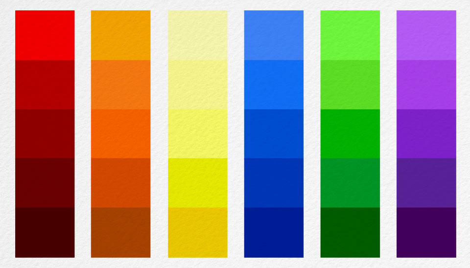
Finally, for the last example, I will make an even weaker contrast of hue, using different colors from the same side of the color wheel. This selection of colors not only includes tertiary, but also secondary and primary colors. I begin with the yellow-green color. For the next color, I mix the primary yellow and secondary orange. This yellow-orange color is located quite close to the yellow green swatch on the color circle. I then add the primary yellow color, the secondary orange, and complete this color selection with a yellow-orange swatch.
Here we have a very strong contrast between the hues of the primary colors, the slightly weaker contrast of the secondary colors, and further reduced contrasts of the tertiary and colors from the same part of the color circle.
The contrast of hue plays an important role in art; here is an example of very strong difference in colors. There are many other contrasts in color theory...
A self-study, self-paced course where you can learn how to paint in watercolor by watching video lessons and doing assignments
One-time payment - Lifetime membership
$297 USD
One-to-one, unlimited and custom-tailored to your skills and needs Personal Tutoring by the Watercolor Academy teachers
One-time payment - Lifetime membership
$997 USD


