Watercolor Academy Online Course
A self-study, self-paced course where you can learn how to paint in watercolor by watching video lessons and doing assignments
$297 USD
ENROLL NOWA self-study, self-paced course where you can learn how to paint in watercolor by watching video lessons and doing assignments
$297 USD
ENROLL NOWOne-to-one, unlimited and custom-tailored to your skills and needs Personal Tutoring by the Watercolor Academy teachers
$997 USD
ENROLL NOWVideo lesson by Vladimir London
In this video lesson, you will discover what Contrast of Saturation is, and how to use it in watercolor painting.
Contrast of saturation refers to the difference between a pure color, and the same but less saturated color, known as the 'tone', which has an equal tonal value to the saturated color, but a reduced purity. Contrast of saturation is also the difference between a pure color, and its darker shades and lighter tints.
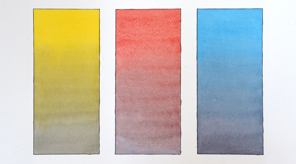
Before we can examine contrast of saturation, we need to establish what tones are, and why they cannot be pure in color. For this purpose, I will use this very simple diagram made up of three rectangles, where each box will be filled in with a pure color and its tones.
The first color that I am using for this exercise is yellow. I have premixed a sufficient quantity of the yellow pigment in the saucer. This color is applied at the top of the first box, using a soft natural-hair paintbrush. This mop brush from Escoda holds a lot of paint in its big belly, and releases paint onto paper nicely.
After covering an area of about one inch with pure yellow, I add a little bit of neutral gray color into the mix. This gray is produced by mixing yellow pigment with the complementary color, which is violet. I gradually add more and more neutral tint into the mix, and I continue painting the yellow rectangle with this amended color. To make the change in color very gradual, I am adding very little gray pigment into the mix at a time. Because violet color is very dark, and yellow is very light, I have to dilute the gray mix with clean water quite a lot, to prevent the yellow gradation from changing its tonal value dramatically on paper.
The purpose of this exercise is to make a gradated rectangle that starts at the top with pure yellow color, and gradually changes to a more desaturated grayish yellow color, without changing its tonal value. This means that I would like to achieve the same lightness of the color on this rectangle, but with a different saturation at its top and bottom ends. As you can see, the mix in the saucer is no longer a pure yellow, because I am adding more and more gray color into this mix.
As I move downward, within the first rectangle, the yellow color becomes less and less saturated. However, it keeps approximately the same tonal value as the pure color. This dull and desaturated color has lost its initial purity – therefore it is referred to as a 'tone'. This yellow tone still has the yellow hue; however, this hue is not pure any longer, and it is a slightly desaturated yellow. The difference between pure yellow and desaturated yellow is called the 'contrast of saturation'. This is what this color theory lesson is about – the difference between saturated and desaturated color. The yellow color becomes less and less saturated; it is almost neutral gray by the end of this rectangle. Because the tone is obtained here by adding a complementary violet color, by definition, it cannot have high purity, because the pure yellow color has been muted down and turned into the gray mix. To complete this rectangle, I absorb the collecting bead at the end of the painted area with a damp brush.
I will now do the same exercise using another primary color – red. It will be is also muted down with a neutral gray. Once again, I begin painting the rectangle with a pure color. The painting method I am using is called a 'gradated wash' – how to make a very smooth and gradual wash is fully explained and demonstrated in the dedicated video lesson, which you will see later on in the Watercolor Academy course. As you can see, the tone or brilliance of the red color is the same at the top, middle and bottom ends of the rectangle. However, the saturation goes from the pure red color to the chromatic gray. All muted colors within this rectangle are tones of red.
Now I will do the same exercise for the remaining primary color – blue. I begin by applying a pure blue color at the top of the last rectangle. This color is then gradually muted down by adding the neutral gray. Such muted colors are blue tones, because they have the same tonal value, but a lower degree of purity.
There are three ways to achieve tones. A pure color can be desaturated by either adding a complementary color, a neutral gray paint, or a diluted black paint, which is, in a way, a neutral gray.
In general, it is not advisable to mix watercolor paint with black manufactured paint to achieve shades and tones, because such a mix results in a dull, lifeless color. Instead, it is better to add complementary colors, in order to achieve chromatic grays and to reduce saturation or purity of colors. But for the purpose of this exercise, it doesn't matter which way you achieve tones.
All three primary color washes are now completed. They gradate from a pure color to less saturated chromatic grays. The difference between a pure color and its tone is called a contrast of saturation.
Now let's take a pure color, for example red, and another neutral gray color of the same tonal value, which means that the pure color and neutral gray are equally dark. There is no light-dark contrast here – only the contrast of saturation. By mixing the pure color and the neutral gray, we can obtain a gradation or a range of desaturated colors. Such desaturated color is called the 'tone' – it has exactly the same tonal value as the pure color and the neutral gray, but its purity is muted down. The range of tones from the pure color to the neutral gray is called the 'chroma'. It contains all possible tones within this range.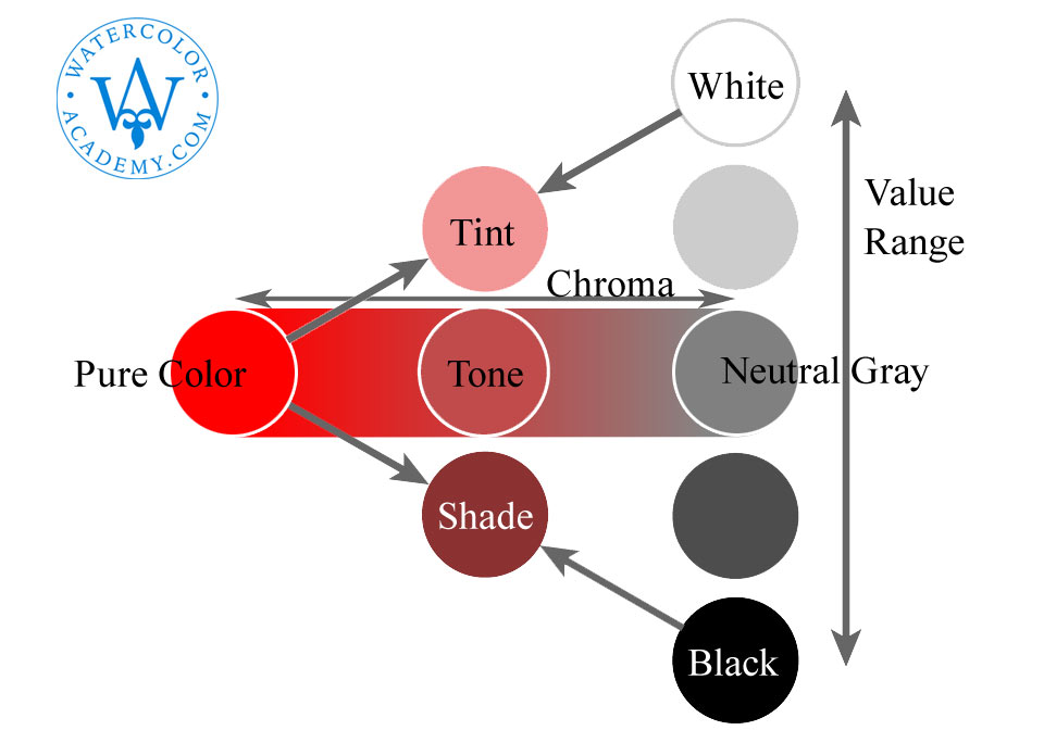
Let's now add to this diagram the tonal values. They can range from very light to totally dark values. All gray colors from white to black create a value range. Of course, there is an infinite number of gray swatches between white and black; for demonstration purposes, I have only placed three gray swatches.
When a pure color is mixed with white, it becomes lighter. Such a light color is called a 'tint'. Of course, in watercolor painting, tints are not obtained by adding white pigments, but instead by diluting paint with water, so that the white surface of the watercolor paper shows through the transparent layer of paint, making it appear lighter.
When a pure color is mixed with black, it becomes darker and muted down; such color is called the 'shade'. Of course, in watercolor it is better not to mix pure colors with black paints to achieve shades, but instead to mix with complementary colors, to tone down and desaturate the pure color.
All possible tints, tones and shades of this pure color are represented by this triangle. There is a correlation between saturation or chroma and lightness of color. At the right side of this triangle, the light-dark contrast is the greatest. However, the red color of this side is very desaturated. As we gradually reduce the light-dark contrast, the saturation increases. The red color becomes purer; however, the range of tonal values becomes smaller and smaller. That is why there is no such thing as highly saturated light or dark red color.
Now, let's examine what happens to the chroma when the tonal value changes. As a color is diluted, and either becomes lighter or is turned into a darker shade, the chroma range decreases; therefore, the color loses its purity as it becomes lighter or darker. That is why it is not possible to obtain a wide range of tones for some color, if this color is very light or dark. So, a very diluted color would have a small chroma range, while a large chroma range is only obtainable by adding complementary or gray without diluting or darkening the color.
Let's see how the contrast of saturation works in painting...
A self-study, self-paced course where you can learn how to paint in watercolor by watching video lessons and doing assignments
One-time payment - Lifetime membership
$297 USD
One-to-one, unlimited and custom-tailored to your skills and needs Personal Tutoring by the Watercolor Academy teachers
One-time payment - Lifetime membership
$997 USD


