Watercolor Academy Online Course
A self-study, self-paced course where you can learn how to paint in watercolor by watching video lessons and doing assignments
$297 USD
ENROLL NOWA self-study, self-paced course where you can learn how to paint in watercolor by watching video lessons and doing assignments
$297 USD
ENROLL NOWOne-to-one, unlimited and custom-tailored to your skills and needs Personal Tutoring by the Watercolor Academy teachers
$997 USD
ENROLL NOWVideo lesson by Vladimir London
In this video lesson, you will discover what complementary contrast is, and how to use it in watercolor painting.
On the color circle, there are six pairs of opposing colors, for example, yellow and violet, red and green, blue and orange, and so on. Any diametrically opposite colors on the wheel are called 'complementary'.
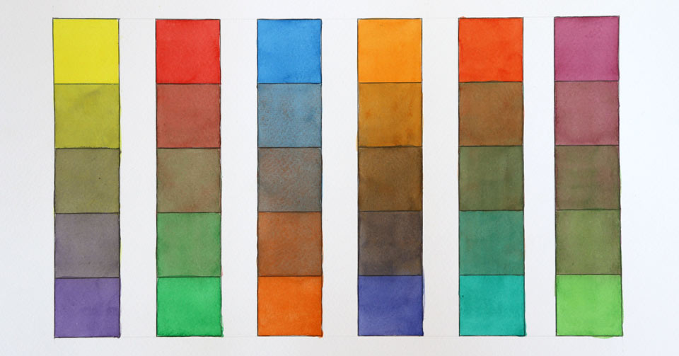
I will use this template of six diagrams to examine complementary contrast. Let's begin with the first pair of opposing colors which are yellow and violet. I use a tint of pure yellow color to fill in the top four boxes of the first diagram. The diluted tint should have about one quarter of the full color strength. It is very important to fully dry the first yellow layer before continuing to the next step.
When the paper surface is totally dry, I can apply the next color, which is violet. Since violet is very dark, it has to be diluted with water to achieve a light tint. I cover this tint with four boxes of the diagram, leaving the top one unpainted. It takes some time for this layer to dry. While it is drying, let's check the next complementary pair, which is red and green.
I have diluted a pure red paint with water, to make a light tint, which I use to cover the top four boxes, leaving the last fifth box unpainted. The complementary color to red is green. As I did previously with the violet color, I use this green tint to paint four boxes, starting from the second one. While this layer dries, let's have a look for the next complementary pair, which is blue and orange.
The light blue tint goes in the first four boxes, and when this layer is fully dry, the orange tint is painted on top, starting from the second box. Let's now return to the first diagram and paint another coat of light-yellow tint, this time covering the top three boxes, leaving the remaining two unpainted.
While the yellow paint is drying, we can do the same, adding another coat of the red tint. I repeat the process for the third diagram, using the light blue tint. After this layer, I let the paper surface dry thoroughly. Let's now come back to the yellow violet pair. The next coat of the violet tint colors the bottom three boxes.
I do the same for the second pair of complementary colors – red and green – making another layer of the green tint. We'll repeat this same exercise for the orange color, after which I dry the watercolor paper surface.
When the paper is dry, I can apply another coat of the yellow tint, this time covering only the two top boxes. I also apply the violet tint, to fill in the bottom two boxes. The same process is repeated for the red, green, blue and orange tints. Finally, to increase the saturation for the remaining top and bottom boxes, I make another layer of yellow, red, blue, violet, green and orange colors.
The remaining three pairs of complementary colors that we can see on the color circle are:
I complete the remaining three diagrams in exactly the same way as described previously. The colors for this diagram are yellow-orange and blue-violet, the next diagram has red-orange and blue-green colors, while the last diagram is painted with the red-violet and yellow-green colors. Several layers of each color are made in order to complete this exercise.
There are 12 different colros on our color circle, so we have six complementary pairs. You may note that the first three pairs – yellow and violet, red and green, and blue and orange – each contains one primary and one secondary color. When it comes to the remaining three diagrams, each complementary pair consists of two tertiary colors. It is interesting that all six diagrams, one way or another, contain all three primary colors – yellow, red and blue.
Let's examine how it works with the example of the first diagram, which has two complementary colors: yellow and violet. Yellow is the primary color; however, violet is the result of mixing blue and red. Therefore, this diagram contains all of the three primary colors, which are of course: yellow, blue and red. The same is true for the second diagram, which has a primary red color and the secondary green, which consists of blue and yellow. All three primary colors are also present in the third diagram, where in addition to blue, the orange color is produced by mixing two pigments: yellow and red. Each of the remaining diagrams – 4, 5 and 6 – has a pair of tertiary complementary colors. Every tertiary color is the result of mixing one primary and the neighboring secondary color, which is in turn, the result of mixing two primary colors. Therefore, such a diagram has all three primary colors.
According to color theory, when three primary colors are mixed together, they produce a neutral gray. This is what in theory should happen to these six central boxes. However, we can see that these swatches have slightly different colors, and that these colors are not neutral gray, but are chromatic grays. This happened not because color theory is wrong, but because watercolor paints do not come with pure color pigments. This is the great thing about watercolor paints – that in order to get a colorful artwork, you don't need six different ways to achieve the same neutral gray. It is much more useful and practical to achieve beautiful chromatic grays by mixing different complementary colors.
Complementary colors are also very useful when you need to mute down pure colors. We can see an example of muted color in the second box of each diagram. The same can be said about the fourth box, where secondary and tertiary colors are muted down.
Let's see how the complementary contrast can be used in painting...
A self-study, self-paced course where you can learn how to paint in watercolor by watching video lessons and doing assignments
One-time payment - Lifetime membership
$297 USD
One-to-one, unlimited and custom-tailored to your skills and needs Personal Tutoring by the Watercolor Academy teachers
One-time payment - Lifetime membership
$997 USD


