Watercolor Academy Online Course
A self-study, self-paced course where you can learn how to paint in watercolor by watching video lessons and doing assignments
$297 USD
ENROLL NOWA self-study, self-paced course where you can learn how to paint in watercolor by watching video lessons and doing assignments
$297 USD
ENROLL NOWOne-to-one, unlimited and custom-tailored to your skills and needs Personal Tutoring by the Watercolor Academy teachers
$997 USD
ENROLL NOWBy Ilya Ibryaev
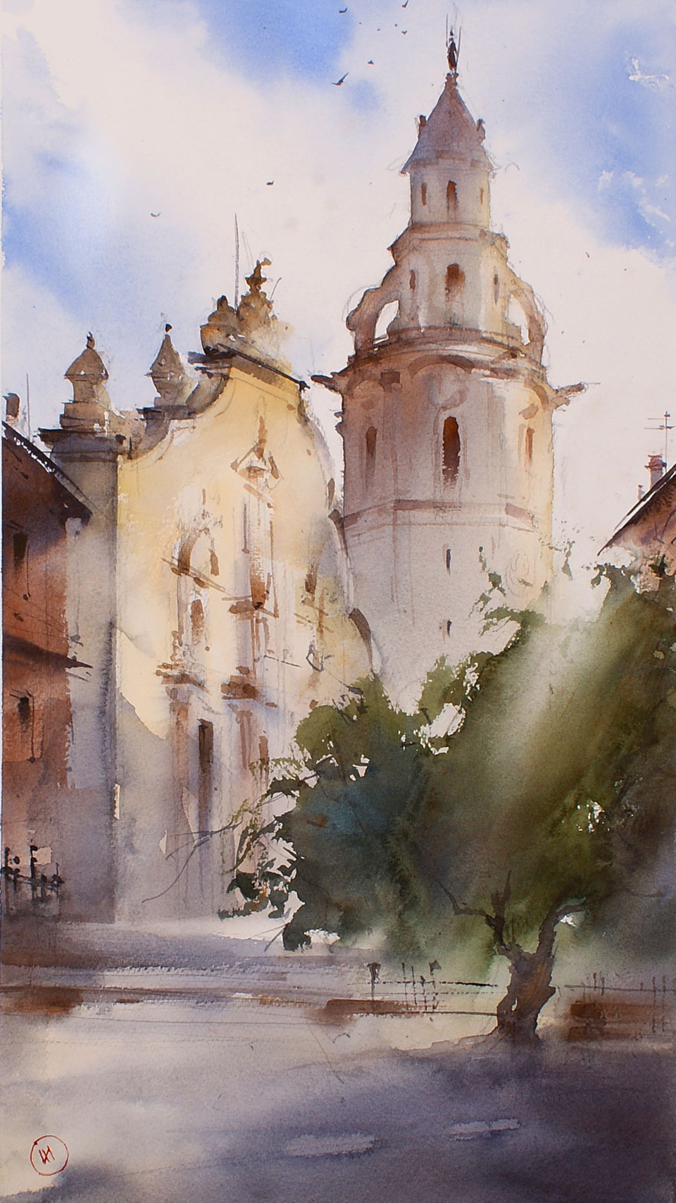
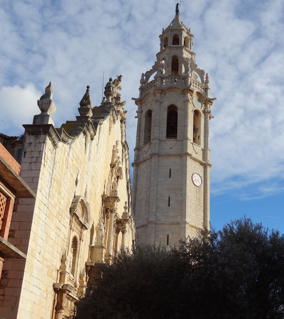
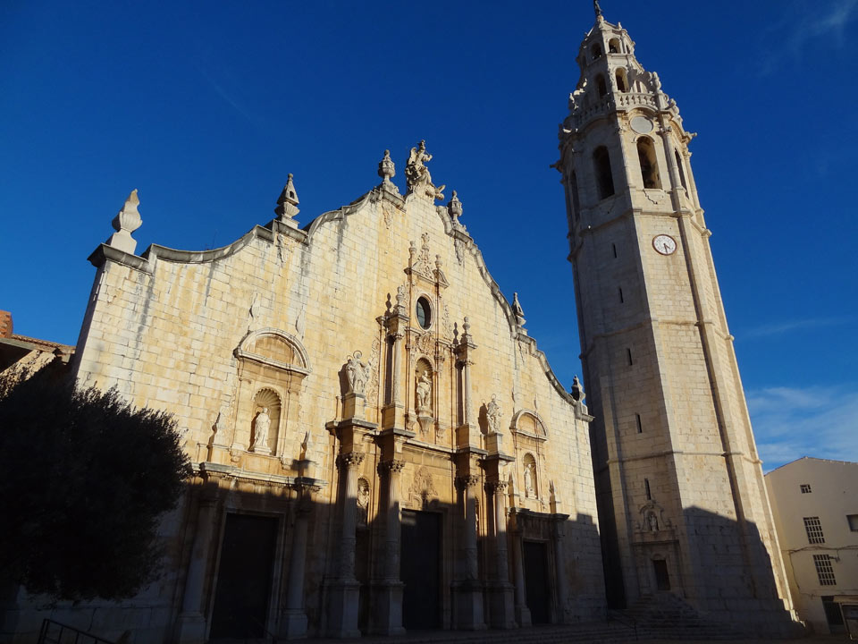
The topic of this lesson is how to paint architecture in watercolor. Here we have a Spanish baroque church on a light sky background. The creative task that I had in mind is not to portray every single architectural detail, but to create an impression of a beautiful building lit by sunshine. Here is the finished artwork that I will produce by the end of this lesson.
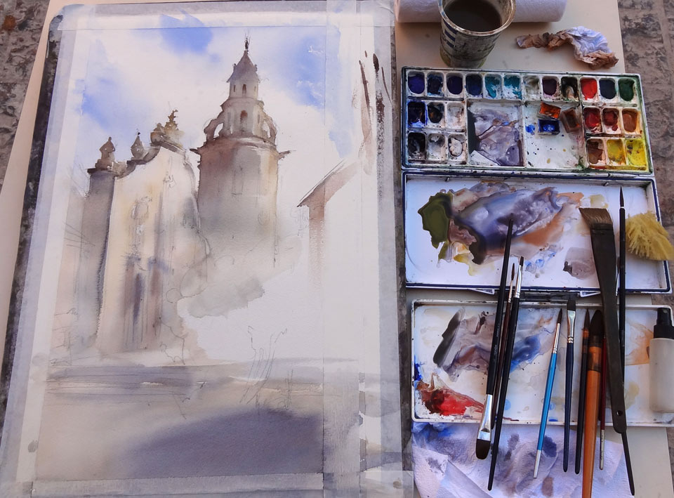
I start by making a drawing in graphite on 300gsm watercolor paper, made of 100% cotton. In this sketch, I outline the main proportions without too many details. I wet the paper with an atomizer just a little bit, so that I can paint a light sky wet-into-wet. For the sky, I am using a pure Ultramarine pigment, which I using a round mop brush. I now rotate the board and spray it even more with an atomizer. This softens up the brush strokes, creating an illusion of white clouds.
It is important to preserve white paper and leave it untouched. The sky design is very simple, with more attention being paid to the architecture. After painting this, I let the sky dry a bit. The façade of the church is lit by sunshine, so I start with a color of light, mixed of Cadmium orange, yellow ochre light and Cadmium yellow. In some places, I also add a little bit more Cadmium red and give the wash with a soft mop brush across the entire façade. The correct sequence of painting in watercolor is from light to dark; when the light paint is in place, I can add colder and darker shadows which intermix on paper with the previous wash. The ground is also lit with sunlight, and I use yellow ochre to cover the square in front of the church. Up until this point, I have been keeping all of the washes very light. However, it is now time to add darker tones. For this purpose, I mix Ultramarine with Cadmium orange, and add this color wet-into-wet. A medium-sized round brush is good for this job. I load the brush with less water because the paper is wet. At this step, I am not interested in precision of details; the task for now is to work on colors and tones, rather than architectural details.
A very limited number of colors is applied here. In addition to Ultramarine, I also use Cadmium orange and yellow ochre, and add those colors on wet paper. To make the mix even warmer, I add Cadmium red into this mix. Watercolor washes look more attractive when there is a variation of color temperature within one wash, so that the warm foreground will benefit from adding a colder mix of Ultramarine with Cadmium orange. Apart from colors, I must also pay attention to tonal values. In many cases, values are more important than colors. Also, greater contrasts and deeper colors visually bring objects closer to the viewer, which is exactly what we need for the foreground.
I let the paper dry a bit, after which I continue painting the architecture. It makes sense to start from the top, because paint flows downwards, and I won't accidentally smudge paint with my hand. The dark mix I am painting with now contains Ultramarine, Cadmium orange and Cadmium yellow. The sky is dry and I can make another layer on top of it, while keeping the sharp edges in place. I can also add, separately, Ultramarine and Cadmium orange into this wash, while it is wet. This time, I am mixing paints not on the palette, but on paper. The bell tower is dark against the light sky, so I keep adding more paint to make its values darker. You may see that I am using a smaller brush, not only to have more control of the small details, but also to have less water loaded onto the brush. Painting wet-into-wet requires a drier brush not to overload paper with water.
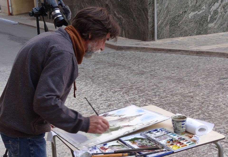
You may also notice that, even within one silhouette of the bell tower, I apply different temperatures of the bell tower, so that both warm and cold shades are present in one place. It is not often that I have the luxury of painting on a table outdoors, so a special thankyou goes to the Café owner who let me use this table.
I then use a wider brush to paint the main body of the bell tower. For this, I am using Cadmium yellow and Cadmium orange, with a little bit of Ultramarine, which is a complementary color to orange, and so mutes it down. Half of the bell tower is in shadow; it is cold in color because the wall reflects the cold color of the sky. The mix of complementary Ultramarine and Cadmium orange gives a beautiful chromatic gray, which portrays the natural color of the stone which makes up this tower. To warm up this gray color, I am adding yellow ochre wet-into-wet.
As the pigment sinks into the paper, the color becomes lighter, so I am adding more Ultramarine and Cadmium orange to deepen up the tone. I apply this wash with a wide flat brush. Because the paper dries quickly, I spray it with clean water and remove any excess water with a damp brush. Using a smaller flat synthetic brush, I wipe off some of the paint to give highlights to the tower. The building is gradually taking shape; it began with watercolor washes, and now I can add some details, such as small windows at the top. Because the wash is still wet, the borders of the details are soft.
By painting with loose brush strokes, I make an impression of the architectural details. For this job, I am using a small synthetic brush, which holds less water, but gives nice sharp edges. I painting with a limited number of pigments; this helps me to concentrate on tones instead of colors. I wet the paper with clean water, using a flat brush. When the paper is moist, the pigments can be added using the wet-into-wet technique. It is a sunny day and the light is warm, hence why the shadows are cold. However, on the foreground, the red brick wall is highly saturated. I use Cadmium orange, with a little bit of Ultramarine, to mark this wall on the left-hand side. More Ultramarine is added to the mix to make this deep dark shadow.
In front of us, there is an old olive tree; I paint it with freely-flowing brushstrokes, using Sap green, Cadmium orange and Ultramarine to produce a nice green color. In some areas behind the tree, the paper is wet, and in others, it is dry. This results in an interesting combination of two techniques – wet-into-wet and dry-brush. I leave some gaps unpainted in order to separate between different branches of the tree. When the foliage is done, I can diffuse its lower border by applying clean water with a flat brush, and also wipe off some of the paint using a natural sea sponge. This sponge can also be used to wipe off rays of light that are beaming from the top. I can now continue, with adding some small details, such as windows of the bell tower and the brickwork of the wall. The mix of Cadmium orange, yellow ochre and Raw Sienna is used for this purpose.
The artistic task I have in mind is not to make a photographic copy of this church, but to create an impressionistic artwork that captures the light and the mood of this place. That is why the precision of architectural details is not essential for this task – such details are not described, but suggested. The tree trunk will anchor this olive tree to the ground, and its wide roots are also indicated schematically. Some small details are added here and there, with thin synthetic brushes. However, the key here is not to overdo such details. According to aerial perspective, the foreground should have a sharper contrast and darker values. I add a deep shadow under the olive tree. Some shadows are casted onto the walls, and I add them in, using a darker cold color.
A self-study, self-paced course where you can learn how to paint in watercolor by watching video lessons and doing assignments
One-time payment - Lifetime membership
$297 USD
One-to-one, unlimited and custom-tailored to your skills and needs Personal Tutoring by the Watercolor Academy teachers
One-time payment - Lifetime membership
$997 USD


