A self-study, self-paced course where you can learn how to paint in watercolor by watching video lessons and doing assignments
$297 USD
ENROLL NOWA self-study, self-paced course where you can learn how to paint in watercolor by watching video lessons and doing assignments
$297 USD
ENROLL NOWOne-to-one, unlimited and custom-tailored to your skills and needs Personal Tutoring by the Watercolor Academy teachers
$997 USD
ENROLL NOWBy Ilya Ibryaev
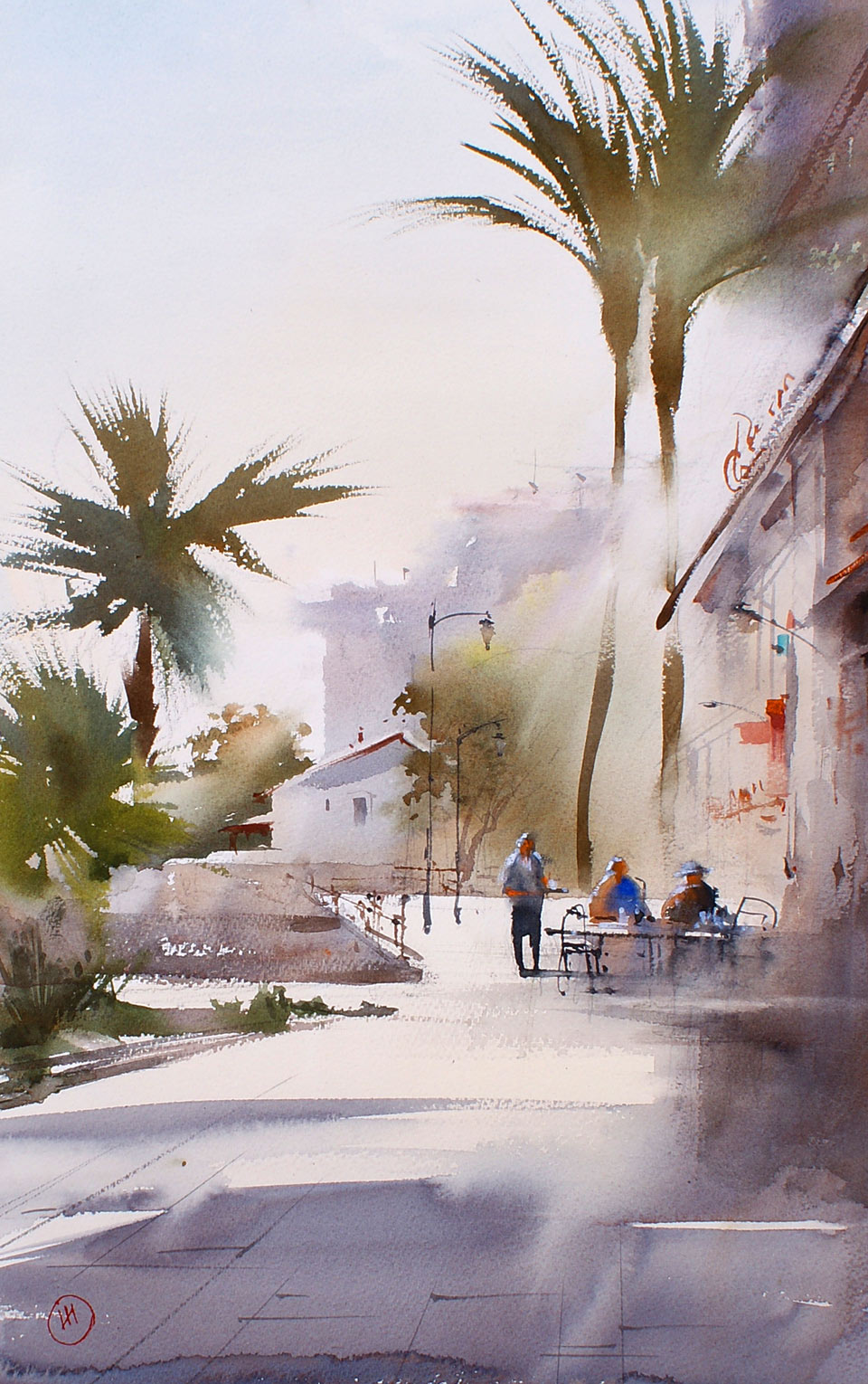
Here is the impressionistic streetscape artwork that I will create in this lesson. It is of a street in a small Mediterranean town in Spain. Here is how the finished artwork looks; it depicts the street in sunset light, and tells the story of people sitting in a café after the working day.
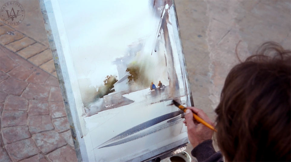
I begin this artwork in rough pencil sketch. Painting on location always has its challenges, especially in that I must work fast before the Sun goes down. I am preparing a light mix using Cadmium orange, yellow ochre light and Cadmium yellow, to paint the evening light with. I swiftly apply this color onto the paper using a round mop brush. I then rotate the board upside down, to allow this wash to flow downwards. Doing this helps to preserve the white paper below the sky, and also intermixes the wash. I then add Ultramarine and cobalt turquoise light to this mix, to produce a light effect. It is important to keep the tone for the sky very light. Once again, I turn the board to achieve a soft gradation for the wash. Any water that runs down can be absorbed with a damp paper towel. We must now wait for a couple of minutes, to allow the paint to dry a bit, before I continue to paint other grounds. The same yellowish tint is used for the light values of the street. On the foreground, the tone is darker, and I add Ultramarine and Cadmium orange. The light foreground reflects light, and is very similar to the sky.
The sky is not fully dried here, which is great for making the soft edges between the sky and the buildings' outlines. The chromatic gray that I am using for the buildings is mixed from Ultramarine and Cadmium orange. These complementary colors can yield in a nice-looking silvery-gray. By adding into the mix more orange or blue, the mix shifts to warmer or colder colors respectively, which produce a very picturesque effect in painting. The warm color of the street, which is lit with sunshine, reflects onto the buildings, so I add more orange closer to the ground. Then, the board is rotated once again, at different angles, to allow gravity to do its job. The different colors flow and softly intermix with each other. At the top, the buildings are colder, because they reflect blue sky. That is why I introduce violet color into the mix. You can see that I am painting using a flat wide brush, and I do not pay much attention to small details. A darker and slightly warmer color differentiates the foreground building from the background ones. While the paper is still wet, I can add trees onto the background. A mix of four pigments is used here: Ultramarine, Cadmium yellow, Cadmium orange and Sap green. Blotting paper with the folded paper towel prevents paint from running down. I have to keep an eye on this edge, and apply the paper towel once again if needed.
It's time to do the middle ground. I am using Ultramarine and Cadmium orange, and I apply the mix with swift wide brushstrokes. Some white accidental gaps are left unpainted on purpose. These suggest any highlights of the middle ground. The tree on the background is still wet, but the sky is dry, so I add sharp edges of green foliage, while ensuring that I leave a few gaps between brushstrokes unpainted. You can see that the green foliage is not totally green, but ranges from orange to blue in lights and shadows. Smaller round and flat synthetic brushes are used for such details. What makes this artwork interesting and artistic, is the combination of soft gradated washes and well-defined edges of details. In some places, I use a wide flat brush to soften up the hard edges of details. This is a good way to keep under control what is in focus, and what areas are soft and diffused. When the paint runs, I can rotate the board and absorb any excess water with a damp brush.
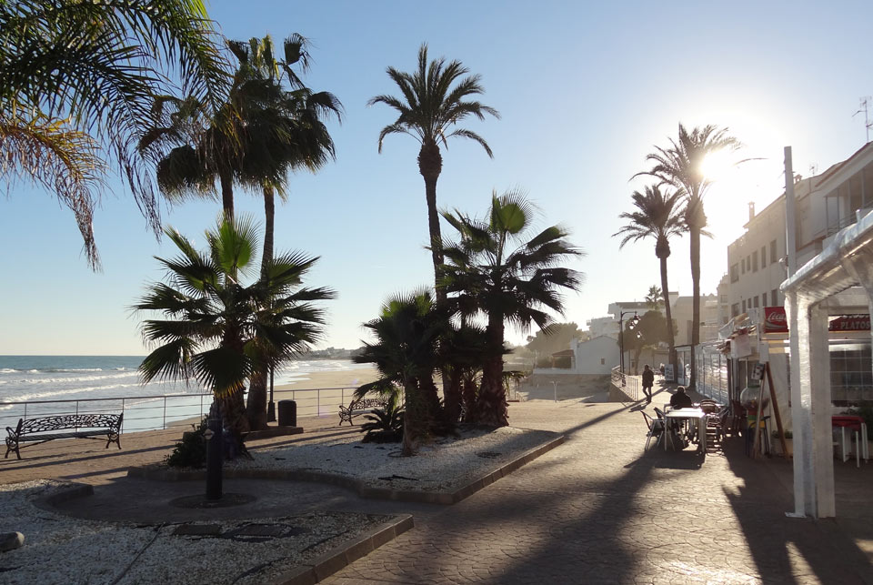
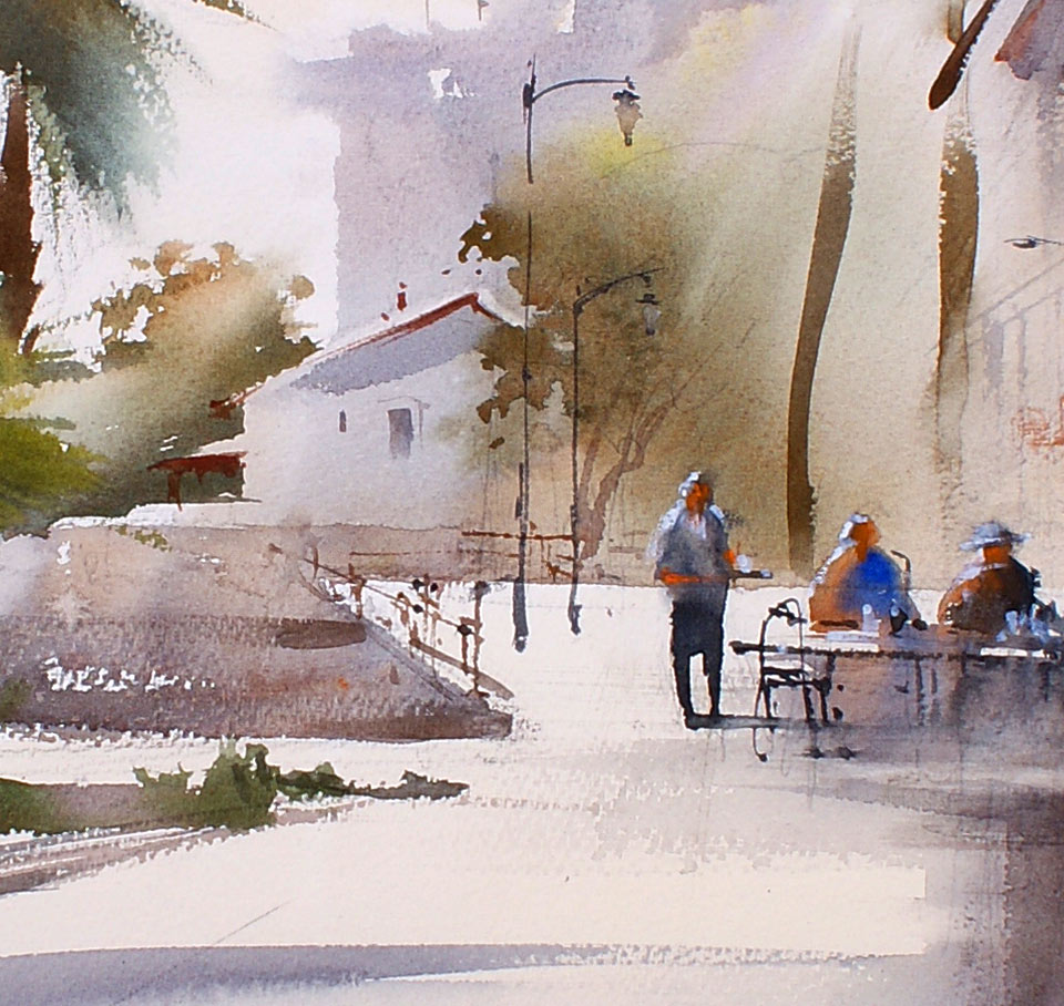
Painting on location is not always easy. Wind, temperature, clouds, constantly changing light all give some challenges to a painter. Nevertheless, when weather permits, I paint outdoors; this is a great way to learn from nature, and master and polish the 'alla prima' watercolor painting technique. When doing watercolors, especially outdoors, I do not except every single artwork to come out perfectly. You can employ the same attitude and take it for granted that one day the quantity will turn into quality, but you have to ensure that you continue practicing and practicing. I will take a short break, to allow the paper to dry, before continuing with this artwork. The first layer is a good underpainting, and it gives an impression of the background and middle ground. I can now paint wet-on-dry, in darker tonal values, and with more defined edges and details. For this purpose, I am still using the same colors: Ultramarine and Cadmium orange. The only different is that I am now working in darker tones. To make this street view more interesting, I add a couple of people sitting in the café. These two silhouettes are rather suggested than described.
It is now time to take care of the foreground. The shadows casted by the buildings are dark and cold. I use the same mixture of Ultramarine and Cadmium orange here; however, it contains more blue and therefore is colder. I paint the ground with swift wide brushstrokes using a round mop brush. To suggest the proximity of the foreground to the viewer, I apply darker tones and sharper contrasts. Some details are added with smaller brushes. I am aiming to keep this artwork impressionistic, hence why details are suggested and not described. The palm tree that is closer to us has more defined sharp edges than the one in the background. It also has darker tonal values; this way, I am creating an illusion of aerial perspective. Once again, the green color used here is not pure green; it contains orange, yellow and blue pigments. Such a range of colors gives an impression of light and shadow. I am painting with freely-flowing brushstrokes because precision is not required here. Into the mix, I add more Cadmium orange to paint the palm tree trunk. I use a smaller flat synthetic brush for this purpose.
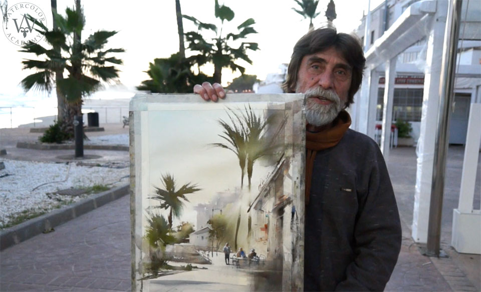
I will also add another couple of tall palm trees standing on the opposite side of the street. These palms are painted in the same manner as the palm trees on the left-hand side. The brush is loaded with pigment, but contains less water. This makes it possible to paint using the dry-brush technique, applying fast brushstrokes. There is a waiter serving people in the café; I also paint this figure rather schematically. This three-figure composition brings some life into the artwork. This watercolor is almost complete. I make some finishing touches by adding some more details and deepening up some of the shadows. When working on details, you don't have to put on paper everything that you see in real life. As an artist, you have a creative license to decide what you want to include in your artwork, and what to omit. I add a few windows, a couple of lampposts and café furniture to the artwork – a few touches here and there is all that is required. Also, a few thin lines on the pavement will add an impression of linear perspective.
A self-study, self-paced course where you can learn how to paint in watercolor by watching video lessons and doing assignments
One-time payment - Lifetime membership
$297 USD
One-to-one, unlimited and custom-tailored to your skills and needs Personal Tutoring by the Watercolor Academy teachers
One-time payment - Lifetime membership
$997 USD