Watercolor Academy Online Course
A self-study, self-paced course where you can learn how to paint in watercolor by watching video lessons and doing assignments
$297 USD
ENROLL NOWA self-study, self-paced course where you can learn how to paint in watercolor by watching video lessons and doing assignments
$297 USD
ENROLL NOWOne-to-one, unlimited and custom-tailored to your skills and needs Personal Tutoring by the Watercolor Academy teachers
$997 USD
ENROLL NOWBy Ilya Ibryaev
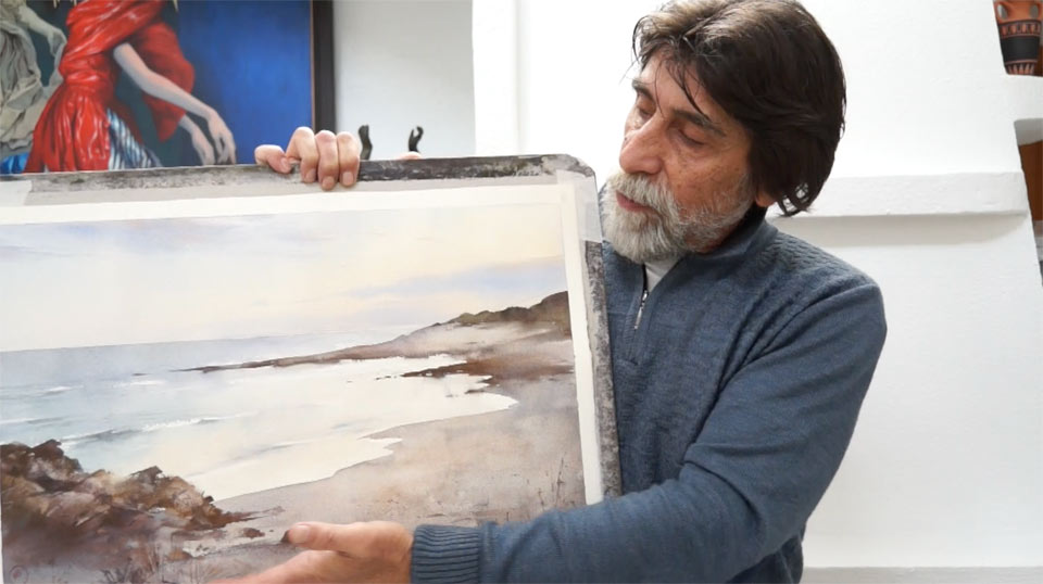
In this video lesson, you will discover how to paint a seascape in watercolor. Here is the artwork that I will get by the end of this lesson. This seascape is quite simple – it is just before sunset, the sky is reflected on the sea, and there are few details on the foreground.
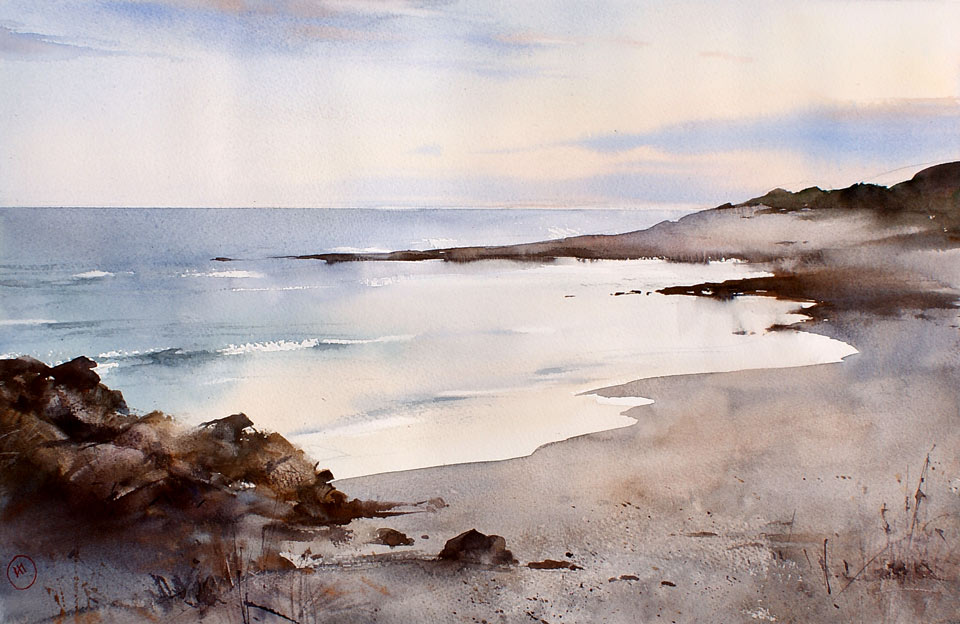
Let's begin. We will start with the composition drawing. I paint this seascape from memory; that is why the composition does not have to follow a specific sea view precisely. First, we need to decide on the big masses. What do you want to show more – the sky or the sea? It is advisable not to place the horizon line exactly in the middle. In this artwork, I have decided to give more space to the sea and to the shore. Therefore, I am placing the horizon line a bit higher, and I am giving about one third of the height to the sky. I draw the horizon freehand – you don't have to use a ruler to make a straight line. If you would prefer, rather than having one third of the sky and two thirds of the sea, you could use a Golden Proportion instead. A composition always looks better when some Golden Ratios are there.
It is a very schematic sketch without many details. So far, I am only interested in general masses, such as the area of the sky, mountains and the sea with the shore. Do not worry if you do not see too much of this drawing; this is because I am using very light pencil pressure. This sketch is almost invisible – the actual drawing will happen later, when I do this with a brush in watercolor. I don't have the final picture of every detail in my head for now; this will happen later, when I see this artwork in color – at the moment, faint lines are enough to define the composition. This watercolor will be made using the 'alla prima' painting technique.
When painting landscapes or seascapes, it is always better to start from the top, so we paint the sky first. In most cases, the sky is darker at the top, and lighter closer to the horizon. Of course, there could be some exceptions, when particularly dark clouds change this rule. I will use the round mop brush to paint the sky. In our case, the sky has a visible gradient, from colder more blueish colors at the top, to warmer or yellow colors closer to the horizon. For the warm part of the sky, I use yellow ochre light and I add a little bit of Cadmium orange. Cadmium yellow can also be added to the mix. I must point out that these Cadmium paints were used before Windsor & Newton created a new range of Cadmium-free watercolor paints.
For the sky, I use the wet-on-dry painting technique, the brush is fully loaded with paint, and I am covering the whole area of the sky with a very light-yellow tint. You can see that, on my palette, the warm mix consists of two areas: a bit warmer on the left-hand side, and more yellowish on the right-hand side. I add a little bit more Cadmium orange, as well as Cadmium red, into the sky to warm up the color. I add these warmer colors closer to the horizon. This means that the sky will be a gradient, not only from darker to lighter tonal values, but also from colder to warmer colors.
While the paper is still wet, I will introduce blue colors to the sky. At the top part of the sky, I add the Ultramarine pigment. You may notice that I do not apply brushstrokes to the very end, on the right-hand side. This is where the Sun is, and I am suggesting the sunset by painting this way. I mix Ultramarine and Cadmium red pigments, to achieve a violet color. After a few wet-into-wet brushstrokes, I rotate the board at different angles, so that the paint can flow on paper and make a softer gradation.
After spraying with the atomizer, you may get some water droplets on the paper. There is nothing to worry about; it is easy to take off such droplets with a soft, wet brush. Make sure that the brush is clean before touching paper with it. Excess water can be absorbed with the brush or with the paper towel. I rotate the board so that gravity does the job; liquid paint flows in all directions, and the gradation of tones and colors becomes even smoother. It is important not to hurry, because while the paper is still wet, we can rotate the board and achieve a very nice color gradient. You may spray the sky once again if the paper dries too quickly, and then rotate the board at various angles once again. Next to the horizon, I would like to make the sky a bit more violet, so the mix of Ultramarine and Cadmium orange is added wet-into-wet. I once again pick up and rotate the board to produce a softer gradient. If wet paint flows uncontrollably it can be fixed by simply rotating the board up and down to achieve the desired result. While the paper is wet, I can add more paint, to make the sky darker. I continue rotating the board, to allow gravity to be my co-creator. I also add a little bit more Cadmium orange, close to the horizon line. This pigment is applied on the right-hand side, where the sun is.
One of the most important skills in watercolor is to judge how much water is required. If there is not enough water, the paint won't flow, and if there is too much water, the paint will run away. Such skill only comes with practice. This applies both for water on the paper, as well as water on the brush. If you have some challenges with controlling the paint flow, it comes down to the amount of water on both the paper and the brush. When you are happy with the tone and color of the sky, you can leave it alone and wait until the paper dries. However, if you would like to continue with the sky, for example to add some clouds, you have to keep an eye on the wetness of the paper. This includes not letting it dry completely, so that you can use the wet-into-wet painting method when depicting clouds.
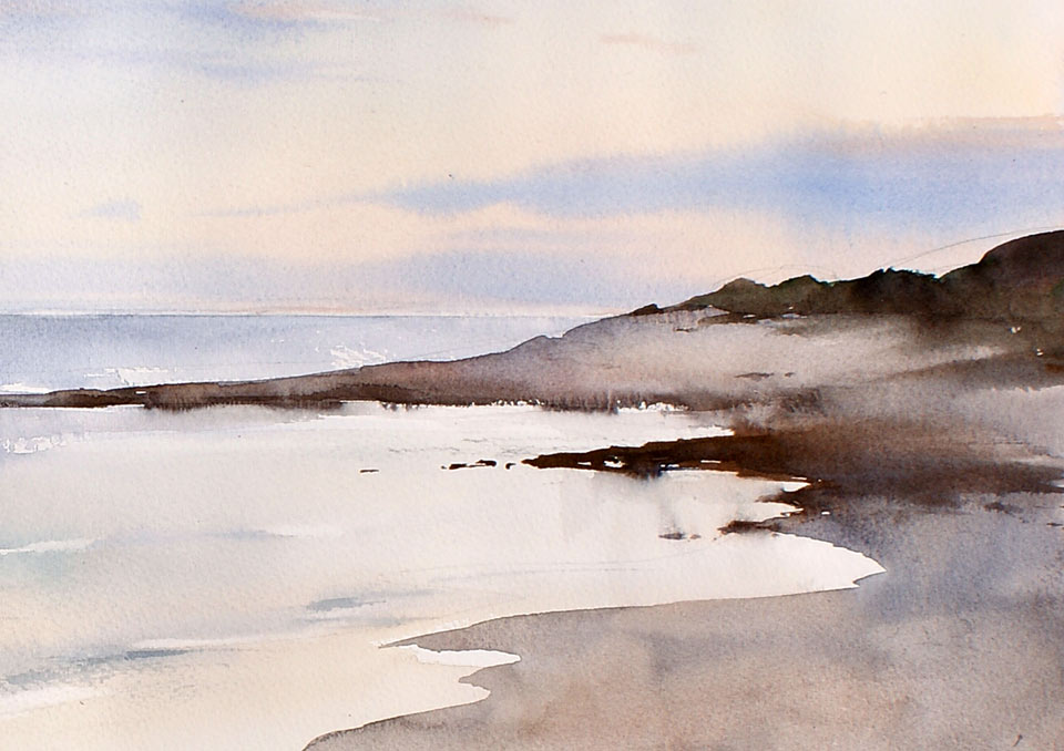
Watercolor is a transparent medium, so in many cases, pencil strokes will show through the paint. This is fine – there is nothing to worry about. I then wait for the sky to dry a little bit more, before I continue painting the clouds. The moment when I can do this depends on how wet the paper is. Having the ability to tell the paper wetness accurately only comes with practice. The drying time depends on many factors: how wet the paper is, how thick it is, and both the temperature and humidity in the studio. If the horizon line is not straight enough, you can fix it with a paper towel – just fold it in half and press it along the horizon line to absorb the paint. You may need to repeat this process a couple of times, in order to obtain a clean edge. The paper is still too wet to paint the clouds - you can tell this due to how shiny it is. However, if your creative goal is to paint clouds that spread freely across the sky, you may experiment without waiting. Here I will demonstrate the results that you would achieve, if you add clouds at this step. I am using pure Ultramarine for this purpose. Just a few fast brushstrokes, of this deep blue color, create an illusion of far-away clouds next to the horizon. Painting wet-into-wet allows us to make very soft and diffused clouds. You may wonder if it is beneficial to use a hairdryer to speed up the drying process – I would say that I would wait until the paper dries a bit more naturally, so you that you don't dry it too quickly, as can happen when using this fast-drying method.
Here is one good tip for painting a sea: make very fast brushstrokes and leave some gaps between them, leaving white paper untouched – such gaps will suggest the existence of white waves. The cold violet sea color is applied next to the horizon. I add dark green to Ultramarine, to paint the middle ground differently from the background. Closer to the foreground, I also add yellow ochre to the mix. Such gradation from cold to warmer colors creates an illusion of an aerial perspective. I can also add Cadmium yellow and Cadmium orange to suggest that the water is transparent, and the sand shows through the waves. While the paper is wet, I can rotate the board, allowing the paint to flow and intermix. Then, using a clean synthetic brush, I wipe off white waves from wet paper. The brush has to be almost dry - but not completely dry – in order to absorb the water more readily. The sea waves are not totally white – they also have casted shadows. To depict those shadows, I use the mix of Ultramarine, Cadmium orange and dark green. In order to make short brushstrokes, you don't need a lot of water on the brush. For now, it is enough for the sea; I can come back to it later, and paint wet-on-dry if required.
When the paper is fully dry, I can accurately take off the masking tape. You can see that the horizon line is very straight and clean. I have to say that the masking tape trick does not always work – sometimes paint gets under the tape and spoils the look; this time, however, I'm lucky. You may also notice that there are a few white spots left on the horizon. This is not intentional, but since it looks very nice, I will probably leave it as it is. I am now ready to undertake the third step of this artwork: to paint its foreground, which is the beach. I will also take care of the mountains in the background. For this purpose, I will use the round synthetic brush number 6. This brush is a bit stiffer than the natural hair brush, and is ideal for well-defined brushstrokes.
I use the mix of Ultramarine with Cadmium orange to achieve the grayish color of the ground. To warm up this color, I add a little bit of Cadmium red and Cadmium orange. According to the rules of aerial perspective, the objects which are further away from the viewer appear colder, so I add more cold Ultramarine. I also add reflection into the sea, by making a few brushstrokes with clean water, so that the paint can easily run in this wet area. In the middle ground, we have another stretch of land – because it is closer to us, I have to make its contrast sharper and the color darker. With the sharp shoreline in place, I can now paint the larger stretch of land. For this purpose, I will be using a bigger brush. The same paints – Ultramarine and Cadmium orange – are used for this mix. To suggest the shadow, I add a bit more Ultramarine to make the ground colder.
I am using free and wide brushstrokes to fill in the space of the beach. I can now add some smaller details to the ground, using short brushstrokes to suggest cast shadows and wet stones. It is important not to overdo it though. You may notice that the same two main colors, Ultramarine and Cadmium orange, are used in many places of this artwork. The amount of each color makes the mix colder or warmer, and the amount of water on the brush makes it darker or lighter. This way, it is possible to get so many gradations of cold and warm colors, as well as dark and light tones, out of only two paints. For the background mountains, I use the same Ultramarine and Cadmium orange, while also adding a little bit of green.
I use a flat brush to suggest the texture of the foreground; this brush is almost semi-dry, has very little water, and touching it lightly and swiftly across the paper produces an interesting texture. By touching the paper with the tip of the flat brush, it is also possible to suggest the vegetation and small stones on the ground. I have to say that it is very important not to overdo such drawing with the brush, because it may overpower the rest of the artwork, and attract all the attention to the secondary decoration. For the rocks on the left-hand side, I use the same Ultramarine and Cadmium orange paints to keep all colors of the artwork in harmony. Because these rocks are on the foreground, they are more orange than the ground in the middle and the background. I am using loose brushstrokes not to describe the rocks and stones, but to suggest them. You may also see that the tone of these rocks is much deeper. Brighter and bolder colors bring objects closer to a viewer, while darker and colder Ultramarine is used to suggest shadows. Cadmium red is added to the mix, to make it warmer and darker.
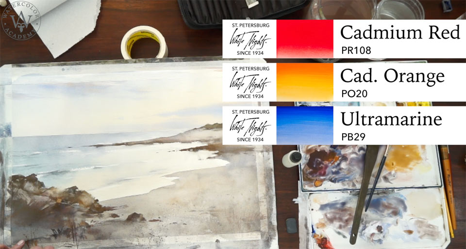
With a piece of plastic card, I can scrape some paint to achieve highlights on the rocks, and create some additional texture. I don't use this technique too often, but you may experiment what texture you can achieve with a piece of plastic. Too sharp edges of the scraped paint can be softened up with the wet brush. Here is another trick you can use: I cover the top half of the artwork with a paper towel, and splatter some dark paint. These dark dots will suggest the texture of the sand and small stones. This technique is called 'stippling'. However, it is important not to overdo it, otherwise it will look artificial. Here is another small trick: you can paint with a brush and then scrape this paint with a nail or the end of the brush, to suggest some texture and vegetation. I mix Cadmium red, Cadmium orange and Ultramarine – using a small brush, this dark mix can be applied when drawing some sticks, pebbles and small details...
A self-study, self-paced course where you can learn how to paint in watercolor by watching video lessons and doing assignments
One-time payment - Lifetime membership
$297 USD
One-to-one, unlimited and custom-tailored to your skills and needs Personal Tutoring by the Watercolor Academy teachers
One-time payment - Lifetime membership
$997 USD


