Watercolor Academy Online Course
A self-study, self-paced course where you can learn how to paint in watercolor by watching video lessons and doing assignments
$297 USD
ENROLL NOWA self-study, self-paced course where you can learn how to paint in watercolor by watching video lessons and doing assignments
$297 USD
ENROLL NOWOne-to-one, unlimited and custom-tailored to your skills and needs Personal Tutoring by the Watercolor Academy teachers
$997 USD
ENROLL NOWVideo lesson by Vladimir London
In this video lesson, you will discover how to paint a still life in watercolor, using the multilayer painting technique.
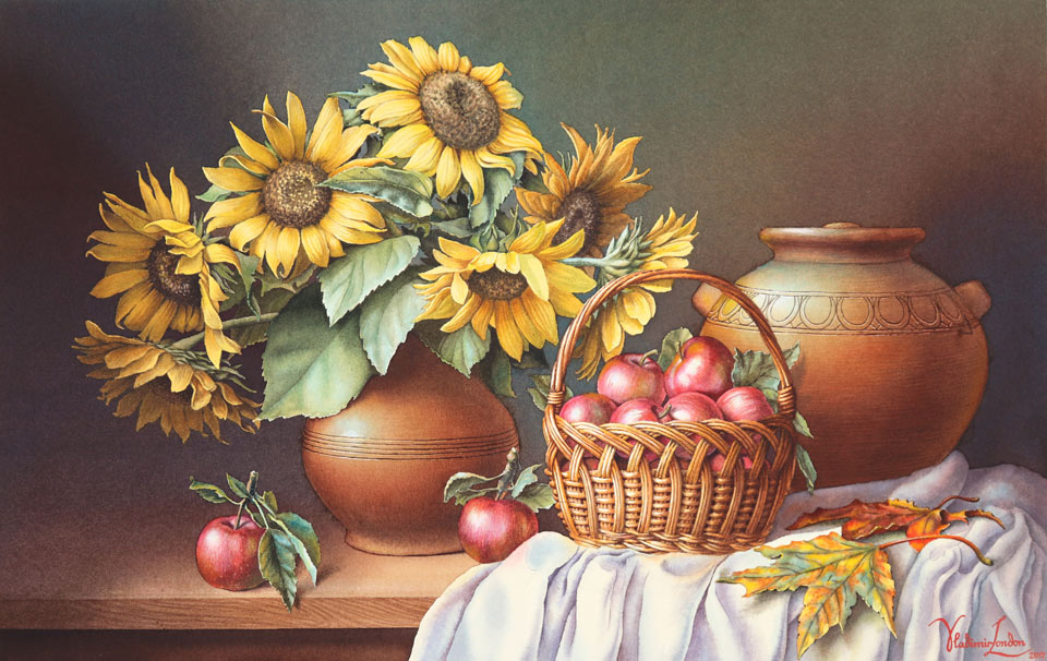
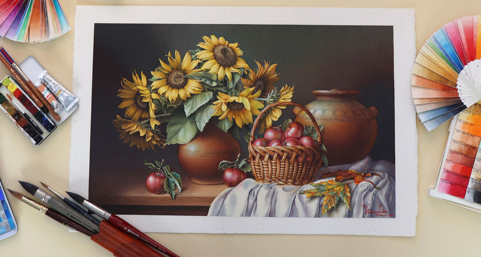
This is the artwork I will have painted by the end of this video.
I will be painting on a half sheet of 100% cotton watercolor paper which is cold-pressed and has 300 gsm weight. This paper is manufactured by Saunders Waterford. I will use a wide, flat synthetic brush to wet the reverse side of the paper. When the reverse side is soaked, I can turn this paper over, place it on the rubber mat to prevent quick drying, and wet its front surface as well. After several minutes, wet paper expands; its size becomes slightly bigger. This is the time to affix the sheet on the wooden board. To do this, I will use a staple gun and strong tape, which I think is made of polyester or some other synthetic material. This tape is totally optional, but it will make removing the staples easier at the end. While the watercolor paper is drying, I will do a cartoon drawing to scale. The term "cartoon" in classical art means a full-scale drawing which will be used to transfer the design onto the artwork support, which is, in our case, watercolor paper. There are many cartoons left from the Old Masters, especially those they used for fresco painting. Because making full scale designs on wet fresco would be very challenging and time-consuming, the Old Masters used cartoons for almost every single fresco artwork they did.
The reason I'm doing a cartoon drawing for this watercolor is exactly the same: To protect the white, clean surface of the paper from any dirt and re-drawing, which are the sub-products of redoing the composition and fine-tuning contours and outlines of the drawing. I draw this still life design on a cheap, disposable piece of paper in graphite pencil.
If you feel your drawing skills need improvement, you can do that by taking a Drawing Academy online video course. In this course, you will learn how to draw whatever you see or imagine using traditional drawing techniques, with the necessary knowledge of such constructive drawing principles as linear and aerial perspective, rules of composition and proportions, proficient tonal rendering techniques, and much more.
I traced the cartoon drawing on tracing paper; flip the paper on its reverse side, and now I will repeat every single line in graphite pencil once again. So, this tracing paper will have exactly the same drawing on both sides. Then, I place the tracing paper on top of the watercolor sheet which is absolutely dry by now, affix it to the board on one side with masking tape, and now I am outlining every single line using a pen. Outlining with a pen makes it easier to see which lines I already did and which lines remain to be transferred. Repeating the same drawing on both sides of the tracing paper is needed to avoid a mirror image.
When the drawing is transferred, I can take the tracing paper off the board and now I will mask white margins of the watercolor sheet with masking tape. Because I plan to do a multi-layer watercolor, there will be several cycles of wetting this paper and paint might get underneath the masking tape. To prevent this, I will apply a masking fluid with a ruling pen, which gives very straight lines, especially when used together with a ruler. This is exactly what I want: Very straight edges of white margins around the piece. Because the masking fluid slightly overlaps the masking tape, it is very unlikely that water will get under it. While I'm working with the ruling pen, I will also apply masking fluid in some places in this artwork, which I would like to keep white for now. When the masking fluid is totally dry, I can do a very light first wash which is called imprimatura. For this layer, I'm using quinacridone gold paint from the Winsor & Newton paints range. It is a convenient mix of three pigments: red, violet, and yellow, mixed into one paint by the manufacturer. But you can easily mix a similar color using separate pigments from your paint box. What I like about this paint is that it's permanent and highly transparent. These are the qualities I'm looking for in the underlayers.
I apply the tint of this gold paint using the "saw wash" technique. Numerous diagonal brush strokes look like teeth of a saw, hence the painting method's name. I cover the whole sheet with the same paint mix, without paying any attention to the drawing. This is imprimatura. When the first wash is totally dry, I can now apply more masking fluid to cover very light areas of the drawing, for example, the petals of the sunflowers. I can add the next layer only after the masking fluid is fully dry. Now, I'm using the burnt sienna paint which has excellent permanence and is very transparent. This paint contains only one pigment, which takes its name "Sienna" from the place it was sourced during the Renaissance period. I also use the saw wash for this layer. When this layer is fully dry, I turn the board upside-down and apply clean water with a wide, flat brush in one corner to prepare this area for the wet-into-wet gradated wash. For this wash, I will use the same tint. If you wonder, why not do the same color in full strength from the first wash, there are several reasons for this. When painting in multiple layers, you'll have a much greater control over the tonal values. This way, you can build up the tones, little by little, as precisely as you want. Another reason is that you can achieve smoother gradations when painting in several layers. This way, it is easier to avoid accidental harsh borders between brush strokes. Also, multiple layers will look different than one layer of the same paint in full strength.
The paper is now dry and I'm masking additional bits of the piece. I can continue painting only after the masking fluid is totally dry. With a flat, wide brush, I'm applying clean water all over the artwork to prepare it for the next wet-into-wet wash. For this wash, I premixed three colors with yellow, red, and blue hues. The saturation of these colors is muted because they will be used for the background which I don't want to be very colorful. Using a soft, natural-hair mop brush from Escoda, I apply these three pigments, one next to the other, quite randomly, and softly diffusing the borders between the colors, directly on the paper. This method is called the wet-into-wet variegated wash. Because the board is tilted at about 15 degrees, the paint flows down. To distribute it more evenly and smoothly, I can rotate this board at different angles. When the paper dries, the colors become lighter. To make another wet-into-wet wash, I moisten the dry paper surface with clean water using a flat, synthetic brush.
The same three shades of yellow, red, and blue are used for the second layer of the variegated wash. Because I don't follow the exact areas of the three colors which were previously applied, the variation of background colors becomes even smoother. This is the same reason why I'm doing multiple layers instead of painting in full color from the first wash. I want to achieve an optical mixing effect, which looks quite different when the same pigments are painted alla prima in one go.
I tilt the board at different angles once again to make a smoother gradation between colors. Then, I will leave this layer to dry fully. To apply another layer of the variegated wash, I will first wet the dry paper surface with clean water and then paint with the same three pigments once again. With every layer, the background becomes darker and the effect of optical mixing becomes more and more apparent. I'm tilting the board for paint flow in different directions. I fully dried the previous wash and wet the paper once again before turning the board upside down to continue painting wet-into-wet. To the previous palette of three colors, I added another one to widen the color range. The creative task I have in mind is to achieve a very dark and slightly cool background on which light and the warm sunflowers will stand out. That is why, for each successive wash, I use a darker mix of paint and follow the rule that darker pigments must be applied on top of lighter tones. I am now applying the masking fluid to preserve colors and tones on the areas I don't want to be any darker. After the masking fluid is fully dry, I wet the paper surface once again with clean water to prepare it for the wet-into-wet variegated wash. For this wash, I again increase the shade of four pigments - yellow, red, blue, and violet - and paint the background even darker.
There is one important question: How dark can I go with these washes? And the answer is: I can paint as dark as I need, providing - and this is very important - that the darkest tone still remains transparent and the white paper surface shows through it. So, this is as dark as I can go without breaking the transparency rule. When this layer dries, it will become lighter and I will not touch this background any more. To complete the foreground, I will paint the tabletop. With the background in place, I can take off all masking, including the masking tape and masking fluid. With the background in place, I can now start painting the still-life objects. This still-life is arranged indoors with cool light that is filtered through the sky coming through the window. That is why the highlights of the objects are cool, while the shadows, which are colored by the reflected light, are warm. So, I apply a very light blue tint for the highlight of the vase.
When this tint is fully dry, I wet the vase with clean water to paint its intrinsic brown color, wet-into-wet. A light tint of raw sienna will be used for the underpainting. I do a gradated wash, wet-into-wet, preserving the light highlight in the middle of the vase. To deepen up the tonal value, I'm now adding burnt umber into the mix. Similar to sienna, burnt umber is also a transparent pigment with excellent permanence. I will let this layer fully dry and then wet this area with clean water to prepare for the next wet-into-wet gradated wash. This time, I warm up the mix by adding light red, a semi-opaque one-pigment paint from the Winsor & Newton color range, to increase the saturation of the vase color. This pigment also has extremely high permanence because it is a red-earth pigment, which is based on natural and synthetic iron oxide. After repeating the cycle of drying the paint and wetting the paper with clean water, I will now add the colder and darker mix to build up shadows on the vase. I wet the paper surface after each wash is fully dry to paint the following layer wet-into-wet. This technique achieves a very smooth gradation of colors and tones which I would like to have for this clay vase. Painting in layers serves several purposes. This way, I can have full control over how tonal values and colors develop. Because it is done a step at a time, after each drying, I can see precisely what color is formed. Also, more importantly, this way I can obtain the optical mixing of colors. Optical mixing means that the final color of the vase combines all the colors of every layer that is painted here, and this color would not be achievable in any other way, for example, by mixing all the pigments used on the palette and then painting with this mix alla prima in one attempt. This is very much what the Old Masters used to do when painting in oils by applying different colors in multiple layers, allowing every layer of oil paint to fully dry before making a new glaze on top. Of course, oil painting is very different from watercolor; but, nevertheless, some painting techniques make sense in both mediums. I'm now painting the big leaded jar in the same way as I did the vase. First, I painted a very light blue tint to depict its highlight and now I'm adding warm orange and brown pigments to paint the jar's intrinsic color using the wet-into-wet gradated wash painting technique.
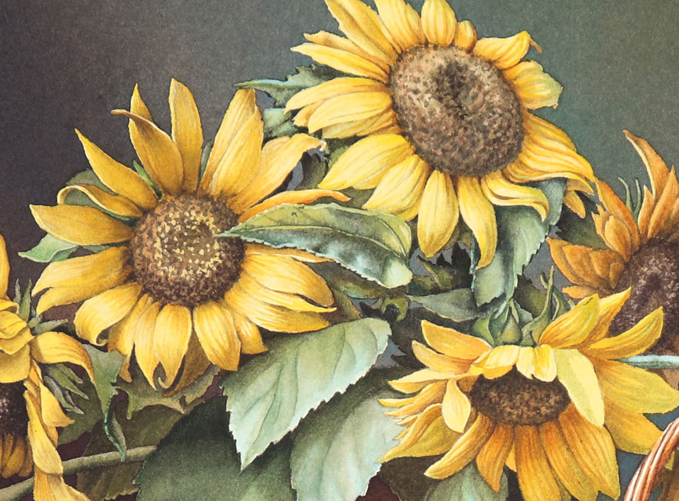
There are several rules you should keep in mind when doing multi-layer painting. One of the most important rules in watercolor is to paint from light to dark. This means that it is better to start with light areas of an object, such as highlights and lights, then progress to the mid-tones, and, finally, finish these objects with shadows. Another watercolor painting rule you need to know is that it's better to start with paints that consist of dyes or very finely ground pigments, and, to finish painting an object by using paints that contain heavier and bigger particles of pigments. Needless to say, you need to have a certain knowledge of each paint in your box. Is it finely- or coarsely-ground? Does it have excellent permanence or will it fade and change color over time? Is it transparent or opaque? What drying shift does it have? How much lighter and duller will it become as it dries? How will it chemically react when mixed with other pigments? There is one more watercolor painting rule that is good to know but not always easy to follow: It is better to start painting with warm colors and finish by glazing with cold pigments. Cold colors will look better when applied on top. The knowledge of painting rules together with the knowledge of your pigments will give you the extra edge when it comes to making beautiful watercolor paintings. I'm now painting the sunflower petals. For their light-saturated yellow color, I may use either aureolin, which is cobalt yellow, or, for example, cadmium lemon or cadmium yellow, which can be replaced by cadmium-free alternatives, cadmium-free lemon or cadmium-free yellow pale. Cadmium and cadmium-free replacement paints have a slightly better permanency than aureolin. However, the cobalt yellow is more transparent than cadmium paints, which are opaque. So, the choice of the yellow pigment is down to your personal preferences and what you have in your paint box. There is no right or wrong decision here. The choice will very much depend on your creative task.
For the darker yellow shades, you might experiment with the golden green paint from the Old Holland range. This pigment is semi-transparent and contains just one pigment, PY129. As its name suggests, this yellow color has a green shade which will look quite nice in combination with the green leaves of the sunflowers. The same pigment paint has a different name in the Winsor & Newton collection of watercolors; it's called green-gold. Also, it is interesting that Old Holland golden green is semi-transparent while Winsor & Newton says it is transparent. Different petals of the sunflowers were masked at different steps. Those petals that are in shadow already have the background wash color. This underpainting helps in separating light and shadow tones on this piece. Because of masking, the sunflower discs already have some texture. It makes the job of painting them much easier. I paint the disc floret in a light warm tint and apply the darker shade for the seeds. I apply the seeds' texture with a small round brush.
Now I will say a few words about how to paint the sunflower leaves. Because, in our case, the light is cold, I first paint the whole leaf with a light blue tint which will be the highlight color. While this first wash is wet, I add a green mix on top, wet-into-wet. A green color for vegetation always looks better if, instead of manufactured green paint, you mix your own green from yellow and blue pigments. Which yellow and blue to use? It's totally up to you. I would advise experimenting with many combinations to see what colors you can make and what shades you like best. You may mix pigments on the palette or directly on the paper to get different colors, and the technique you use - wet-into-wet or wet-on-dry - will also influence the appearance of a leaf.
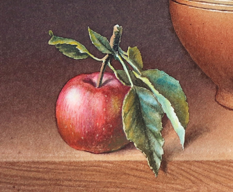
Let's take care of the apples in the basket and on the table. For their cool light highlights, I'm also using a very light tint of blue paint. Then, I work on tonal values, from light tones to darker ones, keeping in mind that every apple is a sphere. As such, an apple's tonal values can be divided into three main groups: light, mid-tones, and dark values. Each of these three groups can be subdivided into three values. Light contains highlight, light and local light; mid-tones will have light half-tone, middle half-tone, and dark half-tone; and, in turn, dark values can be subdivided into core shadow, form shadow, and accent.
In the Watercolor Academy course, I explain different painting methods and techniques by painting the same apple in different ways. So, I will leave it up to you to decide which painting technique you like the most, and which is best suited for your personal style and creative goals. You can paint apples using glazings, alla prima, or maybe dry brush, or even retouching. Whatever fits your personal preferences the best.
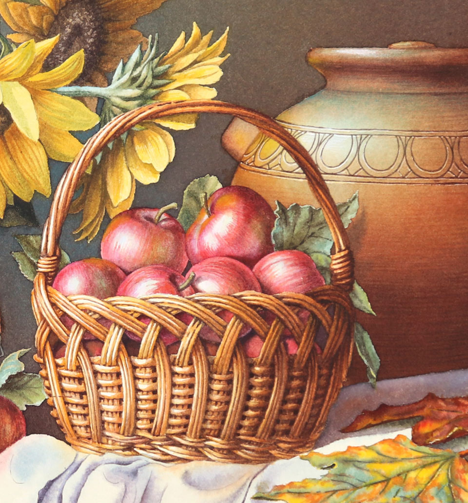
It's time to paint the basket. For its warm yellow-orange color, I will use cadmium yellow and cadmium orange. I would like this basket to look bright and warm and, therefore, will start not with a pale blue tint for its highlight, but immediately with the yellow mix. The sequence of painting steps will go from light to dark tones, so I'm starting with the highlights. To paint this basket in a realistic manner, I will depict quite a number of details, so the process will be rather slow. Anyway, this basket has a cylindrical shape and I need to keep this shape in mind to define its tonal values, which include light, mid-tones, and shadows. I'm painting this basket wet-on-dry because it gives a high definition for small details and works well for its intricate design.
Each successive paint layer I apply on this basket is a bit darker than the previous one. This suits the main watercolor rule of painting from light to dark tones very well. The choice of pigments is less important than correct tonal values. One or another yellow, orange, red, or brown pigments would not influence this basket's appearance much. If tonal values are done correctly, this basket will look like a basket regardless of which exact yellow pigment I used. It could be cadmium yellow or cadmium lemon - it doesn't really matter because a very similar-looking basket can be painted in very different pigments. So, for example, I can pick cadmium yellow, gold ochre, and caput mortuum violet to paint the whole basket. Now, it's time to paint the white drapery lying on the tabletop. I would like to do it wet-into-wet and, to do so, I apply clean water on the paper's surface. For the highlights, I will keep the imprimatura color, which is already in place. For cool light, I will use a light blue tint which is desaturated to be almost gray. The drapery's shadows will be darker and warmer. When painting white objects, here is one good tip: it is better to avoid manufactured black paints to get light gray tints. You can get colorful grays by mixing complementary pigments. When the drapery has multiple folds and you'd like to depict it in a realistic manner, there is no one magic shortcut which will make it fast. You'd have to work on the tonal values of every fold.
When painting shadows, you have to keep in mind that shadows are not only the absence of direct light but they are also colored by the light bouncing off nearby objects. That is why the shades of such colors will depend on the reflected light color. For example, the casted shadow under the maple leaf will include colors this leaf has...
A self-study, self-paced course where you can learn how to paint in watercolor by watching video lessons and doing assignments
One-time payment - Lifetime membership
$297 USD
One-to-one, unlimited and custom-tailored to your skills and needs Personal Tutoring by the Watercolor Academy teachers
One-time payment - Lifetime membership
$997 USD


