Watercolor Academy Online Course
A self-study, self-paced course where you can learn how to paint in watercolor by watching video lessons and doing assignments
$297 USD
ENROLL NOWA self-study, self-paced course where you can learn how to paint in watercolor by watching video lessons and doing assignments
$297 USD
ENROLL NOWOne-to-one, unlimited and custom-tailored to your skills and needs Personal Tutoring by the Watercolor Academy teachers
$997 USD
ENROLL NOWVideo lesson by Vladimir London
In this video lesson, you will learn how to paint a realistic still life in watercolor, using different painting methods and techniques.
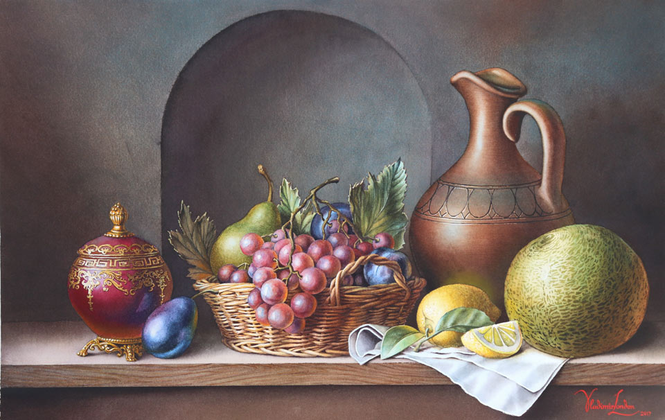
Here is the finished piece that will be done by the end of this video lesson.
I will begin this lesson by making a still life composition. I will draw not on the watercolor paper, but will make a preliminary drawing on a disposable sheet of drawing paper. To make a good-looking composition, I will use the golden proportion caliper. To begin with, I will measure the golden ratio horizontally. Do not worry if you don't have a caliper; you can do the same measurement using a ruler and a calculator. Just divide any measurement by 1.62 and this will give you the golden proportion. You can also subdivide some measurements in the golden ratio once again, as I just did in this video. The way to use the golden ratio in a composition is to align key points of your drawing with the measurements you get.
Just to let you know, this is not the way I do every single artwork. Instead, I draw what looks pleasing to my eyes and, only if I have any doubts, I may check some points using the golden caliper. If you do the same, you might be surprised by how many key points you just draw by eye may coincide with golden proportions.
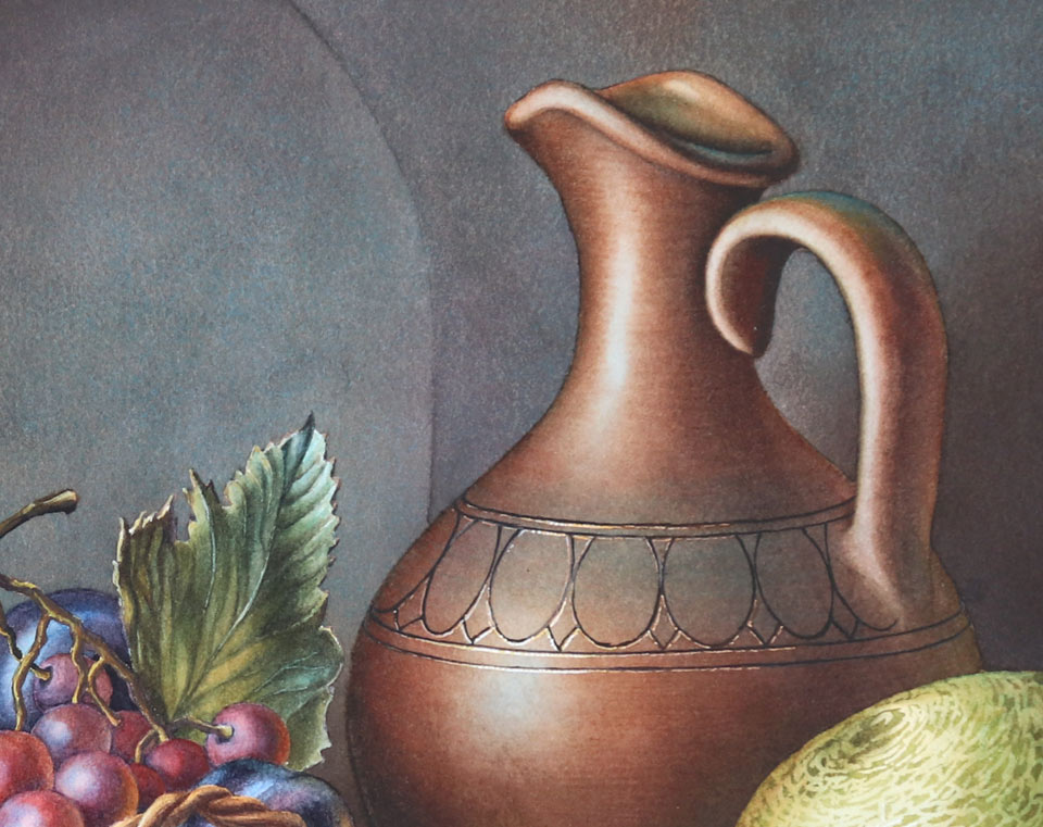
On the right-hand side, there is a jar made of brown clay. This object is almost symmetrical, apart from the handle and the top rim, and that is why I started drawing this jar by depicting its virtual vertical axis. Then, I added horizontal lines, which serve the purpose of the main axis of three ovals, and added those ovals using the rules of linear perspective. You can see that I'm drawing this jar as if it were totally transparent. This is one of the main rules of constructive drawing. If you draw all objects as wire frames, you will avoid many constructive mistakes. For example, I just added a melon and now, I will draw the footprint of the jar, projected to the ground. This footprint corresponds to the level where the widest part of the melon is, which is also projected as an oval on the ground. These two footprints, marked as ovals, only touch but do not intersect each other, which means that the melon does not intersect the jar.
If what I do in this drawing is not fully familiar to you, then you might have some gaps in your understanding of constructive drawing principles. Do not worry; those principles are not so difficult. You can easily learn all you need to know about them in the Drawing Academy online course. In this video course, you will learn how to draw whatever you see or imagine by watching 45 video lessons. Those lessons give in-depth information on linear and aerial perspective, rules of composition, golden proportions, proficient techniques of tonal rendering, and much more. The Drawing Academy course comes with a lifetime membership and unlimited personal support from the course tutors, which includes critiques of your artwork and answers to your art-related questions.
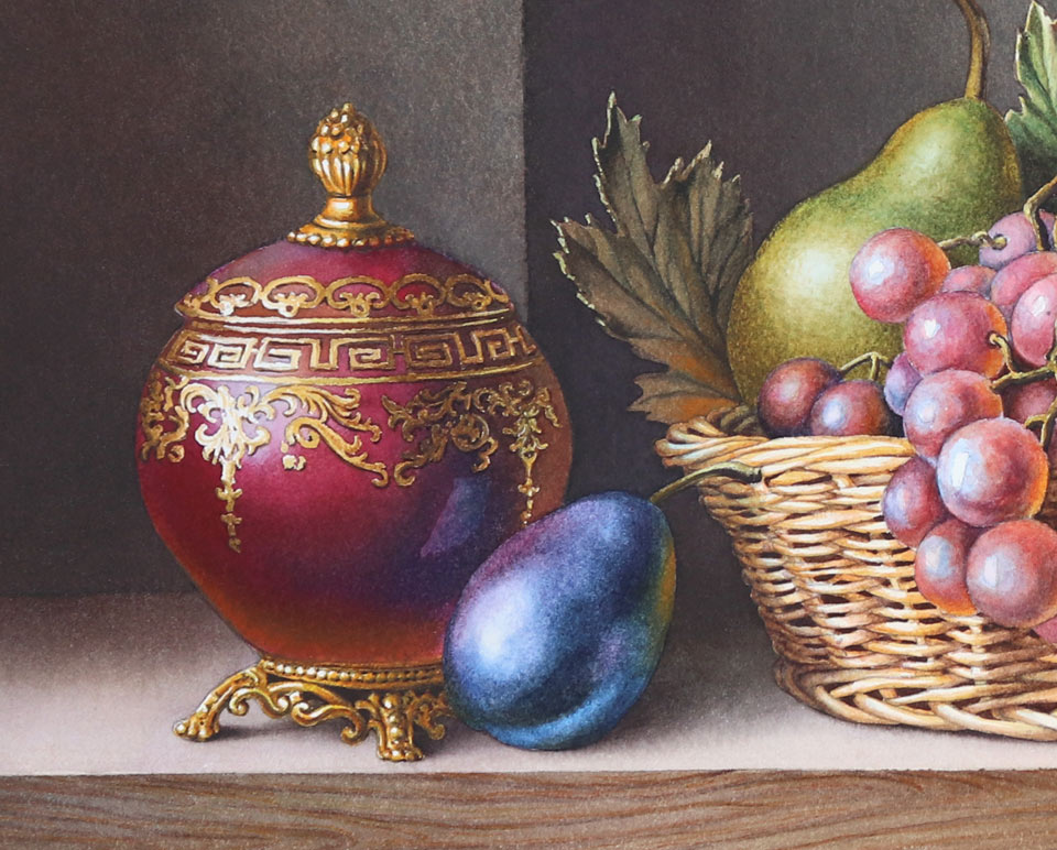
In the middle, will be a basket full of fruit, and, on the left-hand side, I will add one more, smaller jar to balance this composition. Once again, I depicted a vertical virtual axis of the jar's symmetry, added the secondary horizontal axis, marked symmetrical oval of the shoulders, as well as the oval of the jar's neck. This small jar will have four feet and the lid. Next to this jar will be a blue plum. Now I will add the big jar's decoration design. To do it believably in perspective, I first draw a virtual circle and divide it into 16 equal segments. These segments will help me to mark eight visible sections on the curved body of the jar in perspective with the necessary precision. If I lost you somewhere with this geometry in perspective, do not worry. This video is not about how to draw jars but how to paint a still life in watercolor. If you have some questions about constructive drawing, you will find all the answers in the Drawing Academy course.
You can see that the drawing I have done is quite messy. It won't be a good idea to do it directly on the watercolor paper. To transfer this drawing, I will use tracing paper. It's placed on top of the cartoon and fixed in place with masking tape on one side. Now, I can accurately trace every line I need with a thin, graphite pencil. I think this mechanical pencil's lead is half a millimeter thick. First, I check the drawing to see if all lines are in place. Then, I take the tracing paper off and turn it over. Now, I have to repeat every single line on the reverse side; I do it in thin graphite pencil as well.
The sheet of good quality watercolor paper is fixed to the board and I place the traced drawing face up. After sticking the tracing paper to the board with masking tape, I accurately transfer the drawing by repeating every line, now drawing with a pen. The reason I use a pen and not a pencil is to clearly see which lines are transferred and which lines remain.
To achieve a nice-looking white margin around the still life, I preserve it with masking fluid. Afterwards, I will put masking tape on top. When the masking fluid is fully dry, it's time to start painting. I premixed a light tint of orange color to make the first wash, which is called imprimatura. I will cover the whole piece with this mix, apart from several places I would like to keep white. I apply this wash with the natural-hair Escoda mop brush, which takes a lot of paint and releases it nicely on the paper. The painting method I am using is called the wet-on-dry plain wash. I tend not to use masking fluid unless it is absolutely necessary. It is better to preserve white by painting around areas without applying any masking. I will now allow this wash to fully dry.
When the first layer is dry, I can now continue with the second wash. For this, I premixed four very dark shades of red, blue, green, and purple colors. I apply this mix, wet-on-dry, placing all four colors on the paper, randomly next to each other. This painting method is called the variegated wash. You can see that tonal values of all four mixes are approximately the same, but hues are different. Once again, I paint around areas I would like to preserve without using any masking fluid. You can see that the dark wash has some backruns and this is fine because this texture will become an intrinsic part of this painting. I diluted paint with water to get a lighter tint for the table top. I will thoroughly dry this layer now.
The board is tilted about 15 degrees. I turn it upside down for the next wash from the bottom up. For this, I use just one color. On the right-hand side, I applied clean water first, and now will do the wash wet-into-wet. This will help me to soften up backruns of the previous wash. This technique is called the wet-into-wet plain wash. If you wonder which pigments I am using, you may mix any complementary dark colors you like to achieve a dark, neutral shade. By adding cool or warm pigments into this mix, you will make this dark color cooler or warmer. For example, you can mix blue ultramarine, sepia, and cadmium orange to obtain the whole range of gray colors which can vary from cool blue to warm brown, especially if you add some red paint into that mix. The paper surface is wet and, to protect it from smudging paint with my hand, I will use this self-made wooden bridge. The dark background is in place and it's time to paint the still life objects. I'm applying clean water over the jar with a soft, flat brush. In this piece, all lights will be cool and all shadows warm.
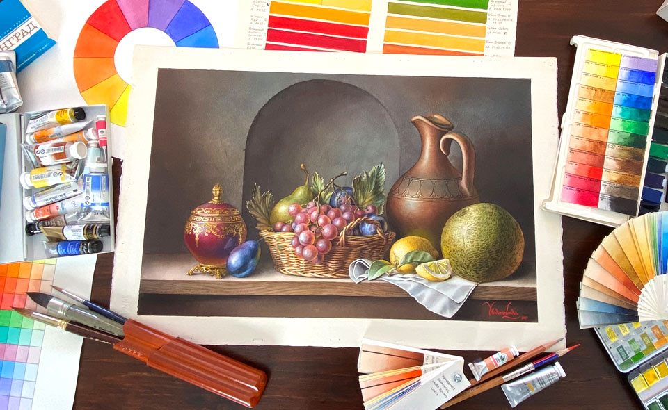
In watercolor, it's better to start from light tones and then continue to mid-tones and shadows. That is why I start from the highlights of the jar, applying a light blue tint with a round brush. Excess water can be wiped off with a damp, flat brush. I will also wet the melon with clean water. The same light blue tint is painted wet-into-wet to be the lightest tone of the melon and, while the paper is wet, I will also add the light colors of the melons, painting them around the highlight. This melon is essentially a sphere and, as such, it has the entire range of tonal values, starting from the highlight, then light, mid-tones, shadow, reflected light, and casted shadow. I will do this gradation from light to shadow not only with tones but also with temperatures of colors, from cold blue to warm red. For now, I will leave the melon to dry and come back to the jar.
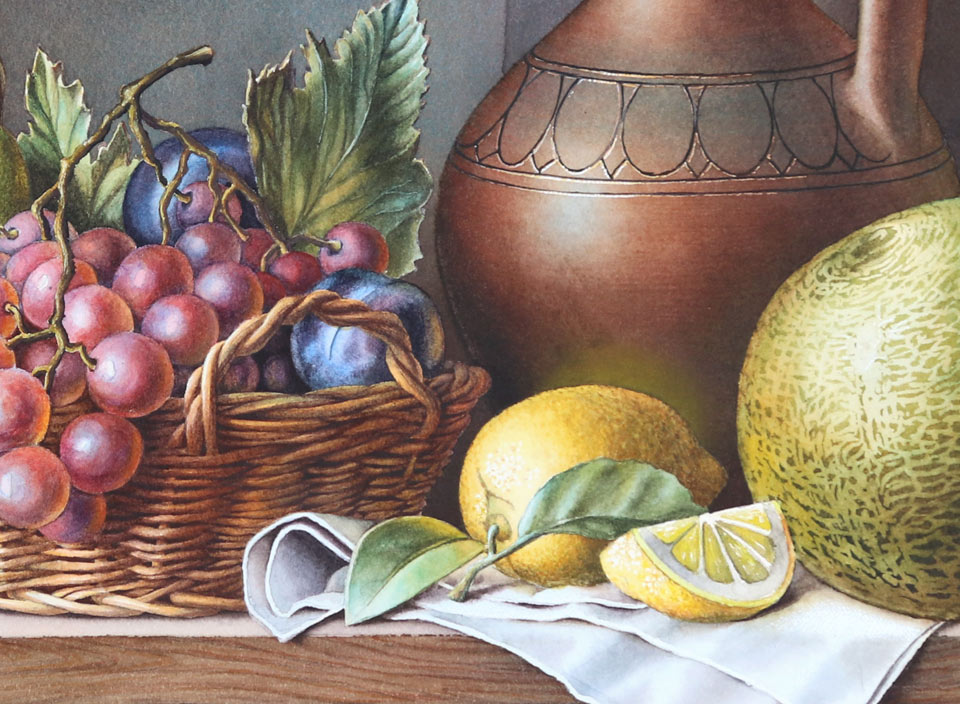
It is already dry and, to continue painting it wet-into-wet, I will moisten it with clean water. This time of the year, the humidity is very low in my studio and wet paper dries very quickly; so, I don't have the luxury of spending too much time painting around the melon because, while I'm doing it, the moisture dries and I can't continue painting wet-into-wet. So, I have to use an alternative way to preserve white space by applying a masking fluid. Now I don't have to pay too much attention to the borders around the melon and the lemon, and can concentrate on painting the body of the jar. I do it with a natural-hair Escoda round brush, applying a premixed brown color to the shadow areas.
For the light tonal values, I will continue using a light blue tint. I am applying this tint wet-on-dry. So, the previous layer is fully dry by now. This is a very simple, plain wash. The board is tilted at about 15 degrees, so the paint flows down and the bead collects at the bottom edge. With every brush stroke, I move this bead further down, filling the whole area with light blue paint.
I let the previous layer fully dry and now can continue the next wash, wet-on-dry, with a warm red color. This paint mix is also diluted very thinly. I do a graduated wash, preserving the cool light highlight in the middle.
The creative task I have in mind is to make this painting by applying several very transparent washes of watercolor paint. You may wonder, why not paint in full-strength color from the beginning? Yes, that would be a totally reasonable way of making an alla prima artwork, but my goal is different. I would like to get a painting that looks more like the masterpieces by the Old Masters, and painting alla prima would not give that appearance to this artwork. That is why I'll do multiple glazing layers to get a wonderful effect of optical color mixing that cannot be achieved by mixing different pigments on the palette and can only be done by adding layer upon layer of different colors. In this technique, every layer has to be totally dry before applying the next one. You may use a hair dryer to speed up the process.
Because there are so many layers, the progress is quite slow. But imagine how much more time the Old Masters had to invest in their paintings, waiting for every oil paint layer to dry! What takes me two minutes in watercolor would take them up to two weeks. So, yes, multi-layer watercolor painting is slow but, compared to oil painting, it is blazingly fast.
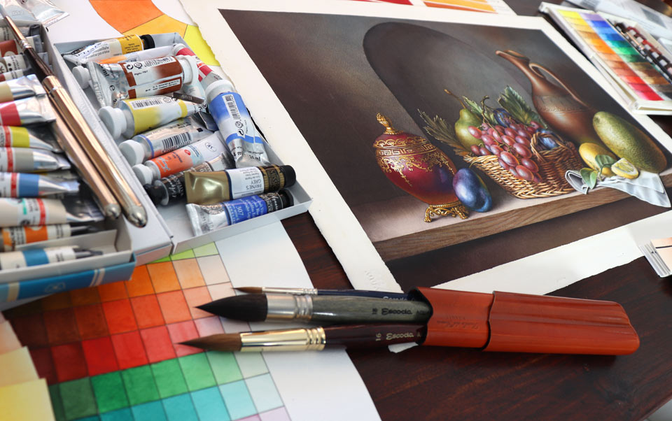
You can see that I'm sculpting the shape of the jar, adding color after color. All these layers mix optically with each other and the colors that are underneath show through the top layers. The effect achieved by such mixing cannot be reproduced by any other watercolor painting technique. You can try the following experiment to see how it works: You can choose any four or six colors, and mix them on the palette together. Apply that mix to white paper and let it dry. Then, take exactly the same pigments and use them separately, layer upon layer, making sure that each layer is dry before adding another one. The key here is to use exactly the same quantity of each pigment as you put in the palette mixture. Now, check how different the first and second results look. You can also change the order of layers to see how this will affect the final color. I hope this explains the reason why I'm making this still life using the multi-layer painting technique. This jar simply would not look the same way if I were to paint it in one layer. Now, I can finish this jar by completing its decoration. I paint these thin lines with a small, round brush from Escoda. The jar is done and I can now peel the masking off.
Here is one of those cases where, without masking fluid, it would be very difficult to depict the texture of the melon's skin. This round melon has multiple cracks that are lighter in tone than the rest of the skin. And to preserve this light color, I do not want to paint around it; this would unnecessarily take too much time. So, it is faster to mask those cracks as I'm doing now.
When the masking fluid is fully dry, I can wet the melon's shape with clean water and paint its yellow-green skin without worrying about the cracks. If you are wondering which pigments I'm using to paint this melon, I can give you the full description of every single paint, including which pigments they're made of, but it would be the least useful information you can get from this video lesson. For example, one of the paints is "Golden green deep", which comes from the Old Holland color range. This paint is a convenient mix of two pigments: Yellow (PY129) and Green (PG36). So, do you have to buy it? No, unless you want to. You can easily mix a yellow-green color from paints you already have. Trust me, your painting skills do not depend on what paints you have in your box. I will now take the masking film off to reveal the melon's skin texture. The high contrast of light cracks can be calmed down by painting over with a darker tone. I will do it in several layers, to keep the same style as was used for the jar. I will now do the fruit basket. Here, I will also apply a little bit of masking fluid first. The fruits also will be painted in multiple layers. Their light tones will be cool and the shadows will be warm. This temperature contrast usually happens indoors when cool light filtered by blue sky comes through the window and gives cool colors to highlights and light areas. Those parts of the objects that are lit by reflected light of the room are warmer. I'm depicting this cold-warm contrast in this painting. However, this doesn't mean that every time you paint a still life indoors, it would have cool lights and warm shadows. For example, when the natural light that comes through the window is replaced by an artificial, warm light, the temperature contrast will be reversed: Lights will be warm and shadows cool.
You may notice that in this still life, I start painting every object with the cool colors of highlights. Then, I add intrinsic colors of the object - for example, green for leaves - and finish it with the warmer colors of the shadows. I will now paint the grapes using just three colors: red, and two shades of blue. The choice of pigments is secondary. What is more important is how I do the tonal values. Every grape has a spherical shape, so, I have to say a few words about how to paint a sphere. All tonal values can be separated into three big groups: Light, mid-tones, and dark values. These three groups can be subdivided. So, light tonal values will include highlight, light, and local light. The mid-tones group consists of light half-tone, middle half-tone, and dark half-tone. And dark tonal values include core shadow, form shadow, and accent. One grape is a very small object. Let's examine the melon instead.
This melon has the highlight, next to which is light and a bit further away is local light. Now, mid-tones: Here is the light half-tone, middle half-tone, and dark half-tone. And when it comes to shadows, the accent is the darkest, the core shadow is where very little light hits the object, and the form shadow is lighter because reflected light influences this tonal value. I should also mention the cast shadow, which, in turn, consists of penumbra and umbra. Umbra is the darker place of the cast shadow and penumbra is a diffused cast shadow. This terminology is not absolute. In some books, you may find other names or even a different number of tonal values. Nevertheless, whichever convention you adopt, it will have the same principles that light is lighter than mid-tones, and mid-tones are lighter than shadows.
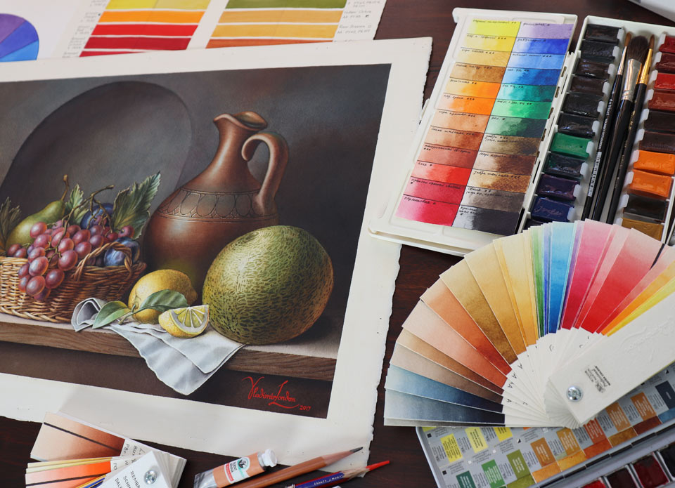
Tonal values play a much more important role in a watercolor than colors. For example, I did the background wall with the arched niche in a neutral gray color that is not made of tinted black paint but was obtained by mixing different pigments on the opposite sides of the color wheel, which make them complementary and, therefore, the mix results in gray. It doesn't really matter which pigments I mix to get this gray - for example, blue ultramarine with cadmium orange; or violet and yellow; or use some conveniently mixed paint, like Payne's gray or Neutral tint. The color is less important than tonal values. You can see that the arched niche in the middle is going into the wall because I applied darker tonal values at its left side and at the top. However, if I were to do these areas lighter than the right-hand side, it would not be a niche anymore, but rather a pilaster coming out of the wall. And the choice of complementary pigments would not make any difference to this geometry. Now, it's time to paint the basket. Once again, the colors I will use for this basket are less important than the tonal values I will apply. The color can be whatever you'd like - bright yellow, dull yellow, yellow-orange, orange, or even brown. A basket will only look like a basket if you manage to depict its correct tonal values.
I have to say that a basket like this requires a lot of patience if you want to do it in a realistic manner. But because of the style of this still life and the well-detailed other objects, I have to continue showing the small details of this basket. For this reason, I'm using a small, round brush and have to go bit by bit, patiently, drawing this basket instead of painting it with wide, impressionist brush strokes. Despite so many details, this basket is a cylindrical object and has quite a simple structure of tonal values. We can see the same light areas, mid-tones, and shadows as you would on a plain cylinder. So, knowing how to paint simple things really helps when it comes to painting more complicated objects. With the fruit basket in place, I can now paint the table top. For its color, I premixed a few pigments. The main one is green-gold from Winsor & Newton, a very transparent and highly permanent one-pigment paint. It is made of the yellow pigment, PY129. To make a darker shade, I also added a rich, dark brown pigment, burnt amber. It is an earth pigment, made from natural brown clays. For the dark, warm shadow, I add caput mortuum violet, also from Winsor & Newton. It is an opaque pigment which has excellent permanence. So far, the table top's edge is a bit dull and monochrome, but, because it is in the foreground, I have to make it more interesting. So, I premixed three colors and will do a variegated wash, randomly adding these colors next to each other. These three mixed shades have approximately the same tonal value but different hues. I am applying these shades wet-on-dry, overlapping the borders of each color so they fuse together seamless on the paper. When this wash is dry, I will add another one on top to darken the tonal values.
With the variegated washes in place, I'm now adding the wooden texture, accurately painting it with a thin, round brush. The cast shadow must be darker, so I'll add more paint for a greater contrast. I'll now paint the white drapery on the table. When it comes to painting white objects, their color really depends on the color of the light and the reflected light. You may find that white objects look better when you paint them using both cool and warm pigments. The choice of pigments doesn't really matter because it is not about colors but tonal values. Even if you use just one neutral tint, that would be enough for a white object. It's time to paint the little jar. First, I will do a light blue imprimatura. Then, I add a yellowish reflected light that is bouncing from the peach and the tabletop. After this layer dries, I will paint the intrinsic color of this jar in quinacridone violet pigment. This paint has excellent permanence and contains just one violet pigment, PV55. This paint comes from the Winsor & Newton watercolor paints range. The intricate design of the jar was preserved with a transparent masking fluid. I'm painting carefully so as not to overlap the highlight and to give soft edges to this wash...
A self-study, self-paced course where you can learn how to paint in watercolor by watching video lessons and doing assignments
One-time payment - Lifetime membership
$297 USD
One-to-one, unlimited and custom-tailored to your skills and needs Personal Tutoring by the Watercolor Academy teachers
One-time payment - Lifetime membership
$997 USD


