Watercolor Academy Online Course
A self-study, self-paced course where you can learn how to paint in watercolor by watching video lessons and doing assignments
$297 USD
ENROLL NOWA self-study, self-paced course where you can learn how to paint in watercolor by watching video lessons and doing assignments
$297 USD
ENROLL NOWOne-to-one, unlimited and custom-tailored to your skills and needs Personal Tutoring by the Watercolor Academy teachers
$997 USD
ENROLL NOWVideo lesson by Vladimir London
In this video lesson, you will learn how to paint a brightly lit marina in watercolor.
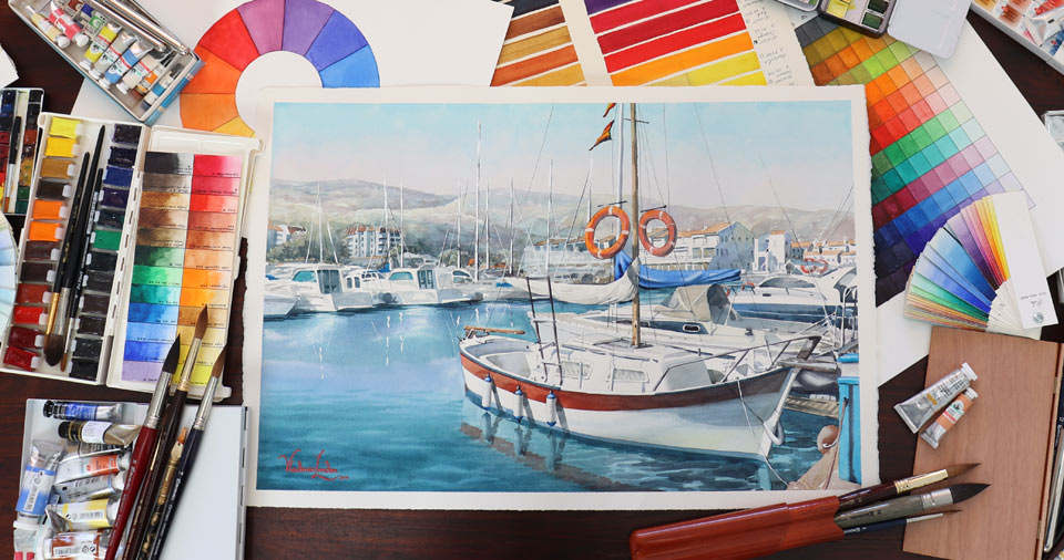
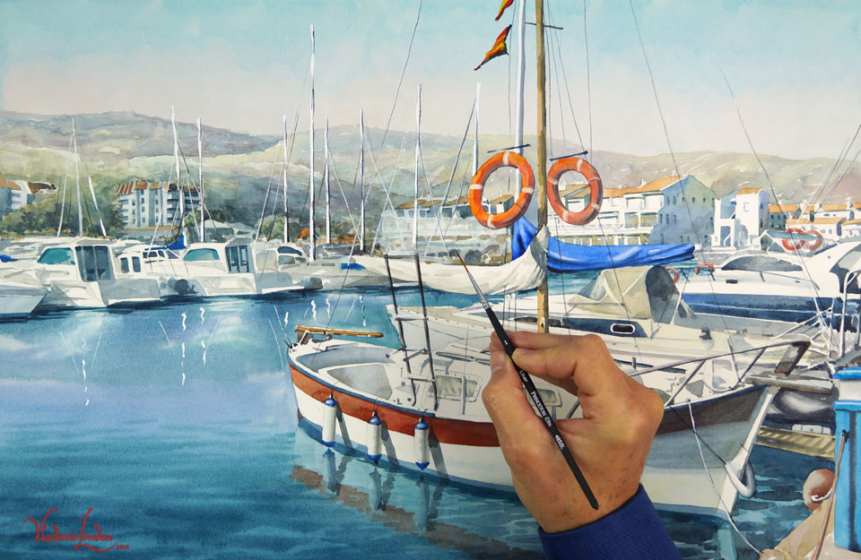
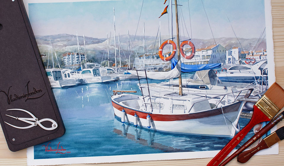
Here is the finished artwork I will achieve by the end of this lesson.
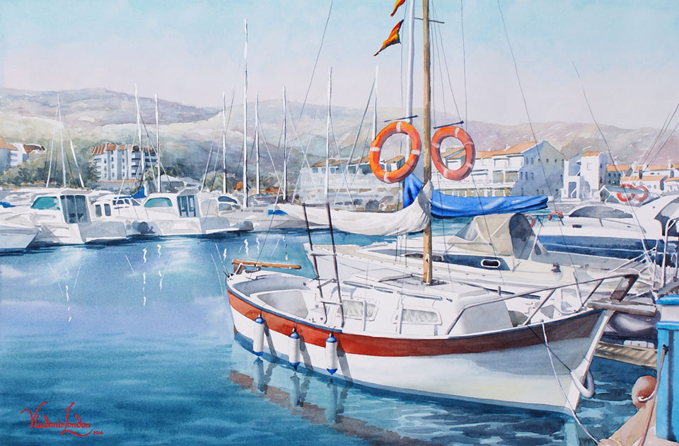
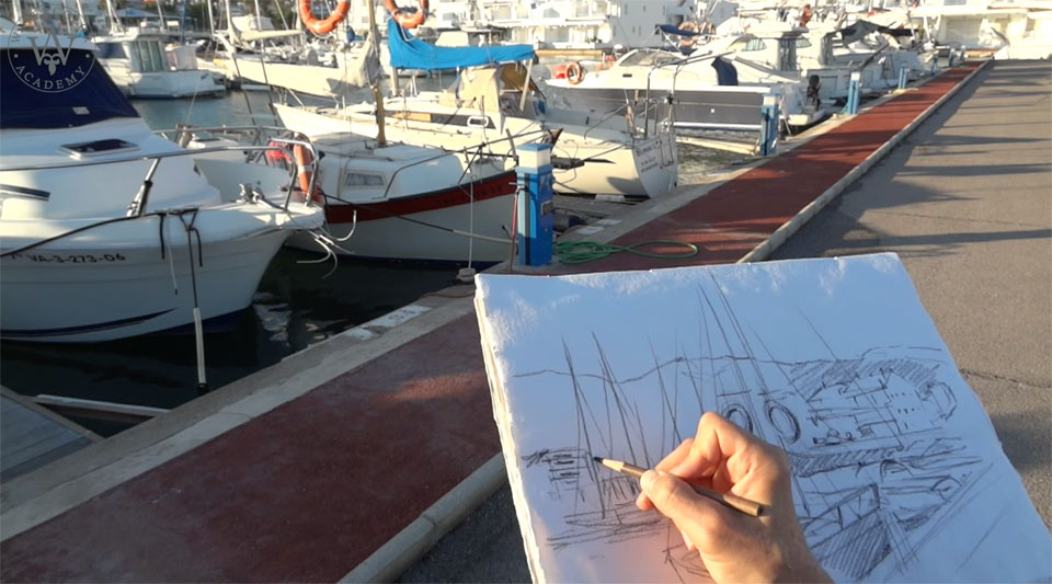
It is late afternoon. Casted shadows are already long; the sky is clear and blue and the boat is lit by sunshine. I start by making a preliminary sketch on location, to decide on the composition. This is a very rough sketch. The purpose of this drawing is not to depict every detail but to capture main masses of the foreground, middle-ground and background. It also helps to decide on the relative scale of the boat. The drawing pad is made of rug paper; this paper takes watercolor well, should I decide to continue in color. I can also mark any tonal values in soft black pencil, to have some reference of tonal values when I paint this artwork in the studio later on. As you may see, I do not copy every feature and the exact details on location; instead, I create my own vision of this marina. For example, to have more clear water visible, I omit the boat on the left-hand side.
We are now back at the studio, and I am starting this painting with the cold blue color of the sky. I am using hot-pressed, 300gsm watercolor paper. Its smooth surface is ideal for making very detailed artworks. However, when it comes to making wet-on-dry washes, this paper is quite challenging to paint on. Its smooth bright surface reflects more light than with cold-pressed or rough paper. That is why the finished artwork will look brighter.
I am applying the wash in multiple short brush strokes. These brush strokes resemble the teeth of a saw, hence the name of this method, the saw wash. Toward the horizon, the sky color is warmer. I continue the wash over far away mountains; and before the layers dry, I continue painting the mountains using the wet-into-wet technique. According to the rules of aerial perspective, far away objects are light and blue; the closer objects are, the warmer they look. That is why I add light tints of warmer colors into the mix. This variegated wash is quite light because I want to keep the background distant. You may notice that, in some places, I leave small spots unpainted. They will have a light blue sky color, suggesting highlights on the hills.
The sequence of steps that I am following, in order to paint this artwork, is very conventional. First, I paint the light blue sky color, continuing with the same sky color over the hills. Far away hills are made to appear deeper in color; this is depicted using a variegated wash in light cold colors. Gradually, colors of the background will warm up as I am coming closer to the middle ground. This type of sequence follows one of the main rules of watercolor: that it is better to start with light colors and work from light to dark tones. As I am approaching the middle ground, colors of vegetation become greener. Nevertheless, it is better to avoid using green paints for this purpose. What we need is a light blue-green color, which can be easily obtained by mixing some blue and yellow colors together. Mixed in this way, greens appear much more natural and believable. You may notice that I am not using any masking fluid to preserve white areas. Instead, I am painting around any areas that I would like to keep white for the time being. When the watercolor paint dries, it becomes lighter. This is because paper absorbs some of the pigment particles; however, hot-pressed paper, which I am using now, has more sizing and therefore absorbs less paint than cold-pressed or rough papers.
I am now painting wet-on-dry in small brushstrokes, depicting the texture of the background. With the sky and background hills in place, we can continue with the middle ground. The warm light of late afternoon creates cold shadows. I leave light sides of the yachts and white buildings unpainted, and only depict shadows.
Now, it's time to work on the water of the marina. This time, I start by wetting the paper with a flat synthetic brush, so it will take the wash more readily. I have already premixed several shades of blue, and I can apply paint swiftly without spending too much time mixing colors on the palette. This will save time while I am painting wet-into-wet, before the paper dries. You may see that I am preserving white reflections on the water, applying short brush strokes with a thin round brush. Paint spreads over wet paper and the amount of water on the brush has to be carefully controlled. I wet the paper once again because it dries quickly. As we come closer to the foreground, I change brush for the bigger one, to make wider and bigger brushstrokes. You can also see that I am now applying a different blue color; this is to suggest the difference between the background, middle-ground and foreground. The board is tilted at about 15 degrees, so that the paint flows down. By adding more paint, I make the wash darker. Working in wide brush strokes, I ensure that I do not overpaint the white side of the boat. I want to have a sharp border between water and the boat, so I paint along this border very carefully. Before the paint dries, I can add a darker blue tone, mixing paint with the previous wash directly onto the paper. In most cases, water is darker than the sky. This is because the reflection is darker than the light. I also have to make the water a bit darker because the paint will become lighter when it dries. How much lighter is a calculated guess, because every paint dries differently; it also depends on the paper.
I am wiping off the paper redundant paint with a damp sponge to keep the edge clean. Hot pressed smooth paper is also suited better for wiping off paint. This is because its surface absorbs less paint. I am wiping off with a clean damp brush, making reflections on water. It's now time to take care of the boat. I am wetting the paper with slightly tinted water. It makes it easier to see where the water is applied. I can now paint a shadow wet-into-wet.
When the first wash is done, I stop it spreading by drying it out with a fan. A bit of yellow is added to suggest the reflected warm light. I can now paint the decoration of the boat wet-on-dry. You can see that I am gradually changing the red stripe from orange to red, and I then add dark blue paint to depict the shadow area. This cold blue shadow also goes across the white side of the boat. Painting over red and white unites these two areas. As the paint dries it becomes lighter. I can now add a reflection of blue and red stripes on the water.
Because I am painting the outdoor scenery, shadows are cold; they are colored by blue sky. It doesn't mean that cold shadows are blue; they could have a whole range of different colors. With the main tonal values of the boat in place, I can now judge the light-and-dark contrast, which helps me to decide how dark the water should be. I am making the waves darker, to allow the foreground to 'step forward'. The water reflects the sky, which is darker at the top and lighter closer to the horizon; however, the reflection is reversed, with the water (and the waves) becoming darker closer to the bottom. All reflected objects are darker as well. You may have already noticed that I am talking more about tonal values than colors. Values are more important in watercolor painting than colors. For example, the red stripe on the boat could be any color you desire – be it orange, red, purple – it is just a decoration. The boat will look like a boat as long as the tonal values are correct. The same goes for sky, hills and water. I could use different blue paints for this sky, and the sky will look like the sky as long as it is cold and light.
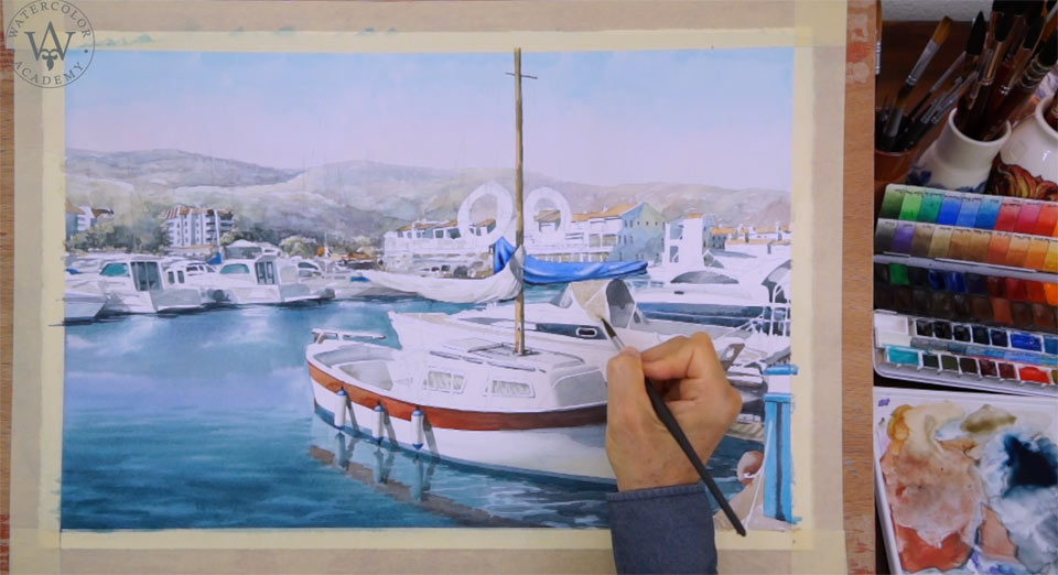
I am now adding small details with a thin round brush. The amount of details really depends on your creative task. Because from the beginning I envisioned this artwork as very detailed, this influenced the choice of paper. It is now very easy to work on small details on its smooth surface.
When making a fast sketch from life on location, I mentioned that this drawing will be used for making a composition. Composing means not drawing exactly what you see, but arranging objects and settings to make an artwork better-looking and balanced. I not only removed a few boats from the marina, but also composed the layout so that it follows the Golden Proportion. For example, the placement of the boat's mast is not accidental; it divides the width of the artwork in the Golden Ratio. You can see that the measurement A to measurement B is the same as the width of the artwork C to the distance from the left edge to the mast, which is equal to the Golden Proportion – 1.6. You may also notice that the primary and secondary Golden Proportion grid coincides with many key places within this artwork, such as the outlines of hills, buildings' roofs and the boat. Of course, when you compose a drawing, you don't have to measure all lines with the ruler, but when you see a pleasing layout, there is a good chance that it follows the Golden Ratio.
I continue working on details in full color. Painting in watercolor is a very demanding process – it requires cheerful calmness and concentration, so that you can consider and choose colors, tones, contrasts, aerial perspective and many other things, and therefore plan the artwork accordingly. Some people may think that, because watercolor paints are so widely available, that using this medium is as easy as simply mixing it with water and applying on paper, and because painting in watercolor is practiced in low grade school, that it is a junior craft. Painters in oil and acrylic may even look down on it as something inferior, unless watercolor is used in a very advanced way. This perception is far from reality. Watercolor is not the easiest medium to master, and true art skills play a vital role here. In a way, painting in oils or acrylics are simpler techniques, especially as paint used for these media dries more slowly, giving you more time to think about your artwork as you are creating it. Lighter tints can be applied at any time and on any area of an artwork; mistakes can be fixed by repainting over with opaque layers, or scraping them out. It is possible to rework the same artwork indefinitely.
However, none of these luxuries are available in watercolor. It is a tough and unforgiving medium. Because every layer of paint is visible, artist skills play the most important part in watercolor painting. Here, it is impossible to fix errors by painting over some not quite right areas, as every mistake will show through. Sometimes, it is easier to start an artwork all over again, than trying to fix something that went wrong. You have probably seen some watercolor books that show you how to paint something in this medium, such as a flower, a cat, a landscape, or a boat. You may even have bought some of those books, and after reading them and looking at the glossy pictures, are still left with no watercolor painting skills. This Watercolor Academy course is different – we don't want you to copy what you see on the computer screen. Such copying would have very shallow educational value. By studying this course, we would like you to gain fundamental information about techniques and know-hows that will be very useful in painting whatever you see, think or imagine.
Let's come back to the artwork. I am now experimenting with the mixed media technique, adding white yacht masts with the corrector pen. I have never tried this before, and I would like to see how the combination of watercolor with white correction fluid will look together. It is probably not the best way to add white highlights into a watercolor artwork. But nevertheless, I will continue to the end, in order to complete this experiment. I have to say that the white correction fluid looks out of place in this particular watercolor artwork; but you would never know it until you try it. Here is the Princeton Neptune brush – as suggested by its name, it looks like a dagger. This is because it has special shape that holds a lot of water, and at the same time, is able to produce very thin and long lines...
A self-study, self-paced course where you can learn how to paint in watercolor by watching video lessons and doing assignments
One-time payment - Lifetime membership
$297 USD
One-to-one, unlimited and custom-tailored to your skills and needs Personal Tutoring by the Watercolor Academy teachers
One-time payment - Lifetime membership
$997 USD


