Watercolor Academy Online Course
A self-study, self-paced course where you can learn how to paint in watercolor by watching video lessons and doing assignments
$297 USD
ENROLL NOWA self-study, self-paced course where you can learn how to paint in watercolor by watching video lessons and doing assignments
$297 USD
ENROLL NOWOne-to-one, unlimited and custom-tailored to your skills and needs Personal Tutoring by the Watercolor Academy teachers
$997 USD
ENROLL NOWVideo lesson by Vladimir London
In this video lesson, you will discover how to use and apply the pen and wash watercolor technique, to make a limited color artwork.
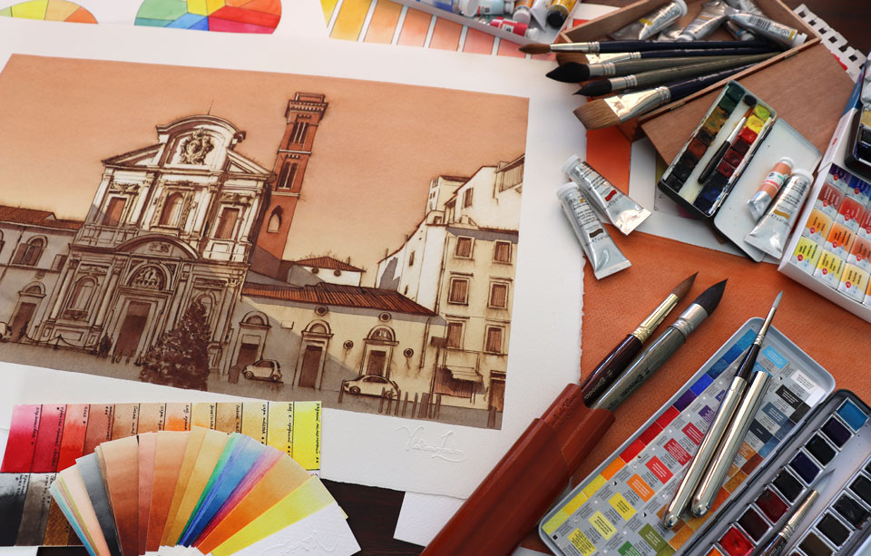
Here is the artwork I will achieve by the end of this video lesson.
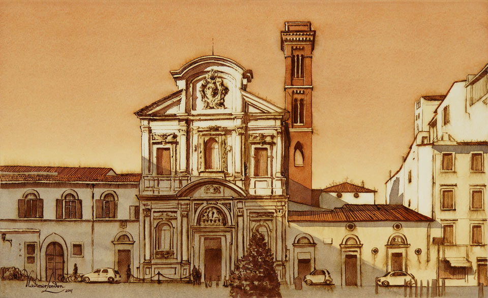
Before creating a big-scale painting, I make a quick sketch on location, capturing the design details of this church, and making some decisions on the composition. I am using the pen and wash painting tech to make this small sketch. The drawing was quickly outlined with a waterproof CD marker, so all that is remaining is to add some colors. This church is located in Florence, Italy. It was originally built in the 13th Century, later rebuilt in the Baroque style in the 17th Century. This church is famous for a fresco of The Last Supper by Domenico Ghirlandaio, one of the first famous early renaissance painters in Florence. Also, another worldwide famous renaissance artist, Sandro Botticelli, is buried in this church. With the small sketch complete, I can use it later as a reference image for the bigger artwork.
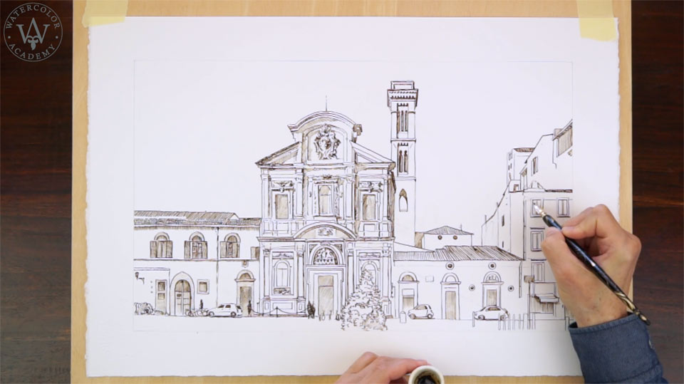
I am now back at the studio, and I begin preparing the half sheet for the high quality watercolor paper, which is made of cotton and has a 300gsm weight. This is 'Not' paper, which means it is not hot-pressed, it is cold-pressed. I have already prepared the composition drawing for this artwork, which is done in graphite pencil on the reverse side of this tracing paper. I can now outline this drawing once again, in black pen, to transfer the design onto the watercolor paper sheet. From time to time, I can flip open the tracing paper to see the progress and the quality of lines. Transferring a drawing is a rather mechanical step; it requires some patience and accuracy when repeating the outlines. This will take some time, so I will fast forward to the step where the drawing is transferred. With the drawing in place, I will use water-resistant sepia ink to outline this composition once again, using the pen and ink medium. This sepia ink is not waterproof, but water-resistant, which means that it will be slightly diluted by water when I make watercolor washes on top of this drawing. However, this is absolutely fine with me, because such dilution will look quite nice, and slightly fuzzy sepia ink lines will add a bit of charm to this picturesque artwork.
There are many different styles of pen and ink hatching, and if you would like to learn to draw with ink, I would suggest checking the Drawing Academy course. In this online video course, you will find numerous lessons on the pen and ink drawing technique. The advantage of the pen and wash watercolor painting technique is that the drawing can be as detailed as you want it to be, whereas the washes on top can be applied much more freely, sometimes with a little attention to the drawing. Because the drawing is well-defined in the first place, the color artwork will look good, regardless of how well-detailed or generic watercolor washes can be. To protect the white frame of this artwork, I will apply colorless masking fluid along the watercolor sheet edges. I use a cheap flat synthetic brush from this purpose, because the masking fluid is very difficult to clean up, and I don't want to ruin expensive paint brushes by using them for this job. I outline the frame free-hand, going along the straight lines I did previously with the ruler. When the masking fluid is fully dry, it is time to decide on the colors. For the entire artwork, I will be using only three pigments: yellow ochre light, Burnt Sienna and Ultramarine. These pigments are highly permanent, produce good gradients in washes, and I know very well what to expect from them.
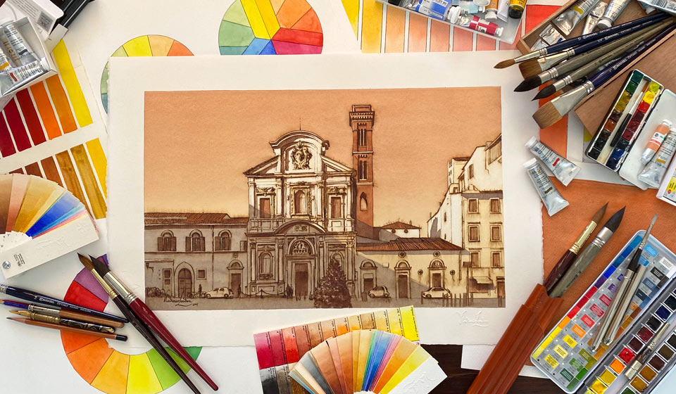
I will use saucers to mix paints. The first wash I will paint with yellow ochre light; this tint can be first tested on a piece of paper. Then, I load the soft natural-hair paintbrush with the yellow mix and apply it at the top of this artwork to form a horizonal stripe with a juicy bead. The first layer will be done as a plain wash; it will be an imprimatura. The purpose of this wash is to make paper off-white, and to give the whole artwork a nice warm yellow color. The yellow tint of this layer will the the lightest tonal value for this artwork. I am using the saw wash painting method. It is a plain wash, which means that the entire artwork will be covered with a very smooth coat of paint, without any gradations of tonal values, nor visible brushstrokes. The saw wash is the ideal method for this purpose. If you missed the video lesson on how to do the plain wash, you may check the multiple rules of using this painting method, in the dedicated video lesson of the Watercolor Academy course. The first wash is complete, and I will now let the watercolor paper fully dry.
When watercolor paint dries, it becomes up to 30% lighter; this is the exact tonal value I want to have for this imprimatura layer. I will now make a gradated wash; for this purpose, I turned the board upside down, and I prepare a very light tint of yellow ochre. This mix is well-diluted and therefore is very transparent. I begin the wash from the skyline of buildings. Because the board is tilted at about 15 degrees, its bottom end is slightly higher than the top one. This makes the water flow downwards, away from the rooftops. This is a good way to paint a skyline, as I don't have to mask it. I added into the mix a bit of Burnt Sienna, to slightly increase the tonal value of the wash. The new band of the diagonal brushstrokes is overlapping the previous stripe, so the bead is flowing to the bottom edge of the painted area. Because I am doing a wash, it is very important to constantly maintain the bead, and keep it flowing from one stripe to another. After each stripe, I add a bit more Burnt Sienna pigment into the mix, so the next stripe of brush stroke swill be a bit darker than the previous one. This creates a gradual change in tonal values, which is what I would like to achieve with this gradated wash.
There are several rules that you have to keep in mind when applying such a wash. The board has to be tilted at about 15 or so degrees in order for paint to flow down. The bead has to be constantly maintained at the bottom edge of such wash. If there is not enough water at the edge of the painted area, the paint will not flow. However, if the bead is overloaded, it might break up the surface tension and run down in a stream uncontrollably. Even if you blot such a stream with a paper towel, the paper surface will become damp, and take the paint layer differently, which might ruin the appearance of the gradated wash.
If you apply the saw wash, which I am using for this layer, all brushstrokes have to be applied at a constant speed and with equal intervals when loading the paint. All brushstrokes have to be approximately equal in size, and overlap the previous strokes in a uniform manner. It is important not to miss any unpainted gaps, or if you accidentally did so, not to come back to repaint them while the surface is still wet. I have completed the first gradated wash on top of the imprimatura, and I will now make another one. Every layer has to be fully dry before continuing with the next coat. Because I do not want you to watch paint drying, which may take up to an hour, I cut out these steps from the video, but you have to keep in mind that the watercolor paper has to be fully dry before attempting another wash.
The purpose of this gradated wash is to further increase the tonal values of the sky. I will do it exactly in the same manner as the previous one, beginning the wash with a very light tint of transparent yellow ochre, and then gradually adding Burnt Sienna pigment little-by-little, after each band of diagonal brushstrokes. As more and more brown pigment is added into the saucer, the sky becomes darker from band to band. Its tonal values gradually change from light to dark tones, as is expected from a gradated wash. To finish the wash, I am absorbing excess paint with a damp paintbrush, until there is no bead left on the paper surface. I may return in a couple of minutes to wipe off the remaining bead that collects, while the paper is wet. Afterwards, I leave this artwork to fully dry.
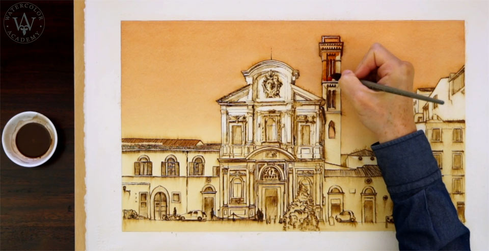
The sky is now totally dry, and I will apply one more gradated wash, to make the gradient of the sky even more pronounced. This will be done in exactly the same steps as for the previous two washes. If you are wondering why you shouldn't paint the sky, from the first attempt, in one layer, I would say that painting in alla prima is a totally plausible way of making a watercolor artwork. However, the educational topic for this video lesson, as you may remember from its name, pen and wash, is to make an artwork using the pen and wash watercolor painting technique. That is why I am using multiple glazing layers, applying wash after wash – to demonstrate to you how to use this technique. With the sky in place, I can now continue painting the architecture. For this purpose, I have prepared a darker mix of Burnt Sienna, which has a rich brown color, with an orange-red shade. Using a very limited number of pigments has its advantage – with only a few colors, you can think more about tonal values, and spend less time on choosing different pigments and mixing various colors. Although I am using three different pigments, this artwork will look almost like a monochrome. This is precisely the affect that I wish to achieve: a painting in the style of the Old Masters, who didn't have the luxury of all the new pigments produced by numerous contemporary manufacturers all over the world.
Today, we can go to museums, and see all the beautiful masterpieces that were done with only one or two pigments, such as ink drawings with sepia washes, created by the masters of the Renaissance and Baroque periods. There is a certain warm, feeling about such artworks. I think that this style is very much suited for the subject of this painting – one of the oldest Baroque churches in Florence. The Burnt Sienna pigment works very well for red bricks of the bell tower, as well as the terracotta roofs and the window shutters. I will now paint the shadows, and for this purpose, I have mixed a cooler brown color, by adding a little bit of blue Ultramarine into the Burn Sienna paint. Such a subtle difference between two brown colors – the warm and cold one – will look very nice in this artwork. I am using a natural-hair mop brush to apply a plain saw wash, which covers the entire area of cast shadows that spans across several buildings, including the church. Here is the beauty of the pen and wash technique: I don't have to paint with the brush every single small detail, such as windows, walls, architectural elements and decorations. Those details are already in place, as a linear drawing that was done in pen and ink. This drawing shows through the transparent layer of paint, and the design of this architecture is described very vividly. Because this linear drawing has also a brown sepia color, it looks very much an integral part of this artwork, not as something that was done separately. The brown wash, which I am painting the shadows with, not only creates darker values of shaded areas, but also unites them. The wash is complete and I will now work on smaller details with a flat paintbrush. The color I am using is a bit warmer than the previous mix; it contains the Burnt Sienna paint and a little bit of Ultramarine. By adding the casted shadows, I am making the church façade appear three-dimensional.
Coming back to the topic of this video lesson, I hope you can see the advantages of the pen and wash technique. It is a fast way of making very detailed artworks, because the drawing can be done in any medium of your choice, such as pen and ink as shown in this video, or permanent marker, ball pen or very soft graphite pencil. Such a drawing is then covered by one or several washes, using one pigment or different colors. And because the drawing is already in place, you don't have to spend too much time depicting small details with a paintbrush...
A self-study, self-paced course where you can learn how to paint in watercolor by watching video lessons and doing assignments
One-time payment - Lifetime membership
$297 USD
One-to-one, unlimited and custom-tailored to your skills and needs Personal Tutoring by the Watercolor Academy teachers
One-time payment - Lifetime membership
$997 USD


