Watercolor Academy Online Course
A self-study, self-paced course where you can learn how to paint in watercolor by watching video lessons and doing assignments
$297 USD
ENROLL NOWA self-study, self-paced course where you can learn how to paint in watercolor by watching video lessons and doing assignments
$297 USD
ENROLL NOWOne-to-one, unlimited and custom-tailored to your skills and needs Personal Tutoring by the Watercolor Academy teachers
$997 USD
ENROLL NOWVideo lesson by Vladimir London
In this video lesson, you will discover how to paint an illustration in watercolor using both wet-into-wet and wet-on-dry painting techniques.
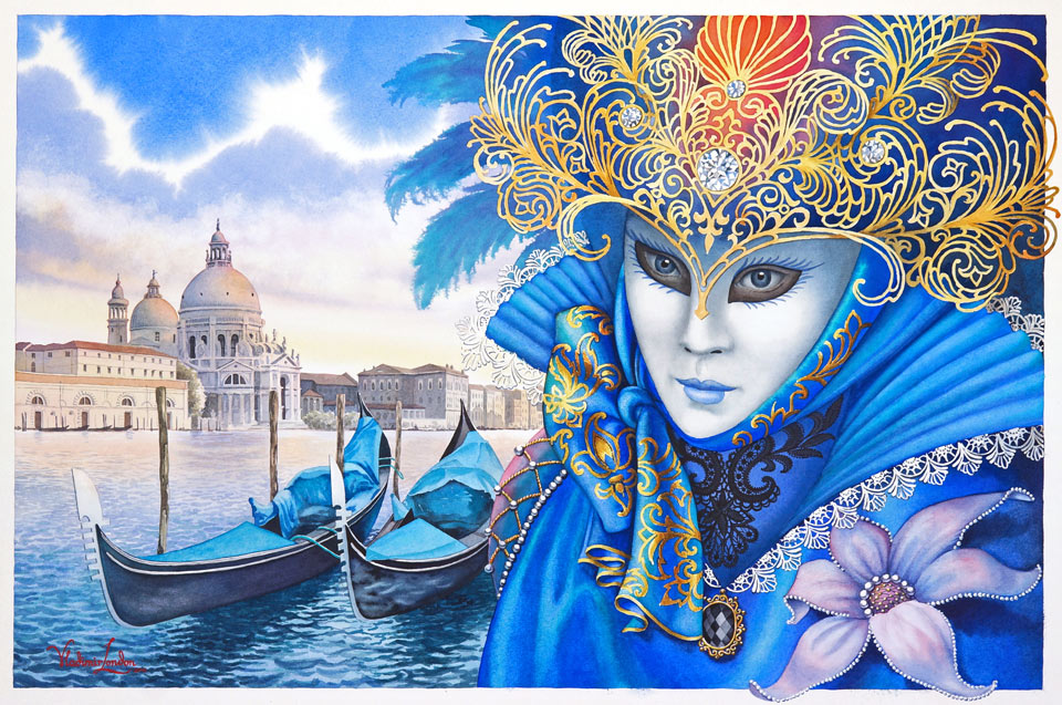
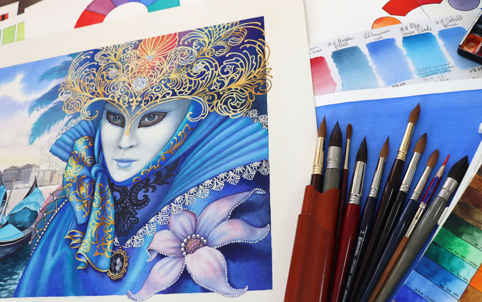
Here is the finished artwork I will have by the end of this lesson. It combines the real view of the city of Venice, as well as a masquerade figure from imagination with a fancy mask.
I begin by making a full-scale drawing which will be used to transfer the design onto the watercolor paper. Such preparatory drawings are called "cartoons". For this purpose, I'm using disposable brown paper to work on the artwork composition, decide on its design, and define all details. I repeat this drawing on tracing paper using a thin 0.5mm graphite pencil, accurately repeating every line I would like transferred on the watercolor paper. It's better to affix the tracing paper on one side in order to flip it over to see if I have missed any lines.
I will be using 100% cotton watercolor paper from Saunders Waterford and the watermark in the corner will tell you which is the front side of this sheet. To stretch this paper, I will first wet its face side with clean water using a wide, flat, synthetic brush. So, the task for now is to saturate this paper with water without leaving any gaps.
When one side is thoroughly wet, I flip the sheet over and place it face-side down. Now, I am applying clean water on its back side as well. This is 300gsm weight paper, and it will take about ten to 15 minutes for this sheet to absorb the water and expand in size. Without moving the paper, so as not to damage its front side which is facing down, I carefully place a wooden board at the top of the sheet. This paper has already expanded and is a few millimeters bigger in size compared to when it was dry. I affix the sheet to the board with a staple gun, starting in the middle of the longer side, and when the middle is set, I turn the big wooden board on which the paper rests together with the board I'm attaching the paper to. This way I'm minimizing all movements of the wet paper to avoid accidentally damaging it. As you see, I'm stapling from the middle to the corners of the board, finishing affixing the paper at the corners. When the paper is stretched, I turn the board and let the paper thoroughly dry. When the paper has dried for several hours or overnight, it will be ready to take the drawing. I'm transferring it using the tracing paper with the design in graphite pencil. It was outlined on the tracing paper once again on its reverse side, so I can transfer the drawing without mirroring it. For this purpose, I'm using a pen, not a pencil, to see every line that I have been outlining.
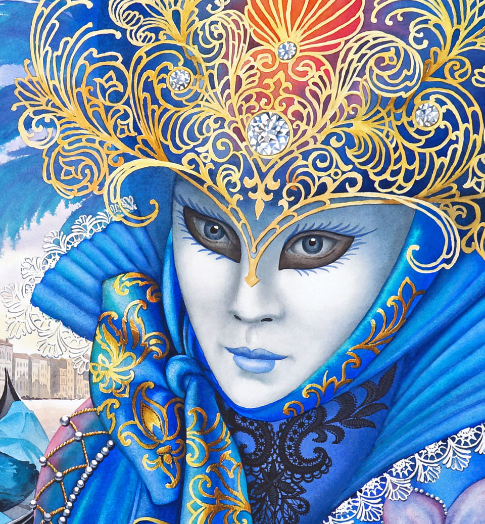
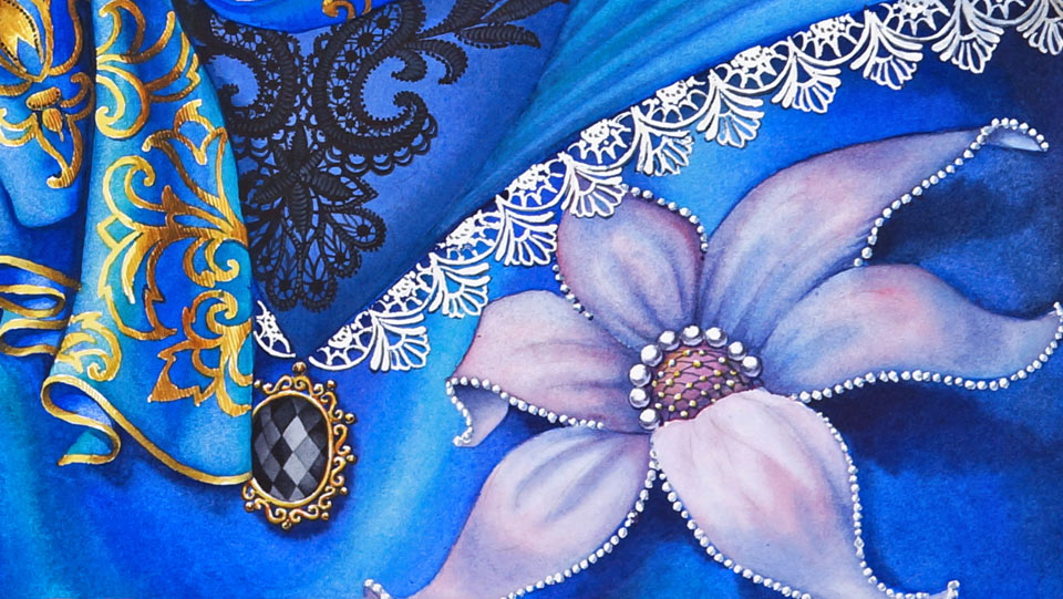
Before beginning painting in color, I would like to mask some design elements with masking fluid. To do so, I will use a dip pen with a metal nib. With this type of pen, it is easy to produce very thin lines and, as a bonus, this pen is very easy to clean. I'm masking the intricate lace work of the person's costume which would be very hard to preserve otherwise by painting around it. I will also apply masking fluid over the complicated design of the Venetian mask.
I will start this painting from the sky and would like to do it wet-into-wet. So, the first thing I have to do after the masking fluid is totally dry is to wet the area of the sky with clean water. I will start with pure ultramarine pigment, mixing it on the palette first to achieve the proper wetness of the brush, and will apply this blue paint wet-into-wet, starting from the top edge of the piece. All edges of this paper sheet are masked as well to achieve a clean, white border around the artwork. This border, by the way, will be an integral part of this painting. I'm applying a pure ultramarine pigment with a round brush, preserving white clouds by painting around them. The wet paint spreads over the wet surface giving nice, soft borders. I added a little bit of purple pigment into the blue ultramarine to paint the shadow areas of the clouds. These shadows are slightly warmer than the clear sky because they reflect light which bounces from the ground and, in the case of Venice, this light bounces from the sea.
You may notice that the Venetian mask has a very elaborate design. It would be very difficult, if not impossible, to preserve the mask's white color by painting around it, and definitely not when I do it wet-into-wet. I am adding the red carmine color into the blue mix to make it purple. I will also add orange and yellow to paint the part of the sky that is close to the horizon. For the plumage, I will use cobalt turquoise from the Winsor & Newton color range, which is a two-pigment paint that has excellent permanence and is semi-opaque. This pigment is quite heavy and, although I'm painting it wet-into-wet, the brush strokes keep their borders quite well. Now I'm moistening the paper with clean water using a flat synthetic brush to continue painting the colors behind the mask.
To suggest the festive atmosphere of the carnival, I would like the color of the costume and the mask to be highly saturated and bright with a high hue contrast, as well as a cold-and-warm contrast. That is why I will use the variegated wash of highly saturated pigments ranging from orange to purple. The costume's main color will be blue and it has to stand out from the blue sky and the blue sea, but I will take care of that later. For now, I am interested in the bright colors behind the golden mask. To get the rich blue color I have in mind, I premixed three blue shades and will apply them wet-into-wet, one after another. This variegated wash is a good way to fill big areas with soft gradations of different colors. I'm also going darker than I need because, when the paint dries, its tone will become lighter.
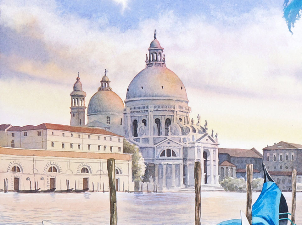
While the paint behind the golden mask is drying, I'll paint the color of the costume. The first blue layer is an underpainting. After drying, it will become a bit lighter. The overall color of the costume will be blue but it doesn't mean that I only have to use blue pigments. Introducing warm and cool colors into this painting will make it more colorful which is what I would like to have for this illustration. There is no right or wrong choice of colors here. This is an imaginary costume and that is why I have full creative license - as a costume designer, in this case - to use any pigments I feel suitable to portray this Carnival costume. Saturated blue color may border the bright yellow, or even orange, or another shade of blue. This all comes down to creativity. Also, to balance the highly decorated mask at the top, I will paint a similar style pattern on the costume as well. It's time to paint a white mask. When painting white objects, there are several solutions you may employ. First, you can go with a monochrome painting, using, for example, a neutral gray mix obtained by combining two or more complementary colors, or even use just one paint, like Neutral Tint or Payne's Grey, conveniently mixed by the manufacturer. So, all you need to worry about is not colors, but tonal values. Alternatively, you can use, for example, the three primary colors - blue, red, and yellow - to paint a white object that will look light gray, regardless of these colors. I decided to go with a neutral gray to counterbalance the rich colors of the remaining artwork. I will now decorate the Venetian mask. To keep this mask in the same style of the costume, its lips will be painted in blue. I use a small round brush for this. The Venetian mask and the costume cover all parts of a person's face, apart from the eyes. The eyes are in shadow, so I will paint them fairly dark, nevertheless leaving a small white highlight next to the pupil. Because it is the focal point of the whole artwork, I have to paint the eyes with proper attention. Black round pupils complete these eyes. To give more weight to this area, I will paint a dark mascara decoration on the mask. Now it's time to take care of the background. Rising over the horizon is Santa Maria della Salute, a magnificent basilica that was built in the 17th century to mark the end of a severe outbreak of the plague. Its beautiful facade is decorated with 125 statues, which of course is not possible to paint at this scale, but nevertheless, this is one of the most iconic landmarks in Venice, which makes this city skyline instantly recognizable.
The sun is going down just before the sunset and the walls of this basilica are lit with its warm light. That's why I started painting this church and nearby buildings with light, warm colors. On top of this warm underpainting, I'm now adding cool shadows, as well as small details, like windows and architectural features of this place. I would like to keep all of the cityscape in light tones because this basilica is in the background and, according to the rules of aerial perspective, all far-away objects are lighter than objects in the foreground. This beautiful Venetian architecture is reflected in the sea, and I'm applying clean water with a flat brush to later paint the sea water, wet-into-wet. I indicated the reflection of the buildings with a warm tint and, now adding blue paint, I paint the reflection of the sky. I apply brush strokes, wet-into-wet, to achieve smooth, diffused edges and, as I'm progressing from top to bottom, I make the tonal values darker and color cooler. These gradations of colors and tones reflect the similar layout of the sky where, next to the horizon, colors are warmer and lighter; and, at the top, are cooler and darker.
With short brush strokes, I add waves to the lagoon water, preserving white paper for the gondolas. These Venetian boats will be painted later. I deepen the tone of the waves and increase their sizes as I come to the foreground. This is to keep an aerial and linear perspective in place. Although I haven't painted the gondola yet, I know its reflection will be much darker than the water in other places. Because these two gondolas are in the middle ground, they are much darker than the buildings in the background, but not as colorful and detailed as the figure in the foreground. Although the gondola's body is black, it isn't a good idea to use manufactured black paint, so I'm mixing dark shades myself. A gondola is probably one of the most recognizable symbols of Venice, so including a couple of boats in this composition was an obvious choice.
Let's come back to the Carnival costume. I must paint it in more saturated colors to bring it closer to the viewer. After all, this is not a hyper-realistic piece of art, but an illustration. So, I would like to keep it bright, colorful, and interesting to look at, as an illustration to the story I'm telling about Carnival, the lagoon with the boats, and the wonderful architecture. Two primary colors I'm using for the blue costume are French ultramarine, which is transparent and has excellent permanence, and cobalt turquoise pigment, which is also extremely permanent but semi-opaque. As you can see, I do not mix these two pigments together on the palette, but apply them next to each other on the paper. This way, I keep the original colors bright and saturated.
Painting on top of the masked lacework saves a lot of time but, for the simpler shape of the flower, I preserved by painting around it. I'm using pure French ultramarine to depict the main color of the costume. The violet pigment is introduced into the shadow to make it darker but still colorful. The flower will be purple and, for this appearance, I'm using blue and red pigments instead of going for the manufactured purple pigment. You may also notice that two petals of this flower extend beyond the white picture frame. This is one of the ways to make a piece of art more decorative, which is what I would like to achieve with this illustration...
A self-study, self-paced course where you can learn how to paint in watercolor by watching video lessons and doing assignments
One-time payment - Lifetime membership
$297 USD
One-to-one, unlimited and custom-tailored to your skills and needs Personal Tutoring by the Watercolor Academy teachers
One-time payment - Lifetime membership
$997 USD


