A self-study, self-paced course where you can learn how to paint in watercolor by watching video lessons and doing assignments
$297 USD
ENROLL NOWA self-study, self-paced course where you can learn how to paint in watercolor by watching video lessons and doing assignments
$297 USD
ENROLL NOWOne-to-one, unlimited and custom-tailored to your skills and needs Personal Tutoring by the Watercolor Academy teachers
$997 USD
ENROLL NOWVideo lesson by Vladimir London
In this video lesson, you will discover how to make an illustration in watercolor using various painting techniques.
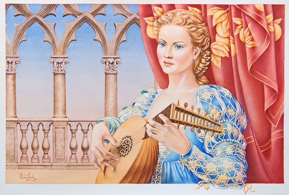
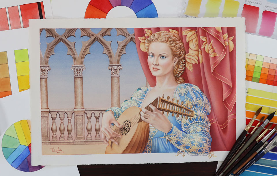
This is the finished artwork I will have at the end of this video lesson.

The backdrop for this illustration was inspired by the architecture of Venice. This wonderful city has so much to offer to fine artists, designers, and illustrators, and has endless examples of beautiful art and architecture.
I am outlining the composition design in red pencil on tracing paper. Red pencil marks will blend with the colors of the piece becoming an integral part of it. With the same red pencil, I will outline the frame borders of this illustration. These white borders are part of the design and will play a role in the composition. I place the outlined-in-red-pencil drawing on top of the watercolor paper and affix the tracing paper with masking tape at one side. So, during the transferring process, I can easily flip over the tracing paper to see which lines remain to be transferred. Another sheet of tracing paper prevents the pencil from smudging. With the drawing in place, I can now accurately repeat line by line in black pen to transfer the drawing onto the watercolor paper. When the drawing is done, I can take off the tracing paper and prepare to paint.

With a synthetic round brush, I will do the first imprimatura in light orange tint. I'm applying the paint on the paper using a plain saw-wash. Every brush stroke is tilted at about a 45-degree angle and overlaps the previous one. These tilted brush strokes go at the angle of the direction paint flows down. This results in better intermixing between strokes and gives a much smoother wash without any brush stroke borders. As you can see, I am preserving white watercolor paper by painting around the figure and also by carefully going along the white frame. The watercolor paper is glued to the board at the four corners. It is one of the ways to stretch paper by affixing it to the board, but I will not be advocating this method as the best one, because it really depends on how much water the watercolor paper will take during painting and, of course, on the quality of the paper itself. I'm using 100% cotton paper which has 300gsm weight and will hold its shape quite well because I'm not planning to apply too much water on its surface.
The first layer is fully dry now. With the warm imprimatura in place, which has to be very light, I can now continue painting the sky. I will do it in several layers, using a gradated wash. A light tint of blue pigment is carefully applied with a small round brush. I do not use any masking here because the design is not overly complicated and I can paint freehand around the areas I would like to keep untouched for now. The choice of a blue pigment really comes down to your personal preference and the creative task you have in mind. For example, I can use French ultramarine here, which is quite transparent and has excellent permanence. Alternatively, phthalo blue will do the job equally well but it stains more strongly and must be applied with care; removing this paint is quite a challenging task if using it goes not as intended.

I'm applying this first layer of blue pigment using a gradated wash. This painting method, as suggested by its name, is good for achieving gradients of tones, for example, from dark to light. You can see, at the top, the blue sky is a bit darker than in the middle. This gradation happens because, for every next stripe of paint, I add a bit more water into the mix and it gets lighter and lighter as I go down. Now, I would like to put a second wash of blue tint on top of the previous one. This can be done only after the previous wash is completely dry.
Painting in layers has its advantages despite it being slower than doing the wash in one go. It allows to achieve a much smoother gradation of tones because I have more control over how every layer is applied. This is especially handy when the area I would like to paint with this gradient is interrupted by an element of design, like these columns, for example. After fully drying the paper, I turn the piece upside down to add another gradated wash with this paintbrush; this time applying a pink pigment, which will also change its tone from dark to lighter values, creating an illusion that the sky is warmer closer to the horizon and cooler at the top. Painting with a soft, round brush, I have greater control over how this wash develops. You may say that using masking fluid to preserve the areas of the balustrade and the columns might speed up this process and make it easier. It could be so, but I don't really like the hard edges masking creates and will try to avoid using masking fluid unless it is absolutely necessary to mask some very intricate design or elaborate pattern. Painting between the columns is not that difficult. As I'm progressing with this gradated wash, I'm adding more and more clear water into the mix, which makes it lighter and lighter, and the final brushstrokes I do are almost colorless. This is a good example of how to paint a sky in several layers with a gradated wash. Now, it's time to paint the curtain. This drapery has an organic pattern design which I'm painting around, once again without applying any masking fluid. I will do this curtain in multiple layers as well. For its color, I'm using quinacridone magenta from Winsor & Newton, which has a rich and deep red-violet color. This paint is very transparent and permanent. I let the curtain dry and will come back to it later.
Now, I will take care of the architectural details. The choice of pigments really comes down to personal taste and your creative task. This colonnade can be done in any color you would like, from a neutral gray tint to a more saturated brown color. I'm using a brown ochre pigment from Winsor & Newton which is extremely permanent and semi-transparent. Arguably, this is one of the oldest pigments that is used for artistic purposes. Its brown color comes from naturally tinted clays that are found in the earth. So, this is one of the earth pigments. I'd like to paint the shaft of the column, wet-into-wet. So, I apply clean water with a flat brush first, and then paint the brown pigment using a small round brush, wet-into-wet. I also add some texture to imitate the marble this column is made of. The design of these column's capitals is painted with a small round brush. Now, I will come back to the curtain and continue painting it wet-into-wet. I apply clean water with a round brush. On the wet paper surface, it is easier to achieve gradations of tones by adding saturated paint on one side and then spreading it over the wet area. I can absorb the excess pigment with a damp, clean brush to make the tones lighter. For the second layer, I'm using cadmium red from Winsor & Newton, which is opaque and more granulated than the pigment of the previous layer, which follows one of the watercolor painting rules: That it's better to apply paints with heavy pigments on top of layers with finely grinded pigments.
It's time to paint the portrait. I will first do an underpainting in the light, warm tint, applying it on the paper with a round, synthetic brush. I will use the same color for the hair, face, neck, and hands; and then will let it dry thoroughly before continuing the portrait. To add the following layers, I first wet the area with clean water and then add the paint, wet-into-wet. This way, I can achieve much smoother gradations of colors and tones, as well as softer brush stroke borders. Every layer must be fully dry before applying the next one.
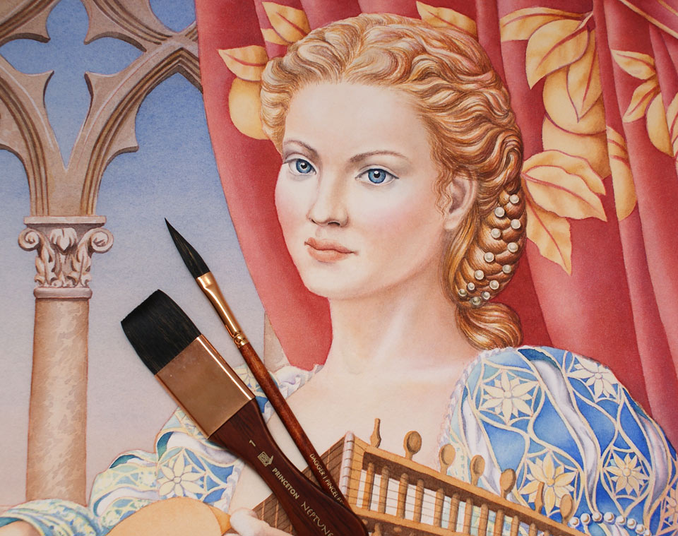
In previous Watercolor Academy video lessons, you have seen how to paint a portrait alla prima using the dry-brush-on-moist watercolor painting technique. In this video lesson, I would like to show you a different way of painting portraits. Rather than painting skin colors and tones in the full strengths from the start, I will paint in multiple glazing layers, gradually building tonal values from light to dark tones. The end result will be quite different because the final color of the skin will be the result of optical mixing, where every transparent layer of color plays a role. When painting eyes in the portrait, there is one good tip you may use: It is better to depict eyelashes with one thick, dark line instead of painting separate eyelashes in multiple brush strokes. You will find that this approach was used by many Old Masters. When it comes to painting portraits, there is one good rule: A good painting is well-drawn. I'm actually drawing this portrait, in color, with the brush. What I'm actually doing goes beyond what you see. While I'm painting this portrait, many questions go through my head. For example: Are the proportions of this portrait correct? Is the face symmetry in place? How about foreshortening and perspective in this three-quarters view? And many similar questions. Painting or drawing a portrait is very much dependent not on what you see and how accurately you can portray facial features, but on what you know about the portrait - its proportions, construction, and anatomy.
There are many proportional rules you should be aware of and apply them when painting a portrait. For example, the height of the face can be divided in three equal parts: from the top of the forehead to the line of the eyebrows; from that line to the base of the nose; and from the base of the nose to the chin. A virtual horizontal line that divides the height of the head exactly in half usually goes through the eyes. The distance from the base of the nose to the chin divided in half, in many cases, coincides with the lower edge of the lower lip. There are also many other proportions, alignments, and angles of the head and face you must know to draw portraits believably. The same is true when it comes to drawing human hands. Depicting hands is no easier than painting portraits. With 27 bones in each hand and wrist, there are so many proportions you need to know to portray hands realistically. I won't be able to cover all this information in one video lesson about watercolor painting because to explain human anatomy, I created not one but 26 video lessons that are available in the Anatomy Master Class online video course.
I will now paint the hair. I would like to keep it very detailed in the style of this illustration. I took inspiration from Sandro Botticelli, one of the prominent Italian Renaissance artists, who lived and worked in Florence in the second half of the 15th century. To me, he is one of the best artists when it comes to learning how to paint hairstyles. His big-scale tempera artworks, such as The Birth of Venus and La Primavera, are great examples of how an artist can paint hair. However complicated the hairstyle is, you must pay attention to its overall shape and remember that the hair just repeats the shape of the skull. So, the knowledge of anatomy is important here as well.
Nevertheless, anatomy alone is not enough for painting recognizable and realistic portraits and human figures. To give you the figurative drawing skills, we created the Life Drawing Academy course. At the Life Drawing Academy, you will learn how to draw realistic figures and portraits from life, memory, and imagination, with the necessary knowledge of human body construction, proportions, and anatomy. There are two courses within the Life Drawing Academy. In the Online Course, you will watch 52 video lessons to learn the necessary know-how of portrait and figurative drawing. This course comes with a lifetime membership and unlimited support from the Academy tutors. This support includes critique of your artworks at no extra charge.

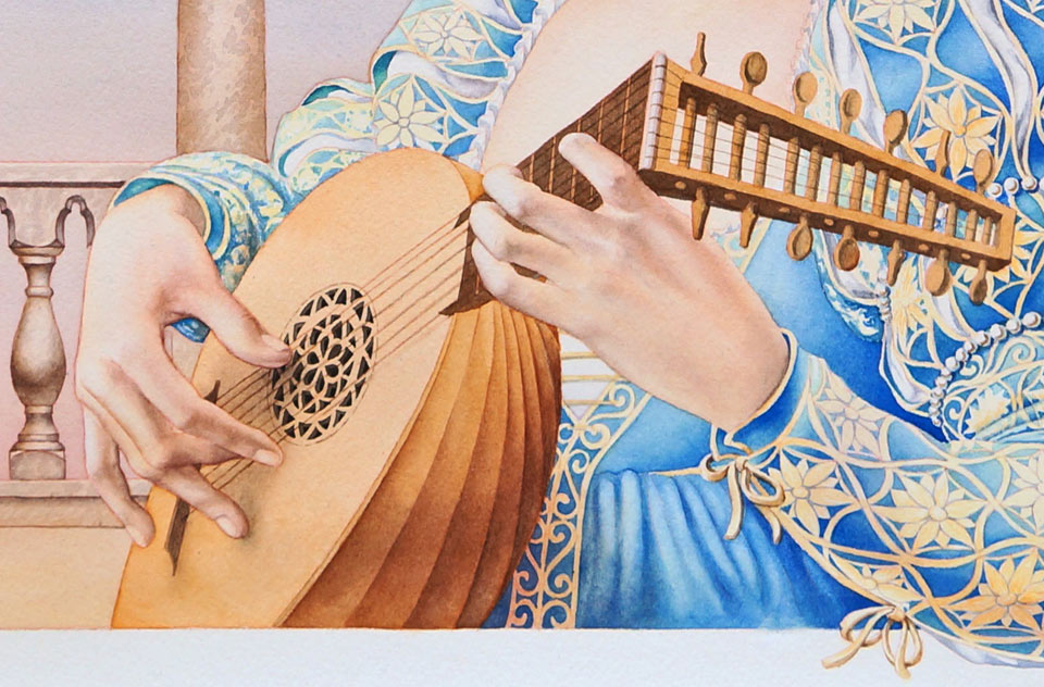
It's time to take care of the lute. This musical instrument was widely used during the Renaissance period. Yet, later on, it was replaced by the seven-string guitar. Did you know that the lute's soundboard is very thin, no more than 2 millimeters (0.08 inches)? Lutes have different shapes and sizes, so I had to do quite a bit of research to come up with this lute design. Before finishing the lute, I would like to paint the dress. It will be light blue with a golden embroidery decoration, which I will start with. Light tints of yellow colors will be used for this design. For the blue color of the dress, I'll paint it free-hand, carefully filling in the spaces between the lines of the yellow decoration. This process is rather time-consuming but I do not want to use a masking fluid if I can avoid it. I paint the light blue dress in several layers, gradually deepening the tones of the shadows. Because I'm painting in layers, each previous layer has to be totally dry before applying the next one. The curtain behind the lute player is not finished yet and I would like to use yellow and orange pigments in a variegated wash on top of it. I'll apply that coat wet-on-dry, covering the entire area of the drapery with the light warm tint. This yellow-orange layer will unite all folds and the design of the drapery into one unit and make its color warmer. This type of glazing is a great way to enhance colors in watercolor and influence the cold-warm contrast in the artwork.
Using a round mop brush, I will also do another coat of the cool color. I will apply this light-blue tint over the background, including the sky, colonnade, and the balustrade. This glazing layer of blue paint will be done as a gradated wash. After applying each stripe of paint, I add a little bit of clean water into the paint mix to make it lighter. Gradually, stripe after stripe, the wash will become lighter and lighter, resulting in a very smooth gradient from darker to lighter tones and, by the end of this wash, it will be almost clear water I'm painting with. With the darker background, I must increase the tonal values of the drapery's shadows. I will do that with a darker shade of the red color. It's easier to apply smooth gradients using the wet-into-wet painting method. That's why I wet the area first with clean water and then apply the dark mix of red paint.
It's time to come back to the lute. The peg box of this particular lute contains 14 pegs, which are used for tuning the instrument. The peg box for this lute is angled at almost 90 degrees from the neck. This is one of the characteristic features of lutes made before the Baroque time. So, this, once again, brings us back to the Renaissance period which I'm illustrating in this artwork. At that time, musicians already used Latin characters of the alphabet and note symbols to write down the music. Many of these notations date back to the Renaissance era so, today, we know how the Renaissance music sounded. Here is one of the melodies reproduced from these notations.
I did quite a number of design drawings for the sound hole, trying to come up with some interesting shapes that resemble the design of organic patterns from that time. You see, painting an illustration is not only about what colors to use and the composition to make. It often involves extensive research of the subject you're illustrating - for example, the architecture, the clothing style, musical instruments, and drapery designs...
A self-study, self-paced course where you can learn how to paint in watercolor by watching video lessons and doing assignments
One-time payment - Lifetime membership
$297 USD
One-to-one, unlimited and custom-tailored to your skills and needs Personal Tutoring by the Watercolor Academy teachers
One-time payment - Lifetime membership
$997 USD