Watercolor Academy Online Course
A self-study, self-paced course where you can learn how to paint in watercolor by watching video lessons and doing assignments
$297 USD
ENROLL NOWA self-study, self-paced course where you can learn how to paint in watercolor by watching video lessons and doing assignments
$297 USD
ENROLL NOWOne-to-one, unlimited and custom-tailored to your skills and needs Personal Tutoring by the Watercolor Academy teachers
$997 USD
ENROLL NOWVideo lesson by Vladimir London
In this video lesson, you will discover what the Cold-Warm Contrast is about, and how to use it in watercolor painting.
The cold-warm contrast is the difference in temperature of colors.
Such colors as yellow-green, green, blue-green, blue, blue-violet and violet are considered cold colors, because they resemble the colors of ice, water and sky. However, such colors as yellow, yellow-orange, orange, red-orange, red and red-violet are warm colors, because they are the colors of fire and the Sun.
The strongest cold-warm contrast is between blue-green and red-orange. Colors located next to each other, such as red-violet and violet, or yellow and yellow-green, have the weakest temperature contrast.
I have outlined several diagrams, to examine the topic of the cold-warm contrast in a bit more depth. Let's begin with the strongest difference between warm and cold colors.
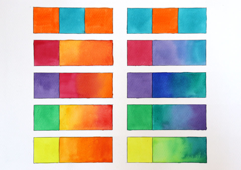
Orange is an undisputedly warm color. I fill in some of the boxes with the Cadmium orange paint. Let's now see how turquoise blue paint swatch looks between two orange boxes: it appears very cold when surrounded by warm colors.
I will now apply this blue color on both sides of the orange swatch. The orange color in-between has a high temperature, and appears in strong contrast to the blue boxes.
Orange and blue are very obvious examples of hot and cold colors; however, what about the red-violet color – is this hot or cold? It depends on the other colors is it surrounded with. To demonstrate how this works, I show how the Rose violet color appears in combination with other colors. For this purpose, I will apply two swatches of Carmine paint – this color is located on the warm side of the color circle. Next to the first swatch, I paint warmer colors, such as orange and red. In comparison to its neighbors, the Carmine paint swatch has a cold color. However, when a Rose violet swatch is placed next to the cold blue colors, its temperature is undoubtedly warm. This therefore demonstrates that the same color can be cold in one situation and warm in another.
I will now do the same demonstration for the violet color. When it is placed next to the red and orange warm colors, the violet swatch appears cold, but when the violet color has blue neighbors, its color is warm.
The same goes for the green: when it is placed next to the yellow and red, its color is cold; but next to blue and violet, the green swatch appears warm.
Here's yet another example – this time for the yellow color. Next to warmer yellow-orange and red, the pure yellow color looks cold, but when it placed next to yellow-green, green and blue, this yellow color is considered to be warm.
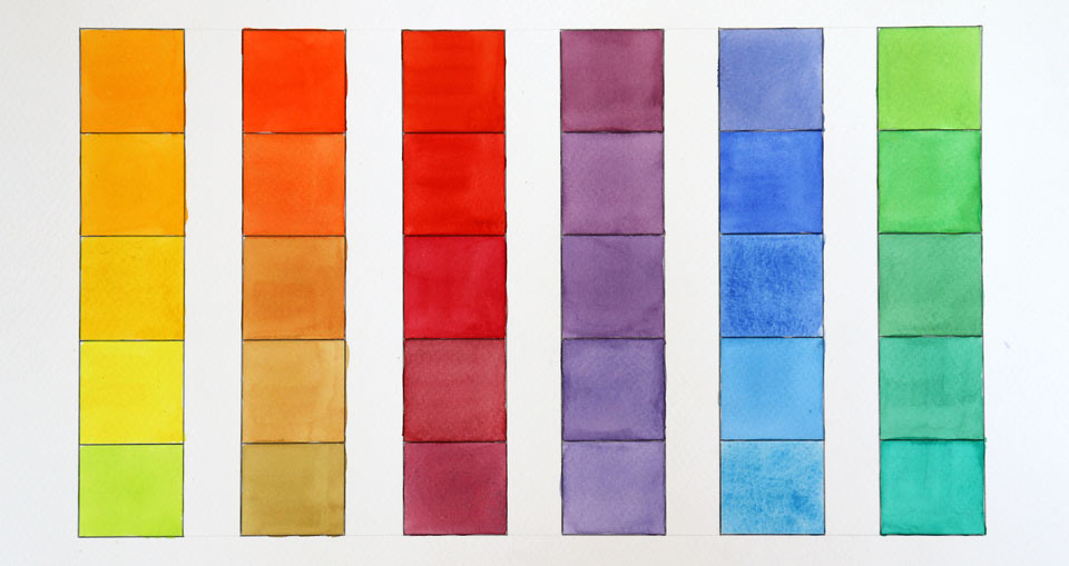
Blue and orange, green and red are obvious examples of a high cold-warm contrast. But how about when we have different shades of only one color, such as yellow. Different yellow colors will also have a temperature contrast, although it will only be a subtle difference between temperatures of very similar colors.
The purpose of this exercise is to develop a good understanding of temperature difference when painting different shades of the same hue. The aim here is to fill in all five boxes with yellow color swatches, making a gradation of temperatures from warm to cold, as you go from top to bottom. Every single yellow swatch, when taken on its own, is considered to be a warm color. However, when all five swatches are compared to each other, they have a noticeable difference in temperature, although the contrast is very low. The top swatch has an orange shade, and therefore is the warmest out of the five; the lowest one is the coldest, because it has a green shade.
I will now repeat the same exercise for the orange color. For the top swatch, a little bit of red is added to the orange, which makes this color very warm. The next box is filled in with pure orange, without any addition of red, making its color slightly colder than the previous one. For the next swatch, I have added a little bit of green paint to the orange pigment, which lowers the temperature of this color a bit more. I am mixing orange with green, but not with blue, because blue is the complementary color for orange; and mixing blue and orange would produce a neutral gray. Although the green color mutes down the purity of orange, this is to a lesser extent. That is why there is no such thing as highly-saturated cold orange.
I will now make the temperature range for red colors. A pure red pigment is applied for the top swatch.
I am not telling you which paints I am using, because it is not about any particular paints or pigments, but colors. You may or may not have exactly the same paints as the ones I am mixing here, and I do not want you to buy any particular paints just because they happen to be in my paint box. What I want you to do is to learn about the paints that you already have. That is why you may use whatever red paint you have in your paint box, and apply it into whatever box it fits the most, according to its temperature. You don't have to use five different red paints; one type of paint is enough, but you may wish to add other pigments into the red paint, in order to slightly change the temperature of each swatch.
Let's now undertake the same exercise – this time for the violet color. If you don't have violet watercolor paint, that is fine – you can mix red and blue pigments in order to obtain a violet color. Adding slightly more red paint into the mix makes it a bit warmer – this color is suited for the top box. Then, you may gradually change the proportions of red and blue pigments, to make the mix colder one step at a time. What you should aim to achieve is a range of five swatches of the same violet hue, but different temperatures of these colors.
Because this gradation from warm to cold is very subtle, this is a great exercise to develop the feeling of how you see different temperatures of the same color.
The next range of swatches will have a blue hue. Because blue is the primary color, I am very certain that you have at least one (or maybe even more) blue watercolor paint in your paint box. It doesn't matter which blue paint you use for this exercise – as long as you make a very gradual change in temperature color from one swatch to another, that would be prefect for the purpose of this task. The gradation of blue from warm to cold goes from blue-violet to blue, and then to blue-green colors. Because a video camera has a different perception of colors than the human eye, and your device screen may have a different color calibration, the colors that you use in this video may differ from the true colors that I have on the watercolor paper. Therefore, if a swatch doesn't look convincing to you, it may be because your device displays it differently.
I will complete this exercise by making a range of different temperature green colors. A green color gradates from warm to cold, starting from yellow-green, moving to green, and then to blue-green colors.
All six colors used for this exercise are not accidental. Yellow, red and blue, together with orange, violet, and green, are three primary and three secondary colors respectively. They are very essential for watercolor painting, hence why understanding their temperatures is very important for an artist. In order to develop a good feeling of the temperature of colors, I advise you to carry out this exercise.
Let's see how the cold-warm contrast is used in art...
A self-study, self-paced course where you can learn how to paint in watercolor by watching video lessons and doing assignments
One-time payment - Lifetime membership
$297 USD
One-to-one, unlimited and custom-tailored to your skills and needs Personal Tutoring by the Watercolor Academy teachers
One-time payment - Lifetime membership
$997 USD


