Watercolor Academy Online Course
A self-study, self-paced course where you can learn how to paint in watercolor by watching video lessons and doing assignments
$297 USD
ENROLL NOWA self-study, self-paced course where you can learn how to paint in watercolor by watching video lessons and doing assignments
$297 USD
ENROLL NOWOne-to-one, unlimited and custom-tailored to your skills and needs Personal Tutoring by the Watercolor Academy teachers
$997 USD
ENROLL NOWVideo lesson by Vladimir London
In this video lesson, you will discover what the Light-Dark contrast is and how to use it in watercolor painting.
The light-dark contrast refers to the difference in values of various colors. Arguably, this contrast is most important in European and Asian art.
To get a measurement of tonal values, we can divide the range from white to black into 12 equal steps. For this exercise, you will need a saucer, a paint brush and manufactured black watercolor paint.
In order to prepare a very light gray tint, I dilute black pigment in the saucer, ensuring that the quantity of this mix is sufficient for the entire wash. It is a good idea to test this light gray color on a piece of paper, before painting grayscale swatches on the watercolor paper. The aim of this exercise is to make a range of gray swatches – from white to black – in 12 equal steps. To achieve a gradation of tonal values, I will apply 12 very transparent layers on top of each other, gradually reducing the painted area one step per each layer.
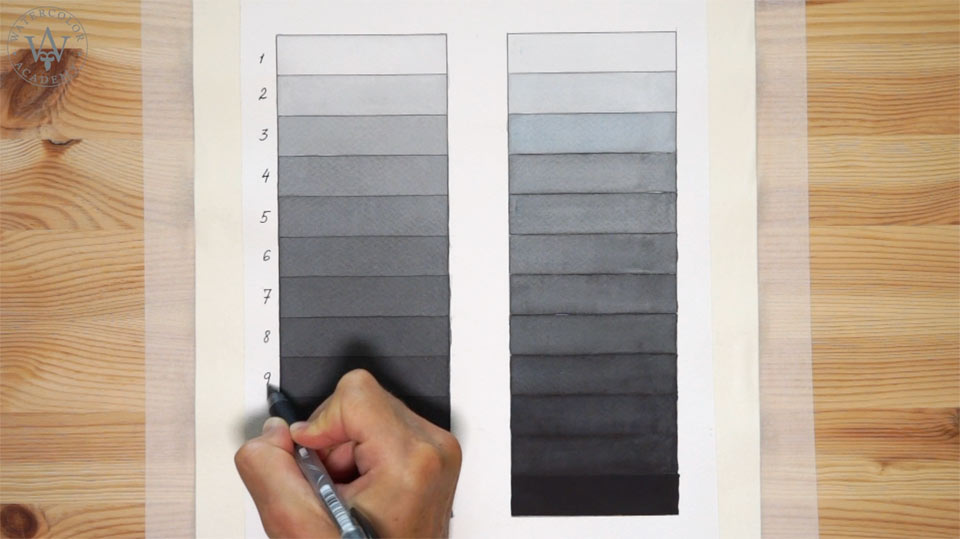
The watercolor paper is fixed to the board, and this board is titled at about 15 degrees, so the top end of this artwork is raised slightly higher than the other end. This helps to make a very smooth wash, because the liquid paint flows down to the bottom edge of the painted area and collects a bead.
Before applying the next layer, the previous one has to be totally dry. It is very important to paint every layer on the dry paper surface. This way, there will be a clear border between each step, because when painting wet-on-dry, the paint will not flow uncontrollably from one box to another.
So that you avoid watching paint drying, I will fast-forward the process of painting every layer. In short, the process of painting this grayscale is as follows: the first light gray layer covers the entire large rectangle from the first to the twelfth row. When the paper surface is dry, I apply the next layer, starting from the second row, and continuing with this wash to the very last row. Once again, after letting the paper dry, I paint the next layer, starting from the third row – I continue this to the end. Then, repeat this process several times, applying new layers one step down at a time. By following this process, you will end up with a gradation of grayscale swatches in 12 steps. The next exercise will be very useful in helping you to develop your sense of tonal values.
I will now repeat the same range from almost white to black tones, this time however, doing it alla prima, and not in multiple layers. The term alla prima means 'from the first attempt'. So, the task is to mix a black paint on the palette to match the exact tonal value of a chosen row on the left-hand side. To make the task more difficult, you cannot start from the top or bottom, but somewhere randomly, such as in the middle. After doing this, pick another random cell, and match its tonal value. Every row has to be filled in – without making multiple layers – in one attempt. The aim of this exercise is to complete all 12 rows and make an exact replica of the grayscale values that have been previously done in layers. This is an excellent exercise to help you develop your sense of tonal values, and to learn how to mix a watercolor paint that will match the grayscale swatch.
You may be surprised that in watercolor painting, tonal values are more important than colors. Of course, it doesn't mean that you have to paint in monochrome or use black paint, but all other colors have tonal values as well. Making the grayscale exercise will help you to better understand the values of other colors, including their lighter tints and darker shades.
I now write numbers next to the grayscale swatches – from 1 to 12 – as you will need exactly the same 12 steps of tonal values for the next exercise.
Here is the template for the next task. The grayscale values are arranged into 12 equal steps from top to bottom. There are also 12 columns, for 12 colors on the color wheel. You may remember this color circle from one of the previous video lessons on color theory. Each fully-saturated color has its own tonal value, and we will examine those values in this exercise.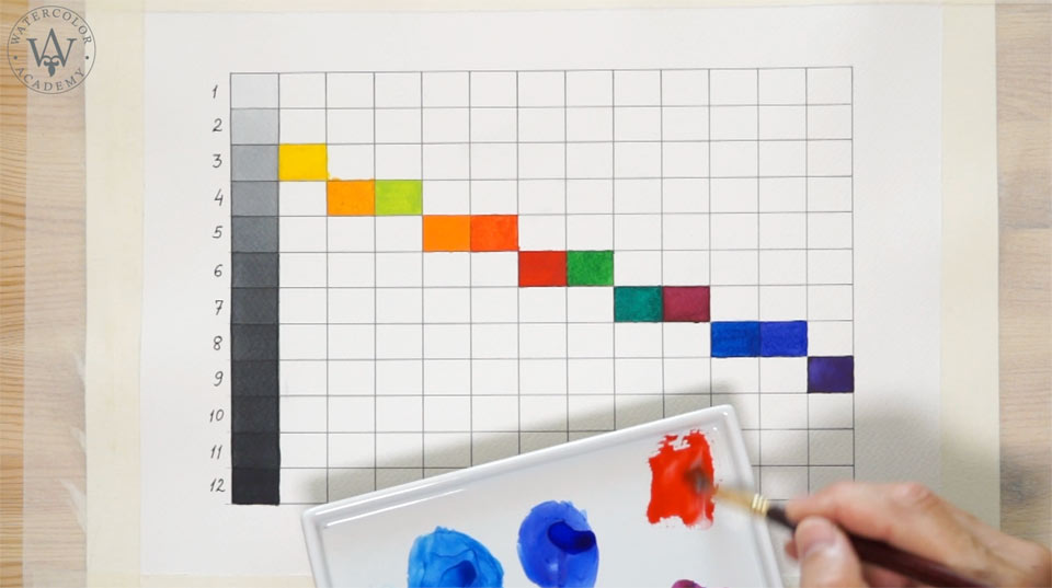
Let's begin from the lightest color, which is yellow. Its tonal value corresponds to the third step on this grayscale. I cannot make this yellow color any darker, no matter how much pure yellow pigment I apply.
The next color on this scale is yellow-orange; its pure tonal value corresponds to the fourth step.
The yellow-green color is somewhere between step number 4 and 5. I will put it at the fourth step, although your swatch may be a but darker and more suited for the fifth cell.
The orange color goes on the fifth step. This is where red-orange goes as well, athough it is somewhere between the fifth and sixth steps.
The pure red color is most suited for step number 6, as does the green color.
The next step, number 7, is taken by the blue-green color.
I place the red-violet color on the same seventh step; however, you may find that your color swatch may be better suited for step number 8.
The blue color goes on the eighth step.
The blue-violet color also takes the eighth step. I have to say that, depending on the device screen settings, this swatch may not appear as a blue-violet color – this is due to the color correction of this video. Finally, the last violet swatch is the darkest; this takes the nineth step.
So far, we have all 12 swatches painted in full-strength. Each color corresponds to a certain step of the grayscale values.
Moving on now, I will show you how to do tints. For example, if we take the red hue, its full-strength color corresponds to the sixth step. In order to fill in step number 3 with this hue, I have to dilute the red paint with water, to make the red color twice lighter.
The first step is a very thinly diluted red hue.
For the fifth step, however, the tint of red paint is slightly lighter than the full-strength color. So, depending on the extent to which the paint is diluted with water, the color tint will be of a lighter tonal value, which will correspond to a particular step of the grayscale.
The task of this exercise is to fill in all of the remaining cells of this diagram, above the full-strength color swatches. Because the full strength of the yellow color is as dark as step number 3 of the grayscale, there are only two cells to be filled in: number 1 and 2.
In watercolor, tints are achieved by diluting paints with water. Therefore, for every color, I create a scale of tints by mixing pigments with water, in order to match the tonal values in accordance with the grayscale steps.
Looking at this diagram, you can understand why there is no such thing as highly saturated light blue. A light swatch of blue cannot be saturated, because it has already been diluted with water.
All light swatches of tints are now in place. They are located above this diagonal line. For some colors, like yellow, there is a very limited range of tints. However, there are a lot of steps below the saturated color. And for the violet color, it is opposite, with only a few steps below and many above. I will now take care of shades. Shades are darker tones of any particular color.
Because the pure yellow color is very light, in order to make a darker shade, I have to mix it with a complementary color located opposite on the color circle. Thus, by adding a little bit of violet paint into the pure yellow pigment, I make it one step darker. To increase the tonal values of the yellow hue, I would have to keep adding more and more complementary color, which for yellow is violet. However, this way of producing shades has its limit, because when I reach step number 9, which is as dark as pure violet is, I can't go any darker by adding more complementary violet color. So, for the remaining steps, I add a little bit of black pigment into the mix.
The gradation of 12 steps tells us that there is no such color as pure dark yellow. Because after the third step, to make the yellow color darker, it has to be toned down by adding complimentary violet or even black pigments. So, all yellow shades from step number 4 to 12 cannot be pure yellow, because they have been toned down.
To make shades of violet color, there is no other way but to add the black paint. Likewise, the darker shades of violet cannot have a pure color, because they contain a black pigment.
Filling in the remaining cells on the diagram with darker shades is a very good exercise, not only to practice the skills of matching tonal values, but also to get a good understanding of why shades and tints cannot be highly saturated. Diluting paints makes them pale and dim, and adding darker pigments to achieve shades, changes their color and makes them dull. To demonstrate this, I dilute the darkest shade of violet with water. Its color is dull and unsaturated.
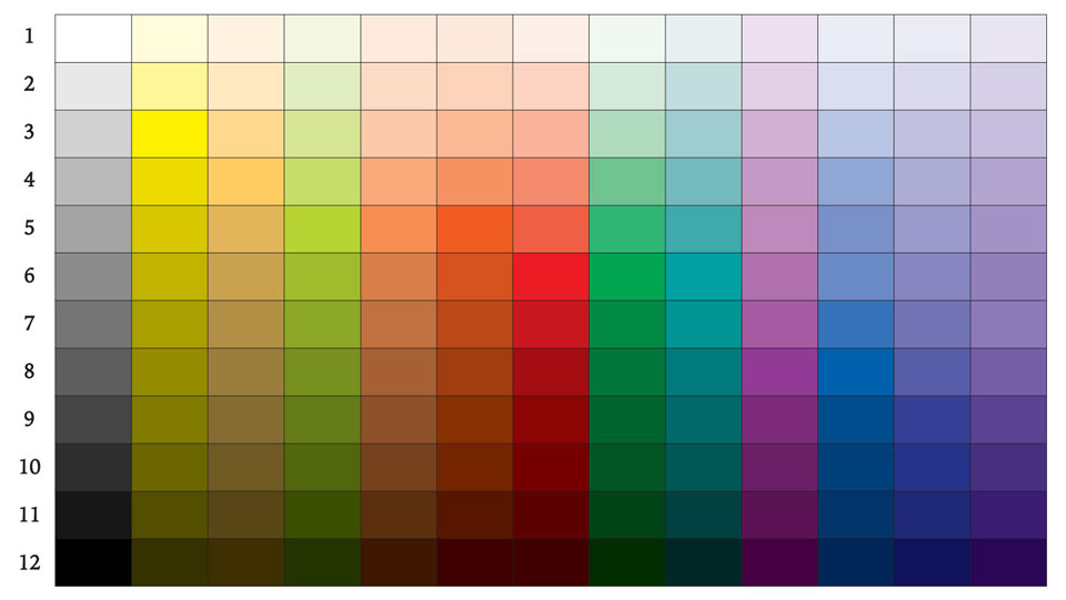
I have completed the full diagram, with remaining shades. If we turn this image into black and white, you can see that all tints and shades have the same tonal values as the grayscale template on the left-hand side.
All pure colors have a high saturation only when they are applied in full-strength. Color tints are achieved by diluting watercolor paints with water. It is because they are diluted, that tints cannot have a high saturation.
Likewise, the shades cannot be pure in color, because they are obtained by adding either complementary pigments or black paint. For example, in order to obtain shades of the orange color, we can add to it a bit of blue, which is complementary to orange. However, this will only work until step number 9, because it is as dark as the pure blue is. To make the orange shades even darker, black paint has to be added for steps 10, 11 and 12.
Coming back to the topic of this video lesson - the light-dark contrast – it is very apparent from this diagram that the largest difference in tonal values is between yellow and violet colors. Colors that occupy the same step on the grayscale values have no light-dark contrast at all; they have no difference in tonal values.
For example, orange and red-orange colors, which are similar in hue, also have very similar tonal values. However, red and green, which although are very different in color to one another, also have a very low light-dark contrast, because their values are almost identical.
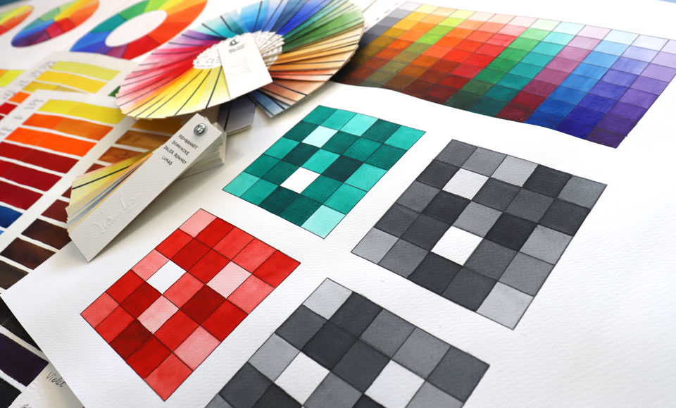
I will now give you another very useful exercise: practicing painting different tonal values. In order to do this exercise, make a 5-by-5 square and randomly fill it with different grayscale tonal values – from 1 to 25. Here, each swatch has to be one step darker than the previous one; the darkest swatch (number 25) must have the same tonal value as the pure red color. Next to the grayscale checkboard, you have to make another one in color. This means that square number 25 will have a pure saturated red color. All other swatches have to be filled randomly one-by-one, with red color tints that match the same tonal values as on the grayscale checkboard. The purpose of this exercise is to practice your vision of tonal values, and to improve your skill of diluting paint with water, at the necessary proportion to achieve the required tonal values identical to the grayscale example. You should carry on randomly filling each square with the precise tonal value, matching the grayscale template.
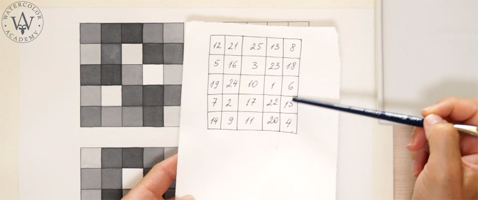
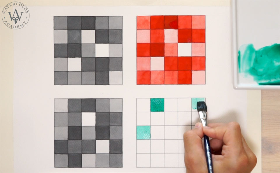
You can do similar exercises using any other colors of your choice. Step number 25, in this case, has to match the tonal value of the full-strength chosen color.
At the beginning of this lesson, I mentioned that the light-dark contrast is probably the most important one in painting. Despite the use of colors taking a very prominent role in painting, in order to create an illusion of the real world, an artist has to apply correct tonal values in an artwork. Light and dark tonal values in art are referred to as chiaroscuro, an Italian word literally meaning 'light and dark'. In the real world, there are infinite ranges of chiaroscuro, so dividing the tonal range into 12 or 25 steps is a simplification of this. There is no limit as to how many gradation steps exist between white and black colors. Of course, to keep things simple, the 25-step square is a great exercise to practice painting tonal values.
The two colored squares are now complete; when we check how they appear in black-and-white, we can see that the tonal values are very closely matched. I would strongly advise you to practice all of the exercises presented in this video lesson, in order to develop a more advanced ability to fill the tonal values, and skills of diluting and mixing pigments.
Let's see which role the light-dark contrast plays in art...
A self-study, self-paced course where you can learn how to paint in watercolor by watching video lessons and doing assignments
One-time payment - Lifetime membership
$297 USD
One-to-one, unlimited and custom-tailored to your skills and needs Personal Tutoring by the Watercolor Academy teachers
One-time payment - Lifetime membership
$997 USD


