Watercolor Academy Online Course
A self-study, self-paced course where you can learn how to paint in watercolor by watching video lessons and doing assignments
$297 USD
ENROLL NOWA self-study, self-paced course where you can learn how to paint in watercolor by watching video lessons and doing assignments
$297 USD
ENROLL NOWOne-to-one, unlimited and custom-tailored to your skills and needs Personal Tutoring by the Watercolor Academy teachers
$997 USD
ENROLL NOWVideo lesson by Vladimir London
In this video, you will discover how to paint a girl with flowers in watercolor.
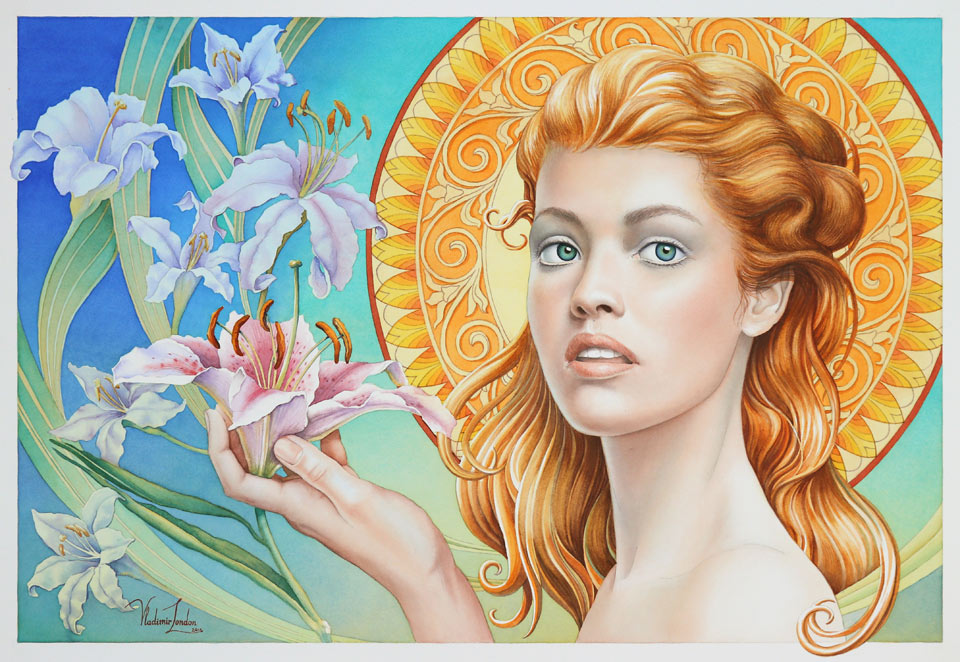
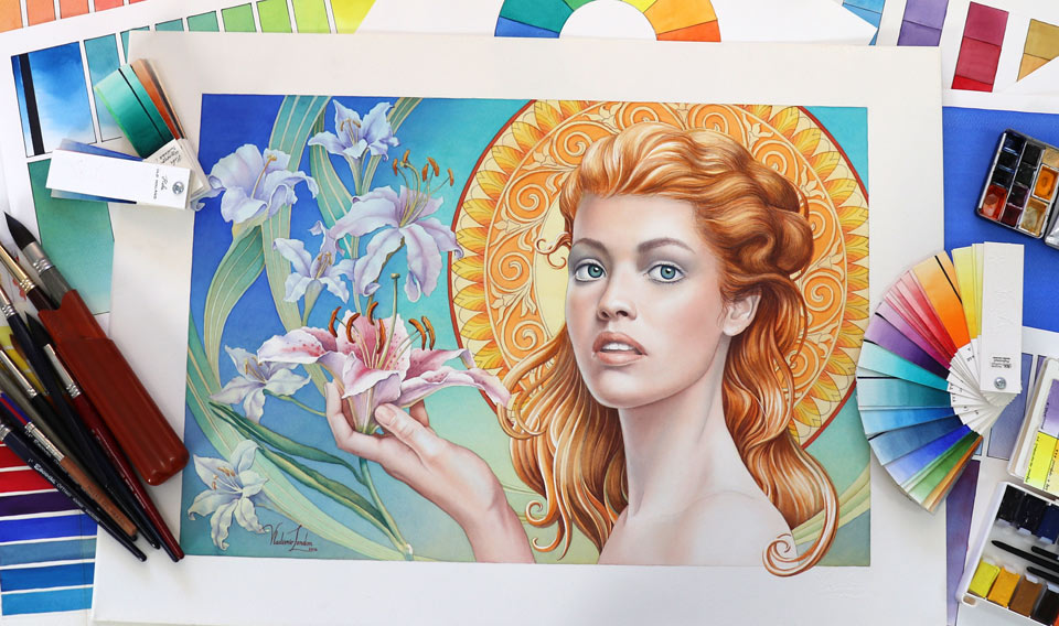
This is the artwork I will achieve by the end of this video lesson. This painting was exhibited at the international watercolor exhibition. Here it is, displayed on the wall among other pieces by watercolor artists from all over the world. In this video lesson, you will see how to make a multilayer watercolor painting that attracts the attention of the viewers and grabs their interest.
I begin this artwork by measuring the golden proportions for its composition. This golden mean caliper speeds up the proportion measurements. However, you don't have to use it because, if you want to measure a golden ratio, you can simply multiply or divide a measurement by 1.62. Good drawing skills do not depend on tools but on the knowledge and experience you have. Nevertheless, to speed up the process, I don't see anything wrong with using the tools you have.
The composition will feature a girl who is holding a lily flower. This portrait is depicted in the three-quarters view. Behind the girl's head will be a circular, organic-patterned design, and the rest of the background will also feature lilies, arranged along curved lines. If you'd like to have a good educational resource on How to draw portraits in the three-quarters view, you may want to check my book on this topic, which is available on Amazon.
Just checking the color balance on this composition, I'm quickly adding blue color even though this is a disposable cartoon. The main purpose of this cartoon is to decide on the composition and to have the preparatory drawing in actual size that I can then use to transfer it onto watercolor paper. For this purpose, I outlined the design on the tracing paper, then flipped this paper over and repeated the whole drawing in thin 0.5 mm graphite pencil once again. This reverse-side drawing is required to avoid mirroring the composition. Now, the drawing is ready to be transferred onto the clean sheet of watercolor paper sheet.
First, I will mark a composition frame - I do it in graphite pencil, using a ruler for straight lines. Now, the tracing paper with the design can be placed on top and the drawing can be transferred, line by line, on the clean watercolor paper. This paper comes from Sanders Waterford, has 300 gsm weight, and is cold-pressed. When the design is fully transferred, I can take the tracing paper off, carefully removing the masking tape, with which it was affixed to the paper.
There are several ways to stretch it - for example, by affixing it to the wooden board - but, to illustrate to you another way, I will use wooden stretchers, the same tools that artists use for stretching canvas. I place the assembled stretchers on top of the paper and mark the four edges of this frame with a graphite pencil. I do these marks on the reverse side of the watercolor paper sheet. Now, I turn the sheet over, face side up, and apply clean water with a soft, flat brush, thoroughly wetting the entire surface of the paper without leaving any gaps. When this side is completely wet, I turn the paper over, place it on the clean board face-side down, and wet the reverse side as well. It will take about 10 to 15 minutes for the paper to soak up the water and expand in size. After that, while the paper is still wet, I carefully place the wooden stretchers, aligning them with the marks I have made previously, and staple the paper edges to the wooden planks, starting from the middle of the long side. Then, I turn the entire wooden board, together with the stretchers and paper, so I can affix the opposite side, which I also begin stretching from the middle. It's very important not to move wet paper across the wooden board to avoid surface damage. When the two long sides are affixed in the middle, I rotate the stretchers with the paper 90 degrees and affix the short side in the middle as well. Now, I can carefully rotate the stretchers 180 degrees to staple the remaining short side in the middle. I staple the corners last to complete the stretching. When the paper is set, I turn it face-side up and let it dry for several hours or overnight.
Now, I have to make a decision about the blue color for the underpainting, then mix a sufficient quantity of that paint, and do a gradated wash. The paint I'm using is Windsor Blue (Green Shade) which is very transparent but also staining. So, I must apply it carefully to avoid any accidental drops or brush marks on the white frame around this illustration because it would be very challenging to remove this paint by washing it out. I'm applying this mix with a round, soft, synthetic brush and, after each band of paint, I add a bit of water into the mix. This way, the mix becomes slightly lighter with every row of brush strokes, which results in a slight gradient, darker at the top and lighter at the bottom, hence the name of this painting method: "Gradated wash". I'm not using any masking fluid and will preserve white areas by carefully painting around them. I will do a plain wash, painting a circle behind the portrait, in yellow. For this part, I have mixed Windsor Yellow, which is a semi-transparent and permanent pigment. You may see that, even though I'm using a small, round brush, the 'saw wash' is a great way to intermix brush strokes on the paper because they are applied diagonally but gravity pulls the paint straight down. So, it flows from one brush stroke to another, resulting in a very smooth wash.
I turn the artwork upside down to make another gradated wash on top of the blue underpainting.The piece is not horizontal but tilted at about 15 degrees; that is why the paint flows down due to gravity. I'm applying a very light tint of yellow paint, carefully preserving white areas. Because there is not a solid board beneath the watercolor paper, I will use a self-made wooden bridge as a support for my hand. As you remember, this watercolor paper was stretched on the wooden frame. It is fixed like a drum skin with no solid backing in the middle. So, I have to be careful not to apply a lot of pressure on this paper because it might get damaged. This is the reason why I first transferred the drawing on paper and only then stretched it.
I'm continuing with the yellow gradated wash. When the previous layer is fully dry, I can continue painting the background. This time, I will do another layer of blue paint, applying it wet-on-dry, using the gradated wash watercolor painting method. As before, I'm carefully painting around areas I would like to keep unpainted for now. There are several reasons I don't want to use any masking fluid. Above all, masking would leave unpleasant, hard edges that would look amateurish and even spoil the whole appearance of the artwork. Another reason is because this paper hangs in the air and any harsh rubbing when removing the dried masking film might damage or stretch the paper's fibers. I'm applying several layers of blue paint every time, going darker and more saturated. These layers are painted wet-on-dry; so, every previous layer must be totally dry before continuing with the next one. Now, I'll do the organic pattern design of the yellow circle. Once again, I'll carefully paint around the areas I would like to preserve without any masking application. This repetitive work is a bit time-consuming but the result looks much better than if I were to apply a masking fluid. The colors I'm using for this design are Cadmium Orange and Windsor Lemon. Both pigments are permanent, which is very important if you don't want your colors to change over time. I keep adding new, warm pigments into this design, working with a small, round brush, to depict small details and outlines of this organic pattern.
I will now take care of the hair. With a round, synthetic brush, I'm doing a light underpainting for the girl's hair. This first layer is simply to make the paper off-white and depict the lightest tones of the hair. I can also use slightly darker tonal values for the shadow areas. I will come back to the hair after paying a little attention to the flesh. I will now do the first layer of the skin with a very light orange tint. First, I will cover the girl's hand with this light paint mix. I would like to paint skin tones in multiple layers. That is why every layer will be very light and transparent. There is a big difference between painting a portrait in alla prima - in one attempt - and portraying skin colors and tones with multiple layers. It is simply impossible to achieve the same result if you paint a portrait in full strength colors from the start. Paint pigments in alla prima are physically mixed on the palette or directly on the paper and the color will appear very different even if you use exactly the same pigments but applied in separate layers.
The color and texture achieved by the multilayer technique will look different because pigments will not be mixed mechanically but optically. Every layer must be fully dry before applying the next one. Optical mixing happens when a ray of light comes from a light source, penetrates through the layers of pigments, and bounces back, reflected by the white surface of the watercolor paper. What you will see in this case is not just one mechanical mixture of different pigments but a collection of different colors, optically mixed with each other, as if you were looking through a stained-glass window made of several layers of different colored glass pieces. I'm now applying a layer of the cold blue pigment which will remain light blue because it is a separate layer, versus the light gray I'd get if I were to mix it mechanically with a complementary warm color. Of course, it is a very light tint of blue, so the portrait will remain warm and fleshy but, at the same time, this blue color will add a pale blue hint, which is so natural for human skin because of the network of veins that runs under the skin. I apply the same blue color tint on the girl's hand. It's advisable to paint a portrait and hands simultaneously using the same pigments instead of finishing a face, for example, and then taking care of the hands. This way, it's easier to keep the entire artwork progressing in the same color style because you do the same steps and use the same pigments instead of working too much on one part of the body after another completely finished area. Thoroughly drying every previous layer gives you a nice start for the next one. You can paint the following layer wet-on-dry or wet-into-wet, depending on the task you have in mind; and, if you want to paint a layer wet-into-wet, first you have to moisten the needed area with clean water, doing it quite carefully not to dilute the layers underneath. Then, to apply the next layer, wet-into-wet. This method really helps achieve very smooth gradations of colors and tones and avoids any harsh borders in the brush work. I'm mixing complementary violet and yellow pigments to make a nice-looking gray mix that will be used for shadows of the flesh. I would like to paint it wet-into-wet, so first, I wet the paper surface with clean water and then apply this mix with a round, synthetic brush in a very thin transparent layer. The yellow and violet pigments I'm using are Cadmium Yellow, with pigment PY35, and Violet, PV3. I have to say that this violet pigment is a bit rare. It comes from the St. Petersburg Watercolor manufacturer and there is no equivalent to it in, for example, the Winsor & Newton palette. It doesn't mean, however, that you have to use exactly this pigment for flesh shadows. Colors are much less important than tonal values. There are so many other complementary pairs of pigments that can produce wonderful looking neutral grays.
When depicting eyes, you have to remember that an eyeball is essentially a ball. As such, it will never be totally white but will have the tonal values of a sphere. There will be light, midtones, and shadow areas of a sphere no matter from which direction the light is coming. Also, there will be a cast shadow under the upper eyelid if the light source is placed above. Depicting this cast shadow is an important step when you're painting the eyes. Attention to these small details makes the portrait more realistic and believable. To paint the eye's iris, I first apply its light tones and colors and then add darker values on top. For the eyes to look in the same direction, you have to draw two irises equal in size and place them at the same angle. To make the eye's texture glossy, you may want to leave some white unpainted highlights next to the pupil. With the eyes in place, the portrait looks more like a portrait and I can continue working on its tonal values, sculpting the shape of the face, applying knowledge of its construction and anatomy.
Students often ask me how to paint a good portrait. What is the most important thing? How to make it realistic and three-dimensional? A good portrait is well-drawn. If you cannot draw a realistic portrait in graphite pencil, why would you expect that painting in colors would make it any better? Watercolor paints will not make the job any easier but actually much harder. Instead of only concentrating on the head's shape, construction, proportions, alignments, and anatomy, you will also have to think about how to depict all those things in colors - which pigments to use; how to mix them on the palette or on the paper; which painting technique to apply, alla prima or multilayer; how to control flowing paints; how to achieve the colors you want; and how to build tonal values so the portrait looks recognizable and believable. Making portraits is not about copying what you see in life or on the reference image, but actually drawing what you know about the head's construction, proportions, and anatomy.
To explain the difference between depicting what you see and drawing what you know, I will use the following example. When painting or drawing an ear, a beginner artist might be very confused by all those curved elements of the ear he or she sees in life or on the photo. With no knowledge of the ear's anatomy, an artist would have to copy what one sees and this will lead to inevitable constructive mistakes. One of the common mistakes is misplacing the ear on the head. Unless you know that the lower edge of the ear is on the same level as the base of the nose, and its top edge is aligned with the eyebrow ridge, you won't notice this alignment in life simply because you don't know you have to check this proportion. If you don't know that the line where the ear attaches to the head is not vertical but tilted, you won't know that you have to measure this angle in life. If you don't know that the crus of helix doesn't connect with the tragus, how would you take care of this detail in your artwork? There are many other proportions, alignments, and anatomy facts that you have to be aware of just to draw an ear realistically. And, of course, an ear is not the whole portrait. There are many other things you need to know about. The alignment of all facial features, their proportions, construction, anatomy, and so on. To give you this know-how, we actually created a whole video course, Life Drawing Academy. If you want to learn how to draw realistic portraits and figures, this course will be very helpful for you.
The girl's portrait is gradually taking shape and I will now continue with the hair. For its darker color, I'm mixing burnt umber and violet pigments from the St. Petersburg Watercolor paints range, and I actually like this burnt umber more than its equivalent from Winsor & Newton. Despite exactly the same name, burnt umber, the Winsor & Newton paint is a convenient mix of three pigments: PBR7, PR101, and PY42. While the burnt umber paint from the St. Petersburg range contains only one pigment, PBR7, which makes it more predictable in mixes with other colors, without any red and yellow undertones. Burnt umber is made from natural brown clays which were originally found in Umbria, a region in Italy, hence the paint name. And the term "burnt" in the name says that this natural earth pigment undertakes a thermal treatment to intensify its color. This pigment is transparent and extremely permanent which makes it an excellent paint for making artworks that will keep their colors over time.
I'm now washing out some highlights of the hair. In addition to changing tonal values, this technique unites separate brush strokes into bigger hair curls. The cycle of painting the hair with separate brush strokes and united them into bigger masses can be repeated several times. With each layer, tonal values become darker, so I can achieve the necessary values with great control, building them little by little. This approach makes sense for an illustration because the creative task I have in mind is to make a stylized but very detailed painting which is not hyper-realistic but decorative. So, I continue building the tonal values and colors of the hair by first applying separate brush strokes and then uniting them into bigger masses by wiping out the highlights.
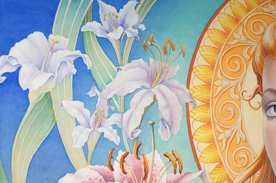
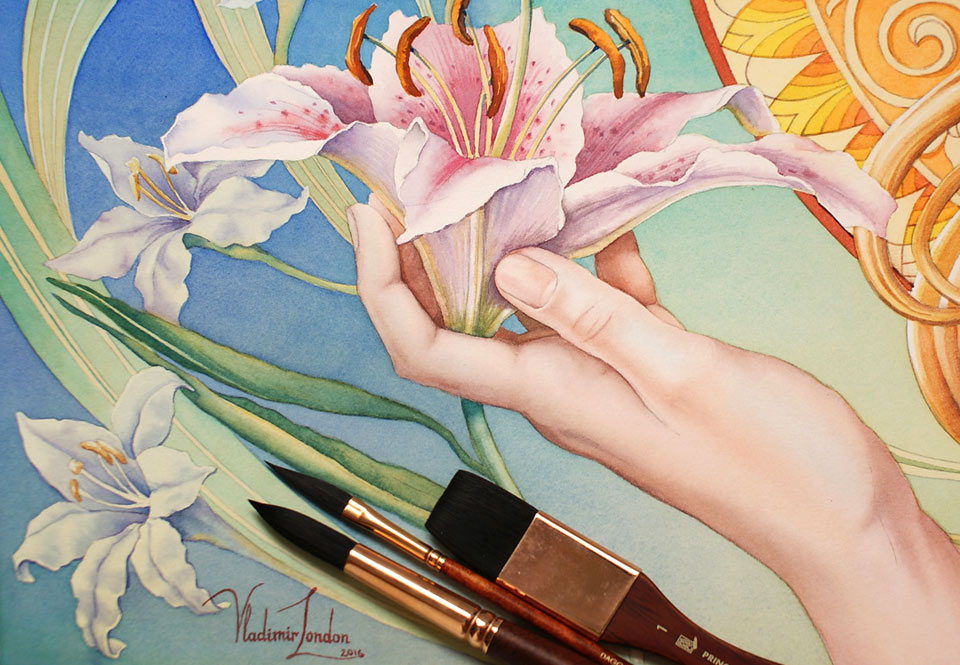
With the portrait in place, I have to take care of the background. The floral decoration has to be secondary to the portrait which should remain the focal point of this composition. That is why I will be using slightly muted desaturated colors for the background and for the flowers. Apart from the reduced contrast of hues, I will also make a softer contrast between cold and warm colors, as well as light and dark tones. I painted the greenery wet-on-dry but, for the flowers, I would like to use another painting method, wet-into-wet. That is why I first applied clean water in the flower area and now I can make small brush strokes with diffused borders to paint the texture and colors of the lily. Even though this is the main flower in the girl's hand, I don't want to make it too bright and colorful, so as not to distract attention from the girl's face.I'm adding colors with a dabbing motion of the brush to illustrate the spotty surface of the lily. You may see that, even here, I'm not using any masking fluid to preserve white paper. These flowers will look more natural and organic if I paint them freehand. It's not that difficult to paint around white areas but takes a little bit more time. As you know, art is not an Olympic sport. They don't give medals for speed. And when this painting is displayed at the International Watercolor Exhibition and in its printed catalog, they won't put any note about how fast this artwork was done. So, I have plenty of time on my hands to achieve the creative task I want and I can paint this flower for as long as I need without applying any masking fluid.
I'm working with a small brush to give full attention to every detail I want to depict. For example, the light green style of this flower is very thin.Nevertheless, I paint not just one thin line but actually give the full range of tonal values that is applicable here, including values of light and shadow, as well as the cast shadow under the stigma. I do the same for very thin filaments and anthers...
A self-study, self-paced course where you can learn how to paint in watercolor by watching video lessons and doing assignments
One-time payment - Lifetime membership
$297 USD
One-to-one, unlimited and custom-tailored to your skills and needs Personal Tutoring by the Watercolor Academy teachers
One-time payment - Lifetime membership
$997 USD


